Edgar Cervantes / Android Authority
TL;DR
- YouTube is testing a new landscape layout for Android, which is better optimized and has less wasted white space.
- The updated layout is available for some users but is not widely available.
YouTube is one of the best Android apps out there, and most of us are hooked enough to spend quite a lot of money on a monthly YouTube Premium subscription. The service has plenty of room to improve, though, and one of these is how the app works on wider aspect ratios, like on phones in landscape orientation and on larger screen foldables and tablets. Google seems to have turned its attention to this landscape experience, as we’ve spotted changes that are a definite improvement over what we currently have in the YouTube app for Android.
You're reading an Authority Insights story on Android Authority. Discover Authority Insights for more exclusive reports, app teardowns, leaks, and in-depth tech coverage you won't find anywhere else.
An APK teardown helps predict features that may arrive on a service in the future based on work-in-progress code. However, it is possible that such predicted features may not make it to a public release.
Currently, YouTube is optimized well for use on Android flagships in portrait orientation. But when you use the YouTube app in landscape orientation or on larger screen foldables and tablets, you are treated to a landscape layout that merely rotates the portrait layout. That’s the lazy way to build a landscape-oriented experience, and it is barely a step up from outright disabling landscape orientation.
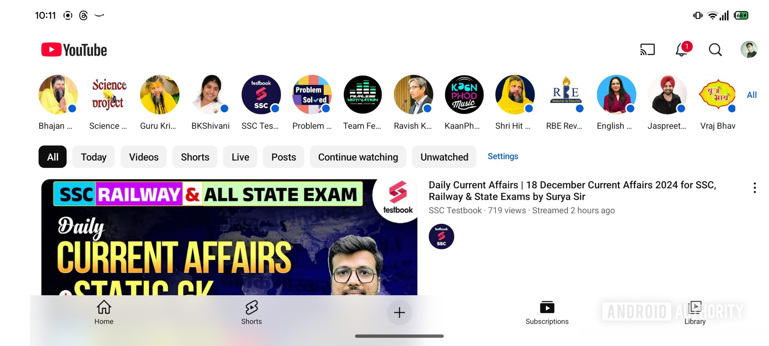
Here is what YouTube looks like currently in landscape orientation and on foldables:
AssembleDebug / Android Authority
As you can see in the current layout, channel updates appear at the top row, while your subscription feed appears below it. It looks cramped and busy since all UI elements appear to be jostling for space on the vertical Y-axis, while the horizontal X-axis has wasted white space.
Here is a video demo of the YouTube app:
As you can see, you have to choose channels from the top updates bar to view their activity. Notice how video listings take up the entire screen with very large thumbnails.
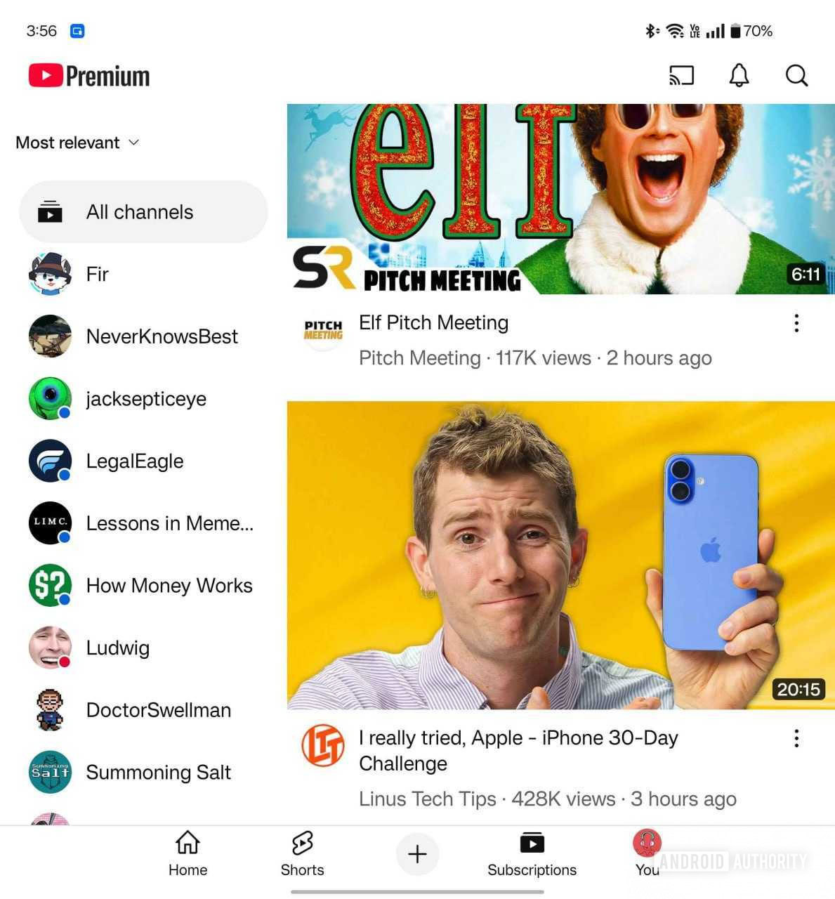
With YouTube app v19.50.36, Google is testing some UI changes that optimize the experience in landscape orientation on phones and larger screen foldables and tablets. We spotted the change on a foldable, and here’s what the optimized layout could look like in the future:
AssembleDebug / Android Authority
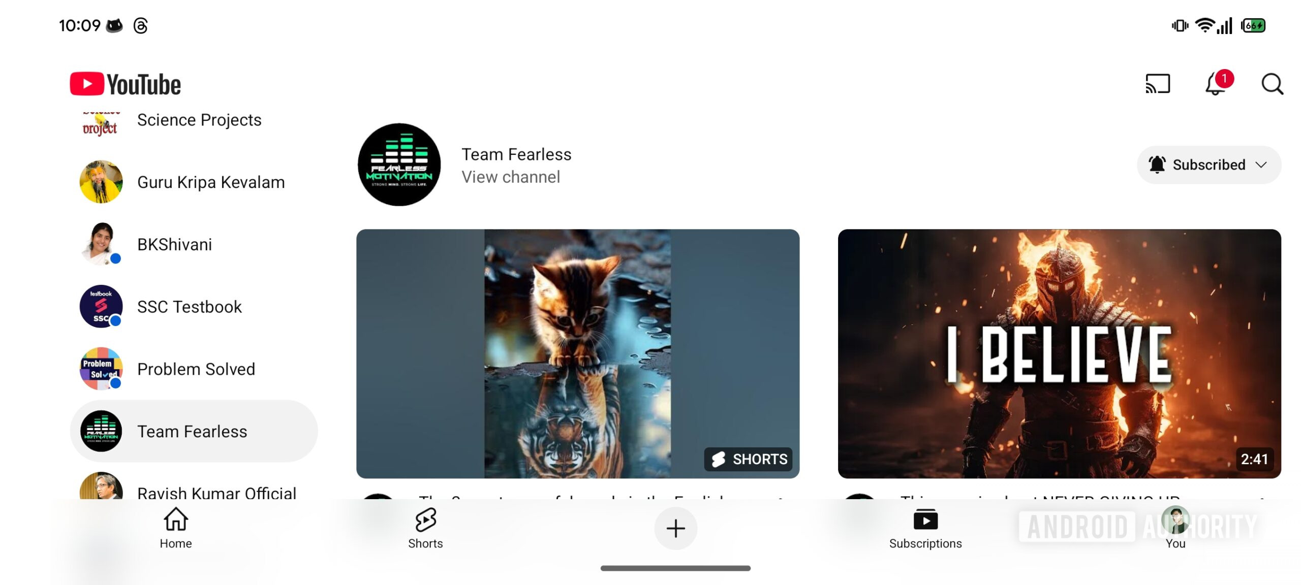
As you can see, the subscription feed is better spaced in the upcoming layout. Channel updates are on the left navigation side rail, while videos are on the second column. This also fixes the thumbnail sizing, significantly reduces wasted white space, and makes the UI easier to navigate and scroll.
Moving channel updates to the left navigation rail also cleans up the channel updates view. Google is further reducing wasted white space by adopting a two-column layout, though this could depend on the device’s width.
AssembleDebug / Android Authority
Here is a video demo showing off the layout changes to the subscription tab:
The entire experience feels significantly better in landscape orientation, with more information present on the screen. It no longer looks like an afterthought to the portrait experience. Even if you use a conventional Android phone, this optimized layout is good enough to not compel you to juggle between portrait scrolling for the Subscriptions tab and then back into landscape for the fullscreen video player. You can feasibly use the YouTube app in a fixed landscape orientation and have a great experience.
This optimized landscape layout for YouTube appears to be in testing. Some users may be part of this test, but we’re not yet seeing signs of a wider rollout. We’ll keep you updated when we learn more.
Got a tip? Talk to us! Email our staff at [email protected]. You can stay anonymous or get credit for the info, it's your choice.



 English (US) ·