TL;DR
- Google is testing a redesigned Search widget on Android.
- The refreshed widget adds support for Dynamic Color, but it no longer offers logo and shape customizations.
- The widget design refresh is still in beta, so Google could make further changes before a wider rollout.
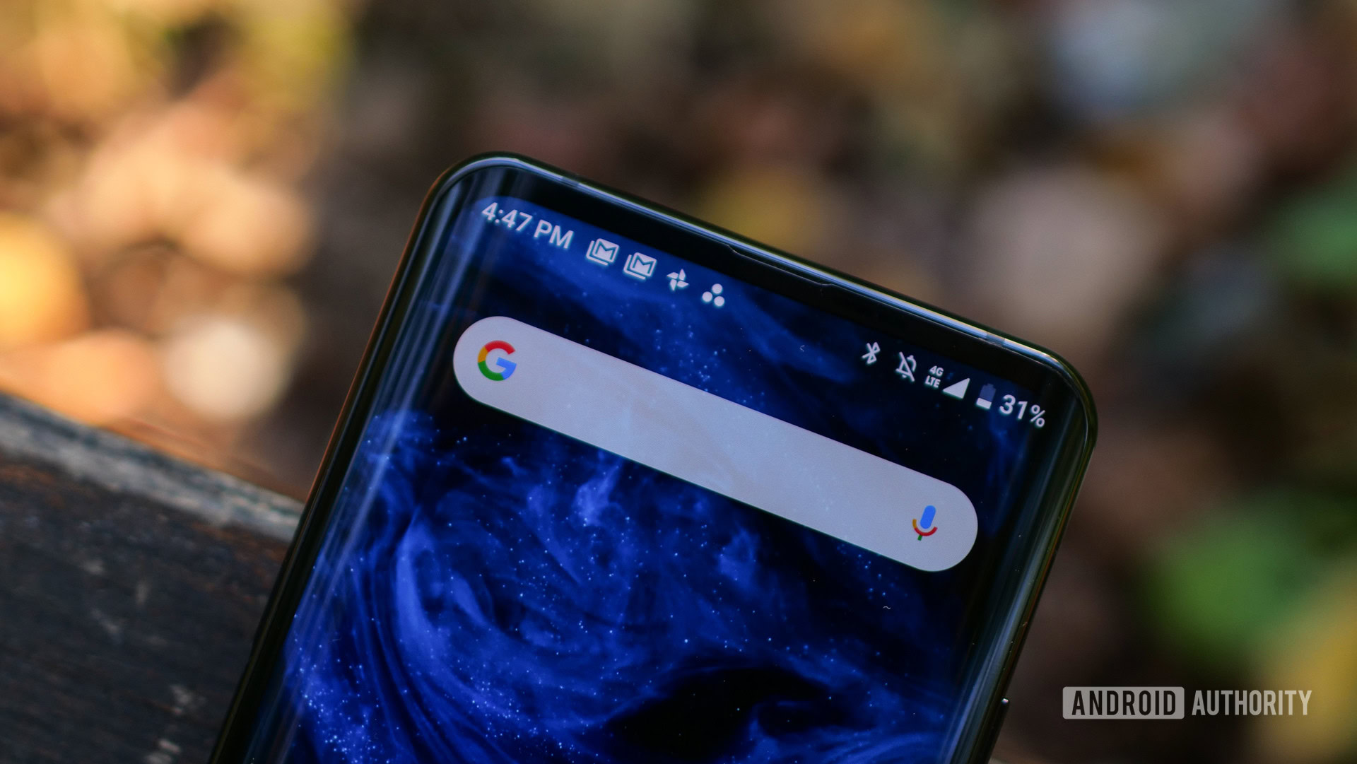
The Google Search widget on Android offers a few customization options that let you change the Google logo shown in the widget and adjust the search bar shape and transparency. Google even gives you granular hue and saturation adjustments to help you manually change the widget’s color. However, the widget currently doesn’t support Dynamic Color, which automatically matches the widget’s colors to your system theme. Google might soon address that with an upcoming redesign, but it might remove a few customization options.
9to5Google has spotted an upcoming Google Search widget redesign in the latest Google app beta update (version 15.30.x). The redesign replaces the hue and saturation adjustments with a new Device color theme that automatically adjusts the widget’s color per your device’s current theme.
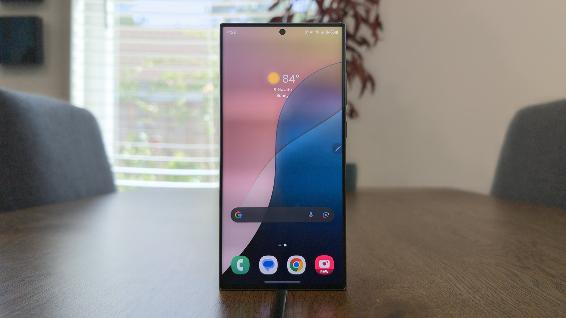
As you can see in the attached screenshots, the updated customization settings for the Search widget also include the previously available System, Light, and Dark color themes, along with a slider to adjust transparency. Sadly, Google seems to have removed the options to change the logo and bar shape, and the widget uses the G logo and pill shape by default.
Since the redesign is still in beta, there’s a slim chance that Google will add the logo and bar shape options back to the customization menu. But we’ll have to wait until the stable rollout to know for sure.
Got a tip? Talk to us! Email our staff at [email protected]. You can stay anonymous or get credit for the info, it's your choice.



 English (US) ·