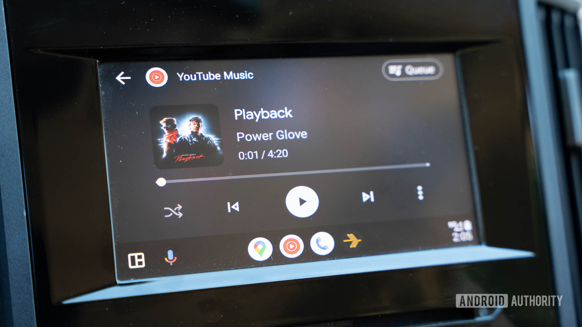
C. Scott Brown / Android Authority
TL;DR
- Android Auto version 13.4 is rolling out a refreshed media player UI.
- This update brings smaller album art, rearranged buttons, and a relocated progress bar.
- A new font completes the makeover, adding a polished look to the updated interface.
Android Auto users are about to get a noticeable shake-up in their in-car listening experience. Google has begun rolling out a refreshed media player as part of Android Auto version 13.4, marking one of the bigger interface changes for the platform since its major revamp last year. First spotted by 9to5Google, many Android Auto users are starting to see this new design right now.
One of the first things you’ll spot in the updated player is the smaller album art, which has been moved to the left side. In the previous design, the media progress bar was underneath the cover art. Now, it’s parked on the right side of the album art.
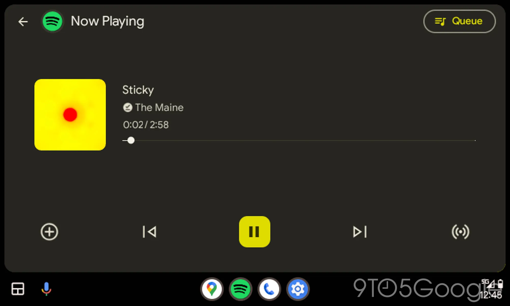
From the screenshot above, it also appears that the text size has been reduced slightly, and the player’s buttons now span the full width of the display. The update also introduces a new font. Overall, this new look definitely feels cleaner than earlier, although it could also look a bit too plain with so much empty space.
While the screenshot depicts Spotify’s media player UI, it’s fair to assume that the same UI tweaks will also apply to other streaming apps like YouTube Music and Apple Music, as all streaming apps on Android Auto share a consistent UI.
9to5Google also speculates that this redesign might be laying the groundwork for Google’s rumored “Car Media” feature, which could allow Android Auto to handle local car media, including radio stations. For now, though, if you’re running Android Auto 13.4, keep an eye out for this new look.
Got a tip? Talk to us! Email our staff at [email protected]. You can stay anonymous or get credit for the info, it's your choice.


 English (US) ·