Dhruv Bhutani / Android Authority
There’s a recurring joke amongst enthusiasts that buying into Google’s products is like enrolling yourself into a perpetual beta. But between jarring UI changes or unpredictable results from what should be tried and tested products, I’m just tired of having to figure out Google’s latest interface test when I just want to get things done.
Google might be the de-facto custodian of how you use the internet, but rampant on-the-fly changes with no recourse for the end-customer risks it becoming a dictator instead. The recent experiment with the switch over to orange hyperlinks for search results was the last straw for me, and some things got to give.
Is Google overthinking its interface updates with constant iteration?
1 votes
The chaos of constant tweaking
There’s a strong reason why Apple’s ecosystem enjoys so much loyalty. Keeping things cohesive, simple, and consistent is an art that Apple has mastered. Google’s approach, on the other hand, makes users feel like they are testing features instead of a polished, final product. Take, for example, Google’s most important product — Google Search.
It’s an indispensable tool, yet Google treats its interface like a playground for experiments. The recent switch to orange search links? Sure, the color might be easier on the eyes, but it’s an unnecessary adjustment that risks confusing less tech-savvy users.
Dhruv Bhutani / Android Authority
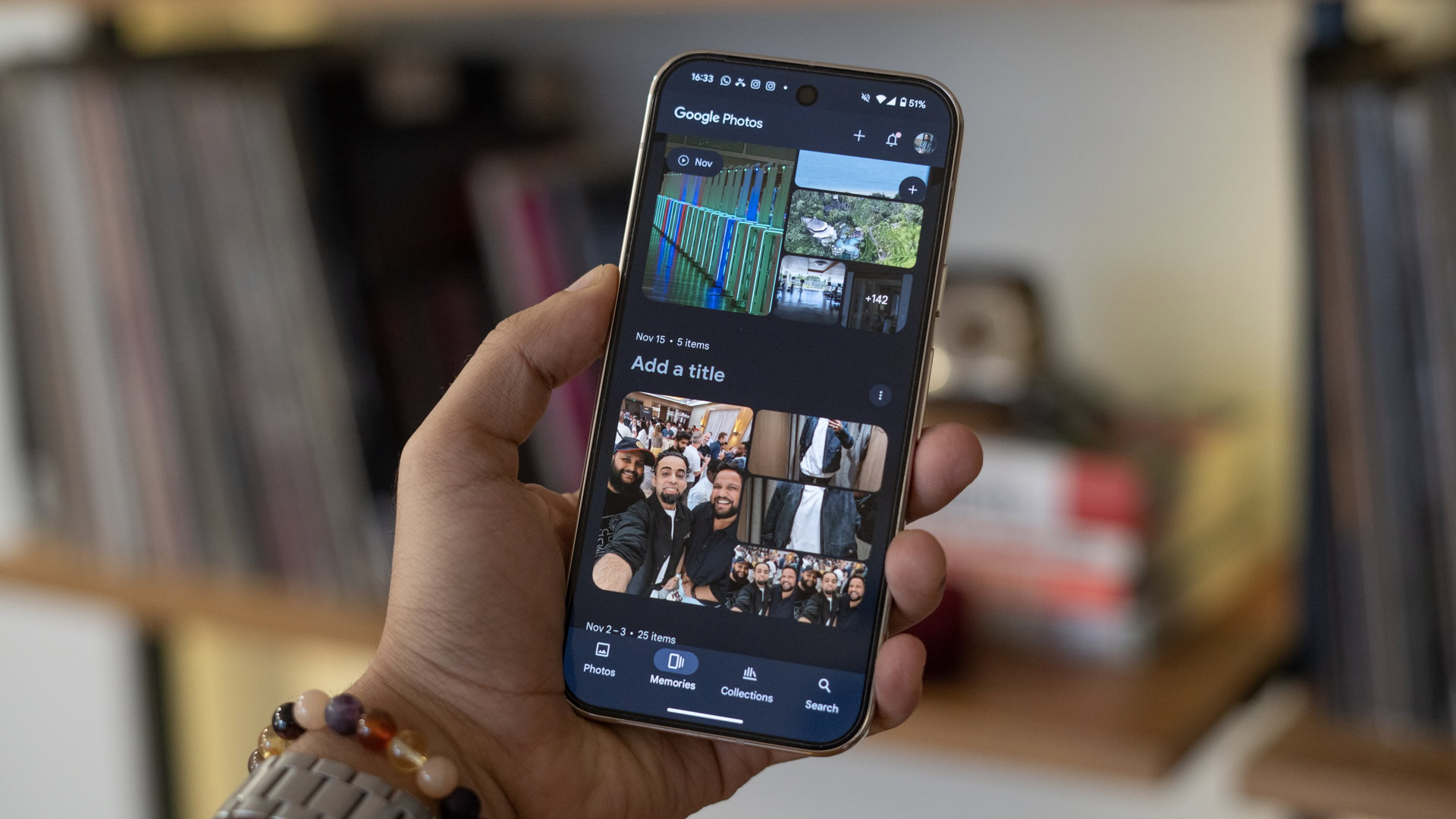
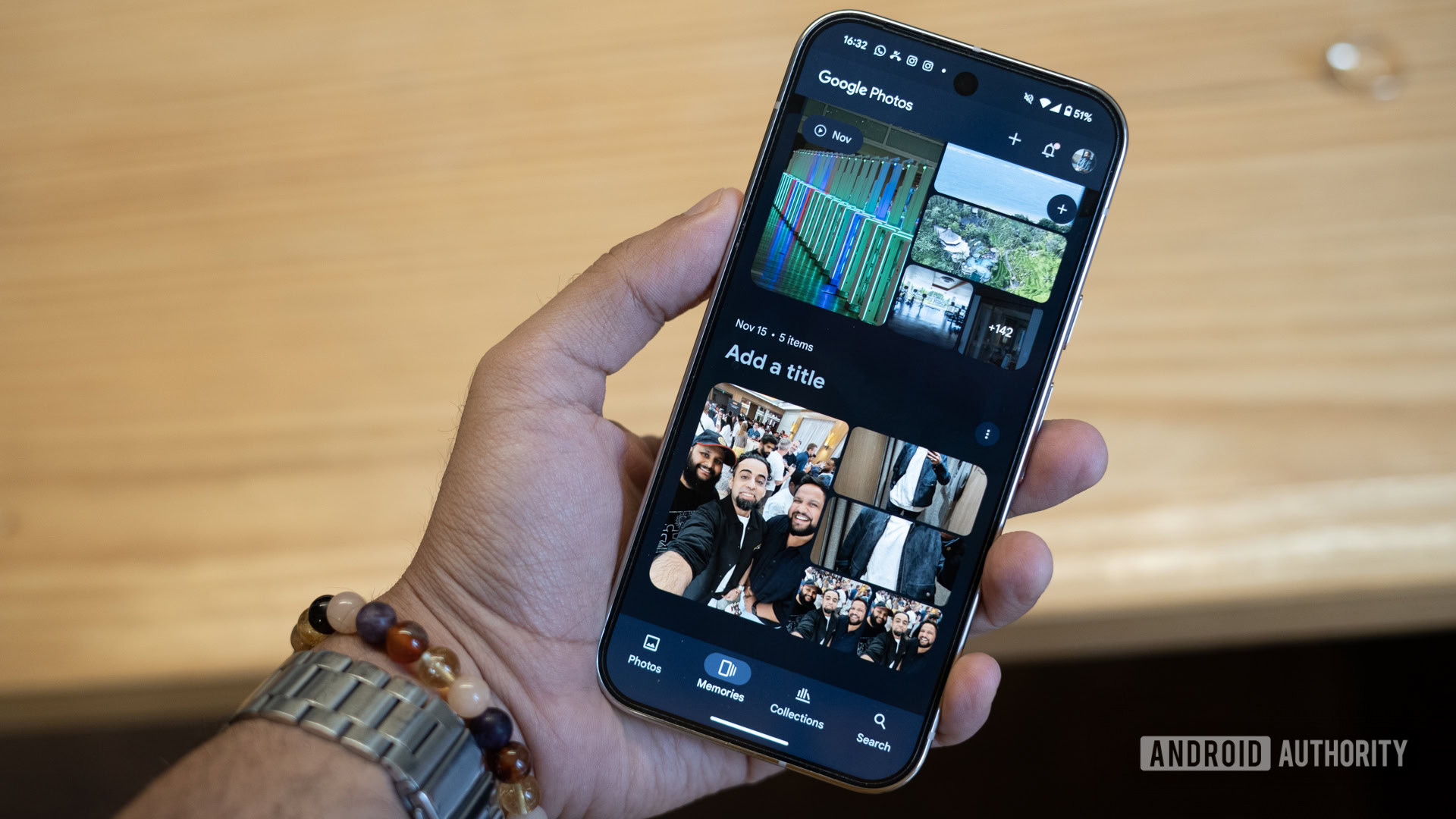
Google Photos exemplifies this problem even more. Recently, I found myself hunting for my photo albums, now buried two folders deep in a “Collections” tab. I only discovered the change because my mom called in a panic, unable to find her vacation pictures. I’m sure many others had a similarly frustrating experience.
In its constant bid to optimize, Google forgets not every user is an enthusiast keeping up with changes to the app.
Even worse, Google has tampered with Memories, one of Photos’ standout features. It’s my go-to tool to resurface forgotten snapshots with a single tap. Now? It’s being rebranded and buried under the same “Collections” tab. Why complicate something that was already working beautifully?
Dhruv Bhutani / Android Authority
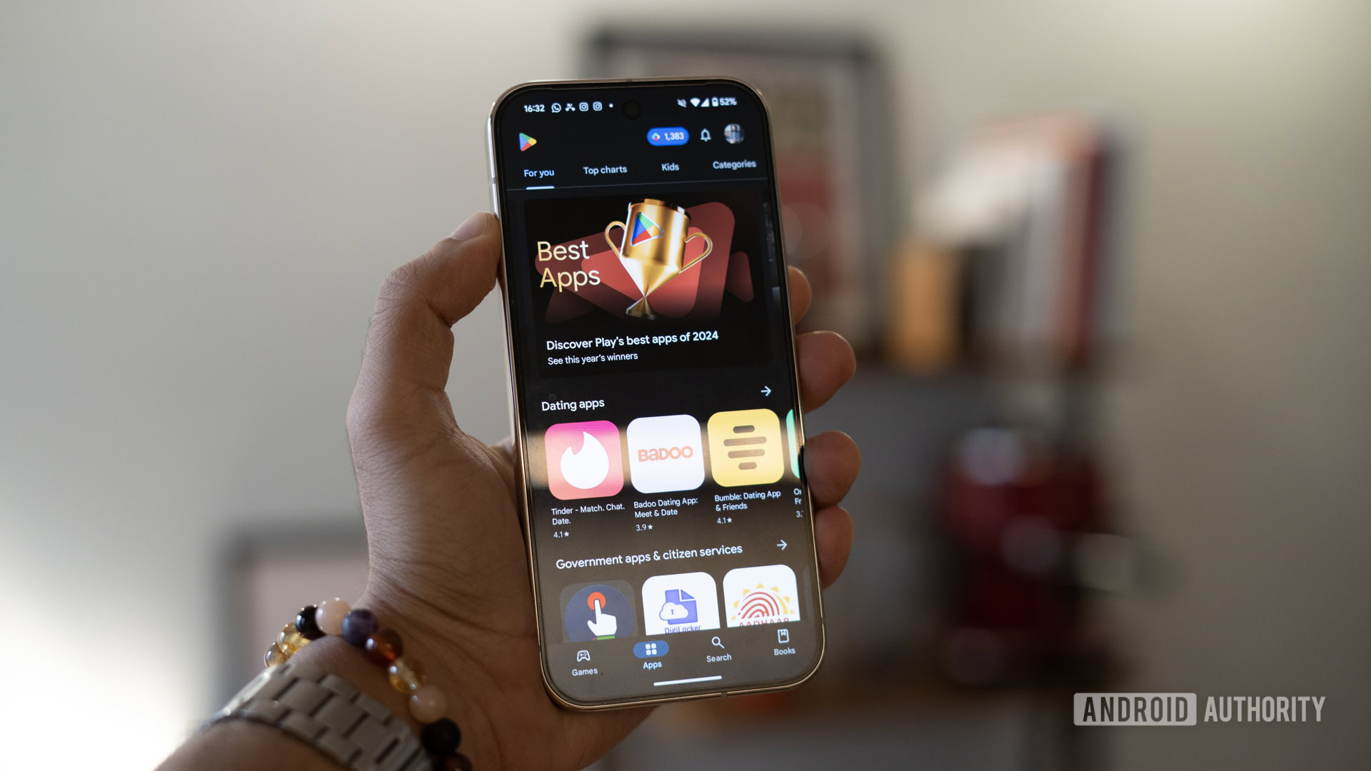
It doesn’t end with Google Photos. Earlier this year, the Play Store underwent a sheets-based redesign. While the lighter layout is arguably an improvement, relocating the search bar from the top to the bottom of the screen feels counterintuitive — especially for long-time users. Worse yet, there’s a workaround to quickly start a search, but no one will discover it unless they’re told about it. Google seems to forget that not every Android user is an enthusiast keeping up with the latest UI trends. For the average user, such a significant change adds a steep learning curve with minimal payoff.
Dhruv Bhutani / Android Authority
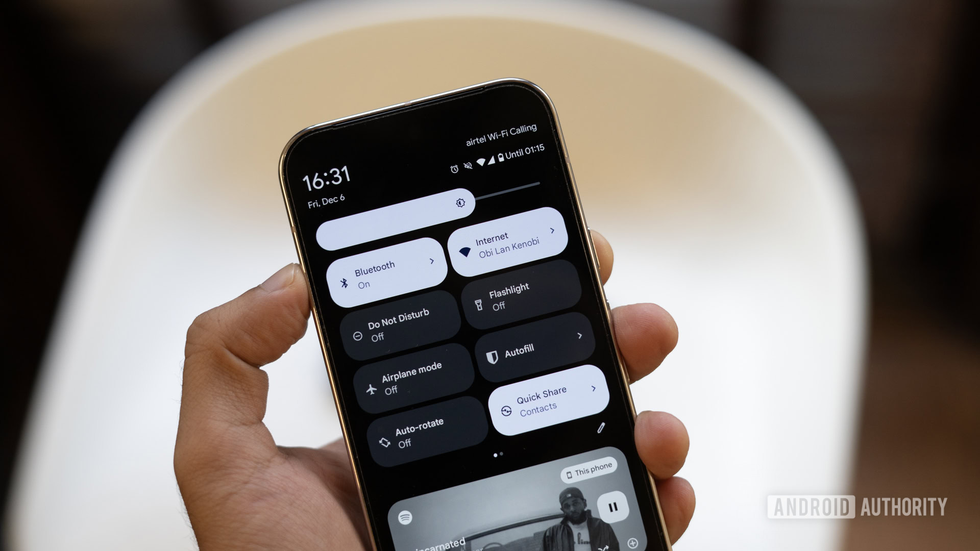
The chaos isn’t limited to apps. Android’s quick settings menu is the oldest and most recent casualty of Google’s haphazard design philosophy. Small tiles, large tiles, we’ve seen it all. Tap-and-hold functionality is gone, and mobile data and Wi-Fi toggles have been merged into a single, clunky Internet tab. It’s a baffling decision that adds friction to everyday tasks like wanting to toggle off mobile data. What used to be a one-tap process now involves multiple taps. I’d love to hear the thought process — or lack thereof — behind it.
It’s a fine line between innovation and confusion
Dhruv Bhutani / Android Authority
Not all changes are bad, of course. For example, the recent move of the Magic Rewrite button out of the text box aided visibility. But it does bring up the question — why did nobody observe this basic interface issue during the development process?
The constant cycle of improvements suggests a lack of foresight during product planning.
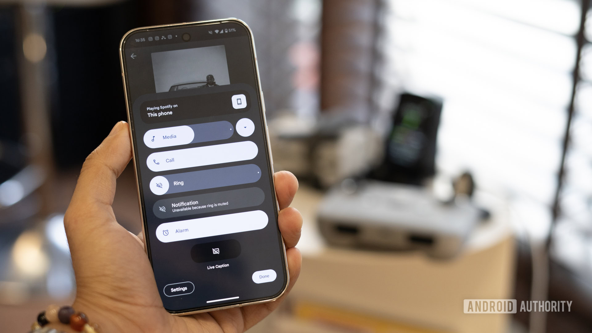
And then there’s Android 15’s volume panel. On paper, it’s a good usability upgrade, but I’m not a big fan of the transition from the primary vertical bar to the horizontal bars offering granular control. It’s just easier to swipe vertically to control volume.
This cycle of rebranding, remaking from scratch, and reworking isn’t just restricted to features, it affects apps too. I’m not going to bore you with the details, but between Google Pay and Wallet, Meet and Duo and Chat, Fitbit and Google Fit, Google might as well publish a dedicated guide to inform people of the changes.
Is Google overthinking its interface updates?
Dhruv Bhutani / Android Authority
If you’ve been following Google for a while now, you’d remember their informal motto — launch early, iterate often. In fact, Gmail stayed in beta for almost five years despite having millions of users. However, the Google of the early 2000s is not the Google of today. Most, if not all, of these services and features have been solidified. There are generations of users who have grown up on them and a whole other generation of less-than-tech-savvy users who no longer wish to keep up with the wild west of Google’s perpetual beta.
Google's old motto that encouraged constant iteration is at odds with the company's current standing.
Is improvement a good thing? Obviously. But for every tweak that is a step forward, Google seemingly makes five interface changes that will make you scratch your head wondering: Why? If you’re here, reading this article, you are already a step ahead of the vast majority of the population that does not keep track of Google’s latest whims and fancies. As for me, all I want is for Google to slow down with the changes, take a step back, and build fully finished products instead of constant betas.






 English (US) ·