Edgar Cervantes / Android Authority
TL;DR
- Google Play Store is testing a small UI change that puts more focus on trailers for games and apps.
- The new UI also defaults to the dark theme.
- Other than the dark theme and the tweaks to trailer positioning, the new game listing UI looks very similar to the original.
The Google Play Store has evolved a lot since the days of the Android Market, especially when it comes to the UI and getting easy access to the information that matters. Google has made a lot of strides here, cleaning up listings and even experimenting with features like AI to help clean up description fluff for games and apps. Now it seems the company is making another change to the UI, this time bringing greater prominence to trailers by placing them directly at the top of listings.
An APK teardown helps predict features that may arrive on a service in the future based on work-in-progress code. However, it is possible that such predicted features may not make it to a public release.
We discovered the change while digging through Google Play Store version 41.7.16-31, though it’s far from the only new discovery made during the teardown process. We’ve also discovered some changes to app ratings that could greatly improve their relevancy. The newly changed UI also lines up better with the mobile browser version.
You can see the upcoming UI on the left, compared to the existing UI on the right, in the screenshot below:
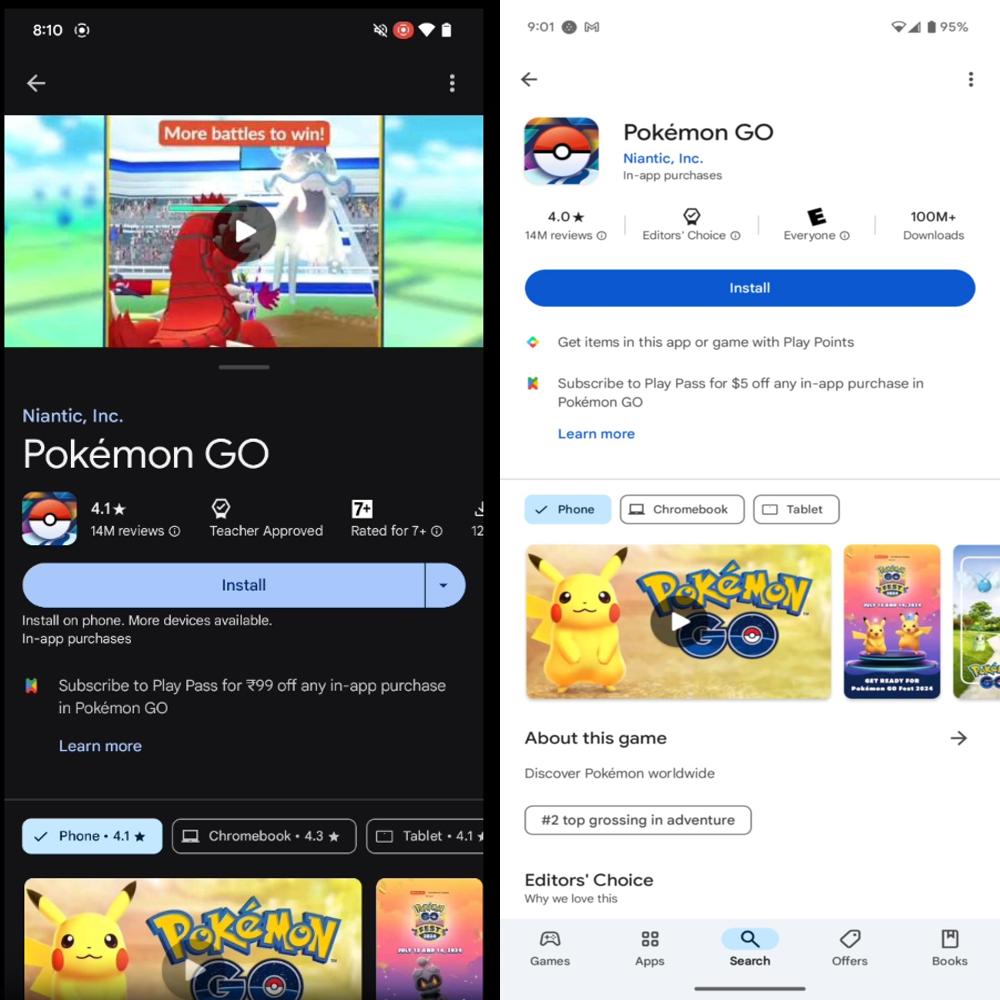
As you can see, the new interface changes aren’t too dramatic. When you open a game, you’ll be presented with the game’s trailer at the very top, with the company name and title directly underneath. Beyond that, the listing isn’t all that different and contains the same sections, such as the description, Events & Offers section, and so on. It is worth noting that the Play Store theme is dark-themed automatically, which we think looks pretty slick.
Here’s a video demo of the upcoming UI:
You can see how the video keeps on playing while you scroll through the listing. The focus appears to be more on the game’s experience (as the developer presents it) than on the text elements of the Play Store listing.
Let’s be honest: this is a small change, but it’s part of the company’s continued effort to simplify the discovery process in the Play Store so you can get in, get out, and start playing. Combined with other efforts like cleaning up descriptions, this will be a positive move toward a cleaner, easier-to-use Google Play experience, once it rolls out to more users.
Got a tip? Talk to us! Email our staff at [email protected]. You can stay anonymous or get credit for the info, it's your choice.


 English (US) ·