Edgar Cervantes / Android Authority
TL;DR
- YouTube Music has released a fresh layout for albums and playlists on its web app, better suited to large screens.
- The service first adopted the new UI on Android tablets, but it’s seemingly still unavailable on iPadOS.
- The update appears to be rolling out gradually, so it may take some time to reflect on your end.
YouTube Music is one of the most popular platforms for streaming your favorite tunes. Bundled with YouTube Premium, the service offers an extensive catalog, including unofficial covers and unreleased tracks you may not find elsewhere. However, its desktop UI was too basic for the longest time, mimicking a mobile design on large screens. Fortunately, the company has finally addressed this by optimizing YouTube Music’s web layout — particularly when viewing albums and playlists.
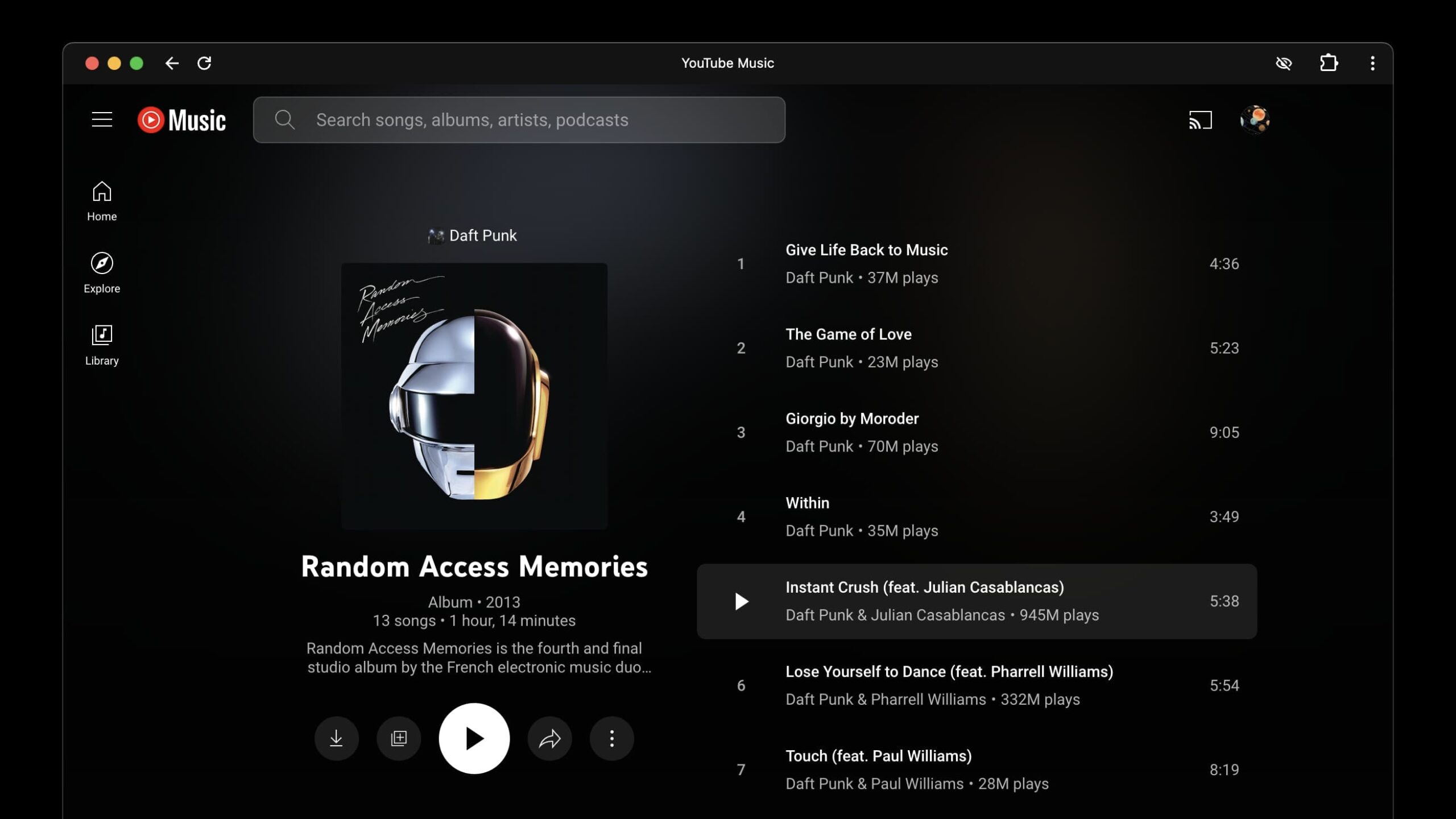
As per a 9to5Google report, YouTube Music is rolling out a redesigned, two-column UI for albums and playlists on the web. The first column highlights the album art, year, and description, in addition to handy buttons like play, download, share, and more. The second column, on the other hand, lists the included tracks, along with their play count, duration, and artist.
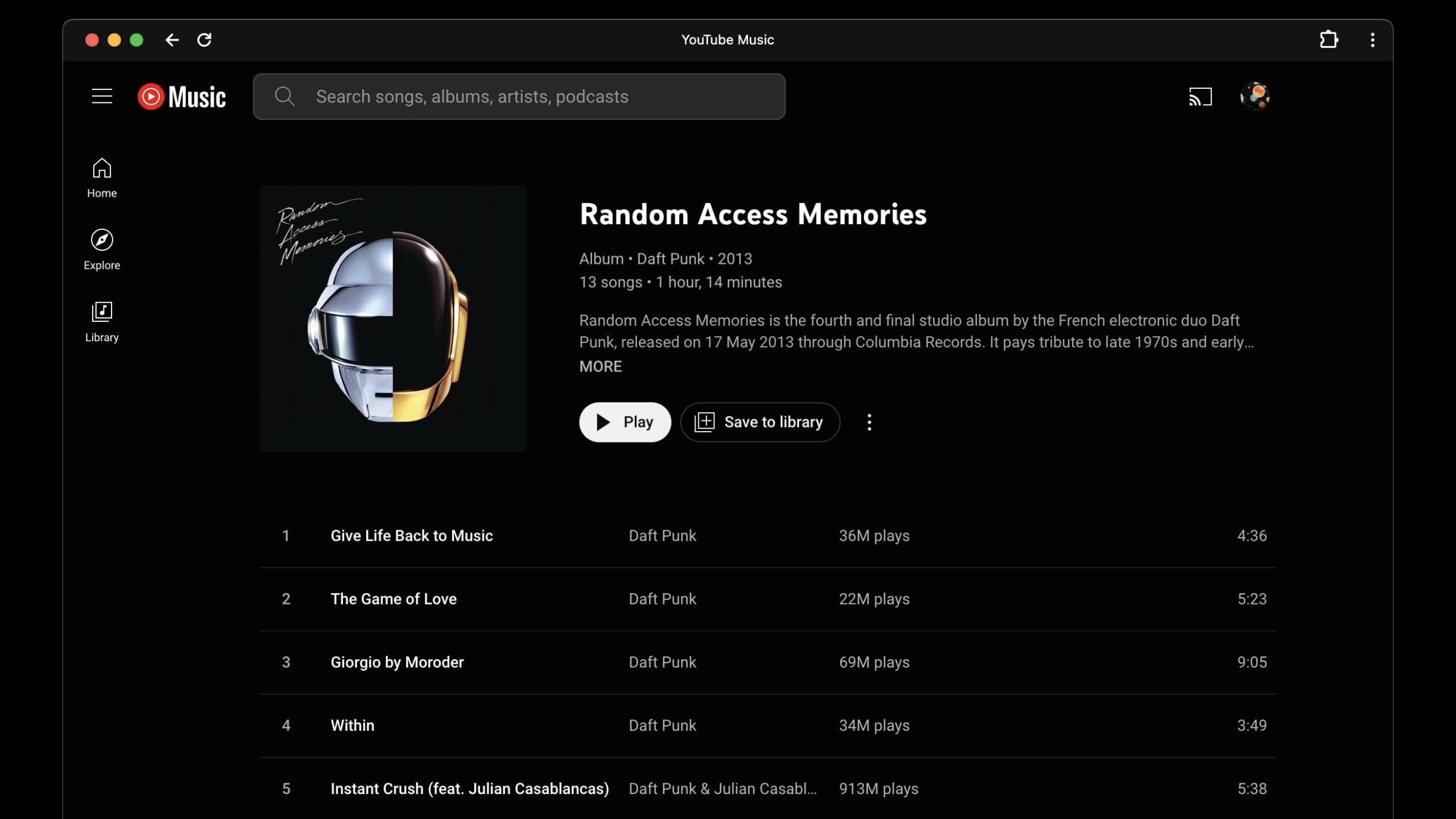
Before this update, YouTube Music on the web would cram the first column’s content at the top of the screen, followed by the second column’s song list. That wasted desktops’ screen real estate, as the margins were too broad and unutilized. The new UI takes better advantage of wider displays by condensing more information in the same view.
YouTube Music first adopted this optimized album and playlist UI on Android tablets (but not iPadOS). While the company has already started rolling it out to desktop users, it’s not yet available to everyone. If it hasn’t appeared on your end, you could try clearing the website’s cache.
Got a tip? Talk to us! Email our staff at [email protected]. You can stay anonymous or get credit for the info, it's your choice.



 English (US) ·