Mahmoud Itani / Android Authority
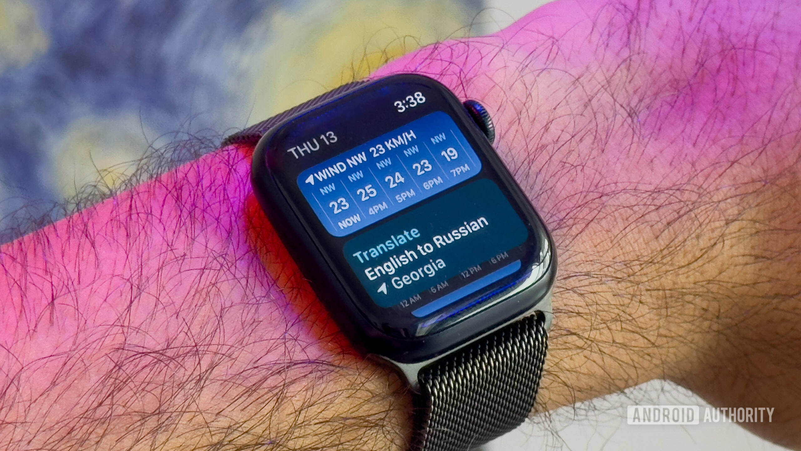
Google’s Wear OS took a gulp of fresh air with the help of Samsung in 2021. The new version launched with an improved UI, smoother performance, reliable features, and the promise of consistent development. We’ve since seen the arrival of Wear OS 4 in 2023, with the next iteration possibly landing later this year. But even though the revamped OS is miles beyond its earlier versions, it’s still not the smartwatch OS of my dreams. It fails to accomplish one important task: display contextually relevant information when it’s most needed.
So, how can Google remedy this? I think Apple may have a solution.
Wear OS and its info dilemma
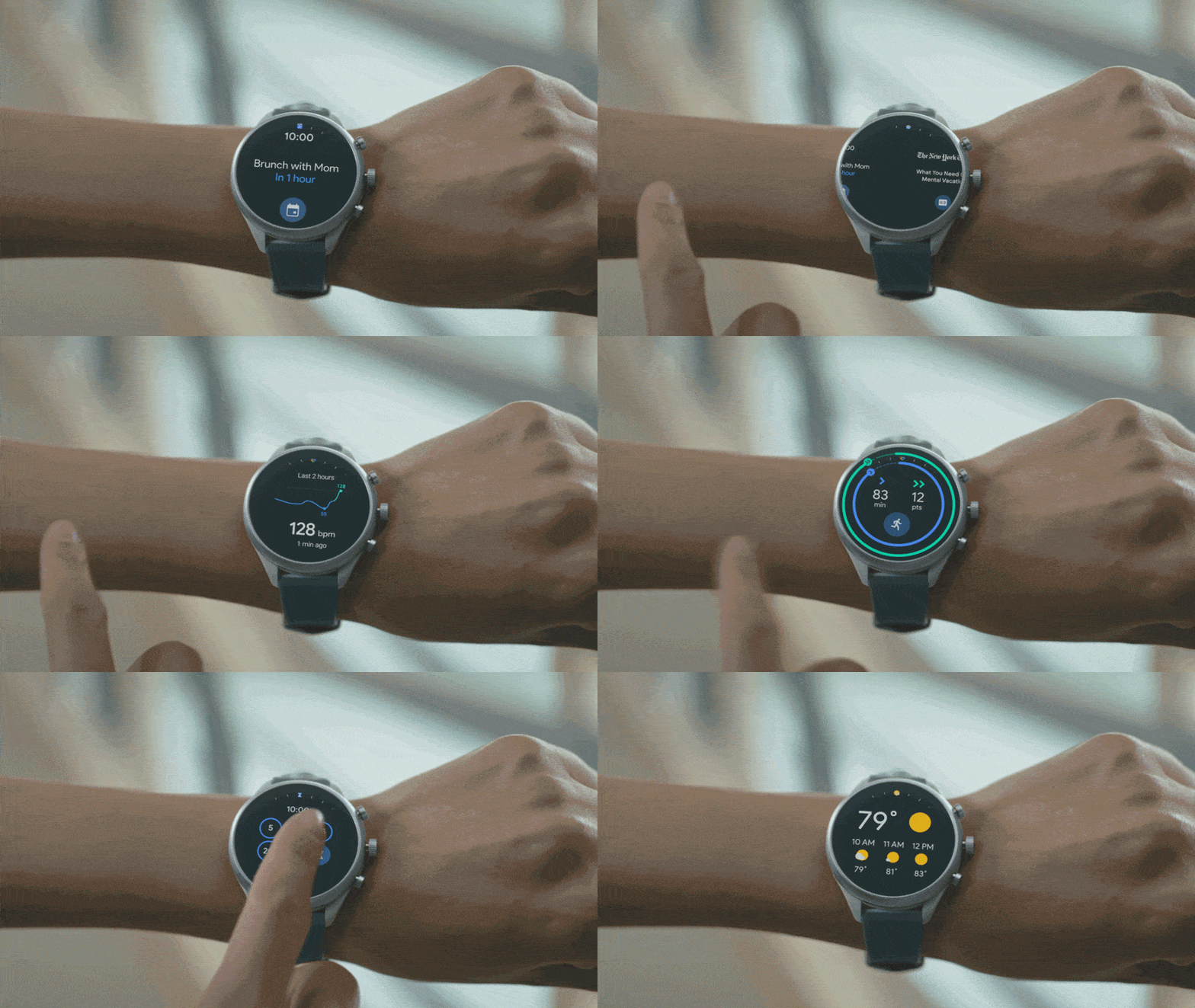
For context, I use a Samsung Galaxy Watch as a daily driver. I’ve been through several Fitbit and Garmin watches, but I’ve always returned to Wear OS for that comfortable fit. It feels familiar, and forms the basis of my digital life when my hands are tied. My phone usually stays nestled in my bag when I’m not at home, and when I do need it, I prefer to continue any task I’ve initiated on my watch. However, this isn’t always possible. Information on Wear OS is always a button press or a swipe too far, or simply isn’t available on the wrist.
Information on Wear OS is always a button press or a swipe too far, or simply isn't available on the wrist.
Google has tried to remedy this with the release of newer complications and the addition of tiles. While I’ve always felt complications are essential for viewing bite-sized information, tiles leave a lot to be desired. The feature allows apps and features to display dedicated screens beyond the home screen, but it’s never been a true solution to my problem. The implementation is clunky, relies on multiple swipes and button presses, and often neglects to update in a timely fashion. As it stands, tiles just aren’t useful.
How watchOS tackles the problem
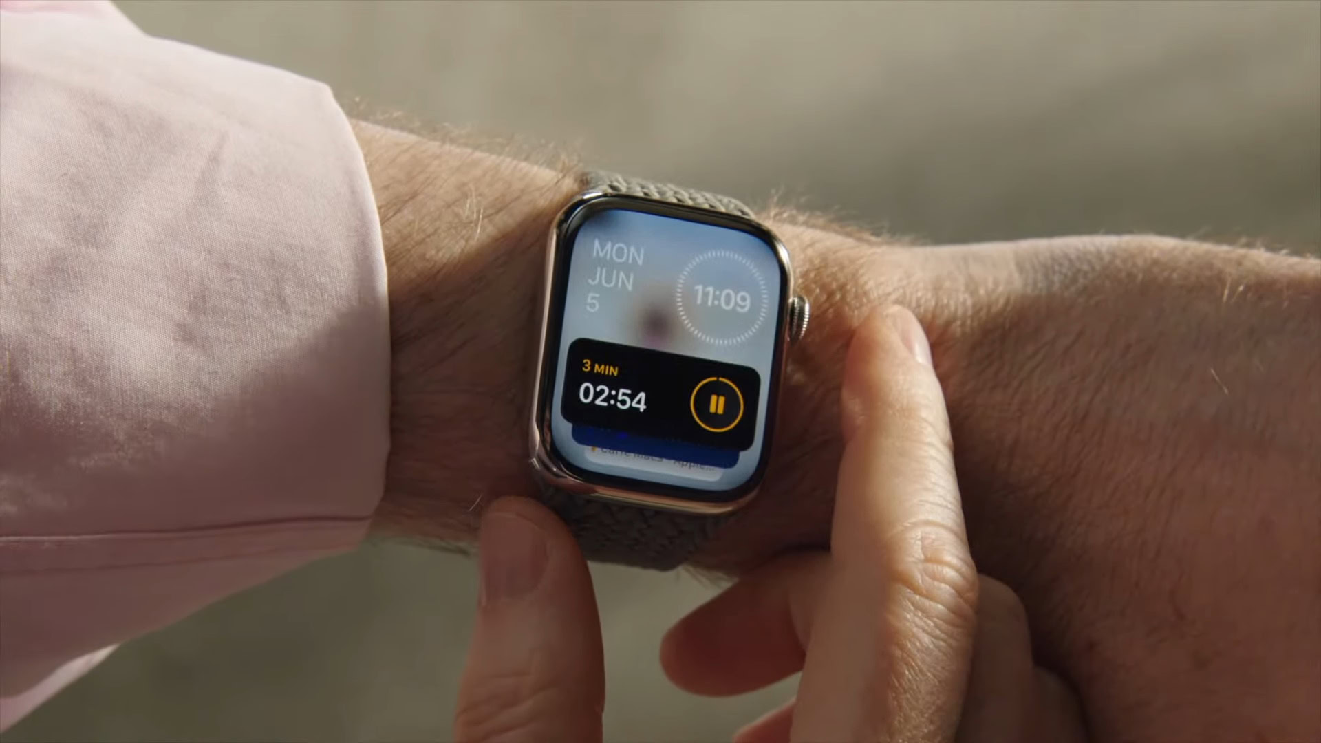
Ironically, the previously widget-shy Apple does a much better job with this on the Apple Watch. With Smart Stack — a home screen widget carousel that displays relevant information from apps running in the background — app information is readily available and easily cycled through using the digital crown. There’s never a need to leave the home screen to access this information. This has other benefits too. There’s no need for complications, so users can run their favorite watch faces unabated.
Ironically, the previously widget-shy Apple does a much better job with on the Apple Watch.
At WWDC 2024, Apple added even more functionality to this system by introducing Live Activity support to watchOS 11, allowing it to display contextually-relevant info cards in the stack when appropriate. These are essentially mirrored toasts taken from the iPhone’s Dynamic Island, but functions as a natural extension of your phone on your wrist. That degree of seamlessness is dearly missing with Wear OS and Android.
Do you want a Smart Stack-like feature on Wear OS?
0 votes
Smart Stack isn’t perfect, but it could be for Wear OS
Rita El Khoury / Android Authority
There’s no denying that Smart Stack has its issues, but this is due to execution rather than concept. I’ve read multiple complaints from users who feel there just aren’t enough useful widgets available. There are others who feel that data-heavy watch faces are all they need. Perhaps I’m in the minority, as I see Smart Stack as a potentially great addition to Wear OS. But now that Apple was the first to launch the feature, a Wear OS equivalent can iron out these problems.
It would put essential information relayed from your phone front and center without user intervention. Do you want to use a complication-free watch face but still demand info snippets? A Smart Stack clone would allow this. As more Wear OS watches are adopting a dial, a swipe-free implementation would also be more than doable.
Despite its numerous improvements over the years, Wear OS still has plenty of room to grow.
Google has done wonders with Android’s notification system, and there’s room to improve it on Wear OS. In an ideal world, contextual clues, be it time of day, location, specific days of the week or month, and even ambient light could all prompt specific widget cards. Google wouldn’t necessarily require Gemini smarts to accomplish this, but it would add some welcome smarts to the experience. Of course, such a feature would live and die by the apps it supports. It’ll still need third-party developers to enrich the widget offering. This is an opportunity, not a potential issue. If the feature adds value, developers will build for it.
Despite its numerous improvements over the years, Wear OS still has plenty of room to grow. Addressing the way it displays information could hugely improve its interoperability with Android and make it a true extension of the smartphone. If Google needs ideas on how to address this, its competitor has a few.


 English (US) ·