When I got my original Pixel Fold, I hit this snag a few times: I’d open an app with my phone unfolded, expecting to get a big display-filling experience, only to see it show up in the middle of the screen with two humongous black bars on either side. I’d start scratching my head, wondering how I can see this app in proper fullscreen, then realize I have to turn my phone sideways (from book-style with a vertical hinge to laptop-style with a horizontal hinge) to get it to fill the whole screen. But now I’m holding the phone awkwardly, and my thumb goes across the crease every time I scroll up or down. Yikes.
The new Pixel 9 Pro Fold fixes that, and the solution is done through simple geometry — rectangular geometry, to be exact. Or aspect ratios if you want the fancy technical term for it.
Pixel 9 Pro Fold vs Pixel Fold: Should you upgrade?
2 votes
Portrait vs landscape, a matter of rectangles
C. Scott Brown / Android Authority
See, the original Google Pixel Fold had an inner display with a resolution of 2,208 x 1,840 when unfolded book-style. That is 2,208 pixels in width and 1,840 in height. The underlying Android operating system considered that display “landscape,” so every app opened in landscape mode. And since some developers haven’t optimized their apps for foldables or for landscape mode, they could only be displayed in portrait. So the Pixel Fold would show them in the middle of the screen and slap back bars on either side.
When you rotate the Pixel Fold 90 degrees and hold it laptop-style, the display is seen as “portrait” and apps will, as they do on any other Android phone, adapt to fill the entire display, regardless of resolution. You can see this effect with the Booking app below.
The Pixel 9 Pro Fold changes that equation. The inner display has a 2,076 x 2,152 resolution, so it is slightly taller than it is wide. That means apps will treat it as a portrait display when unfolded book-style and will fill up the entire screen so you can use them without spinning your phone around. If you want the landscape experience, you can still turn your phone sideways. This is similar to how the Samsung Galaxy Z Fold series behaves, as well as the OnePlus Open, and other big foldables from vivo or HONOR.
Rita El Khoury / Android Authority
The Pixel Fold had it right, but lazy apps made it look wrong
C. Scott Brown / Android Authority
Personally, I’m happy about this change because when I’m using the Pixel 9 Pro Fold, I’ll be able to seamlessly switch between the outer and inner displays without breaking a sweat. Usually, when you’re using a foldable, the two main reasons you’d open it up are to enjoy that app on a bigger screen or run two apps side-by-side. If you unfold and get the same app experience with two black bars, that negates the purpose, and having to rotate the phone every time adds a layer of friction that isn’t enjoyable on a $1,899 phone.
But to be fair, this problem was created by lazy app developers, and I think Google’s original approach was right — on paper. Putting aside the ridiculous aspect ratio of the first Pixel Fold, a more square-ish but still landscape-oriented display should’ve been perfect for foldables. Folded? Portrait. Unfolded? Landscape. Apps stretch out and fill the entire display, using the extra space to display side menus and extra options. That sounds perfect, and most of Google’s apps did that very well. Photos, YouTube, Gmail, Play Store, and more were all working perfectly fine that way.
Few developers bothered to adapt their apps to landscape mode, making Google look like an absolute noob.
However, since not every developer bothered to implement a landscape mode for their apps, this made the experience less than ideal. And it made the Pixel Fold and Google look like absolute noobs to the end user, who didn’t understand why this was happening or why their apps looked like shit.
Google tried to mitigate that by adding an experimental option to force apps to go fullscreen, but that was more like putting lipstick on a pig. So, it caved in and adopted the form factor and aspect ratio that were the least problematic. For most apps, this means you now get the stretched-out portrait look on the entire screen. For developers who went above and beyond, like many Google apps and Instagram, for example, you still get a large screen-optimized interface, regardless of whether you’re in portrait or landscape. That is the correct approach, but we all know that few, very few, apps will bother to implement it.
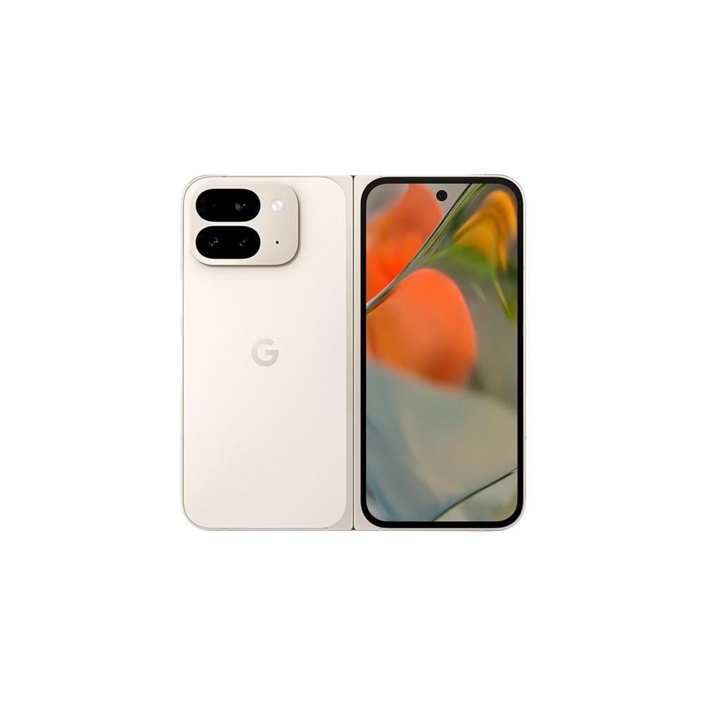
Google Pixel 9 Pro Fold
Improved design • 8-inch folding display • Seven years of software updates
The Fold goes Pro.
The Pixel 9 Pro Fold is Google's most impressive foldable to date, offering a 6.3-inch exterior display, 16GB of RAM, and 256GB of internal storage. When you're ready for more, unfold to access the 8-inch interior display. Solid cameras, a decent battery, and top-notch software support round out this monster of a device.


 English (US) ·