Samsung touts the new Galaxy Watch Ultra as its top-of-the-line device intended for adventurers. This claim accompanies loaded durability specs, unique band styles, and reconfigured device interaction, most notably with the addition of an Action button. Yet, after a week with the new device, I’m not convinced the newest button deserves such a lofty title.
And then, there were three

Kaitlyn Cimino / Android Authority
Samsung’s two-button configuration has been a hallmark of the Galaxy smartwatch lineup for some time. Historically, this has included a top Home or Power button and a bottom Back button. Each has short- and long-press functionality and is semi-customizable. The Back button isn’t as versatile as I’d like, but it’s always been good enough. Beyond these buttons, users turn to their digital or physically rotating bezel for further navigation or use the watch’s touchscreen. Streamlined but effective: two buttons, a bezel, and a display.
The Galaxy Watch Ultra's extra third button promised a lot of extra functionality and only delivered some of it.
That was, at least, until the Ultra model. When images first leaked of the Galaxy Watch Ultra, I was stoked to see a third button introduced. At first, many of us thought we were finally getting a rotating digital crown, but that dream was short-lived; it’s only a button; it doesn’t even rotate.
Still, an “Action” button was an exciting prospect in itself, and I was eager to see similar functionality to Apple’s own Action button on the Ultra. Like many shoppers, I assumed a third button would add convenience and further customization to Samsung’s established setup.
Limited “action” from a color-coded button
Kaitlyn Cimino / Android Authority
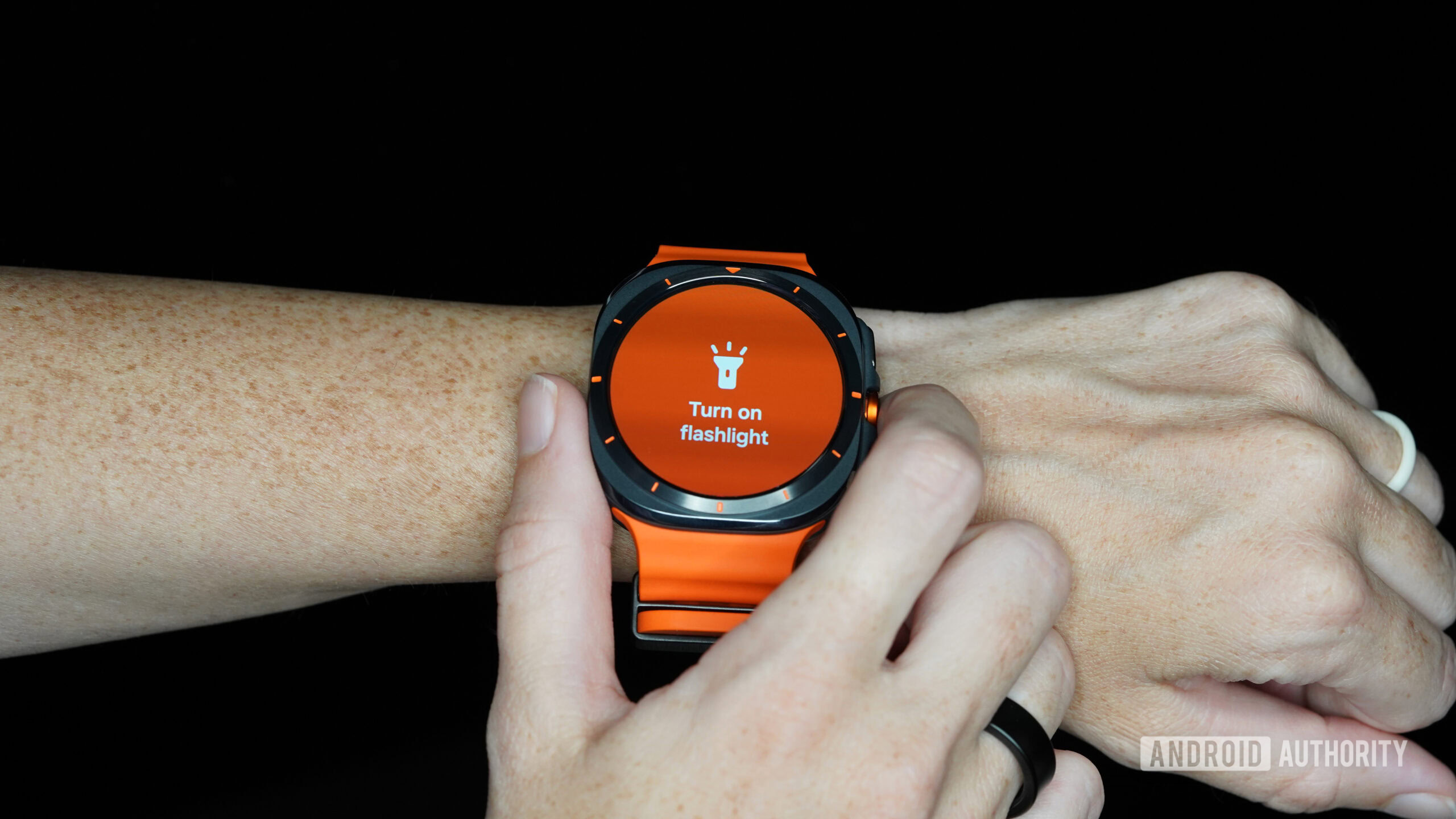
Once I got my hands on the Galaxy Watch Ultra, my hopes were truly dashed. Where I had anticipated versatility, Samsung offers minimal functionality. The new button can only be set to one of four options: start a workout, stopwatch, flashlight, or water lock. Technically, there is some nuance available within “start a workout” (you can choose a specific workout or open your workout menu), but it’s generally a single function. Meanwhile, a 5-second long press of the Action button will set off the device’s 85-decibel siren.
I am not saying everyone will be disappointed with these options. I’m sure there is a fitness tracking junkie who loves quick access to their stopwatch or a beach bum who appreciates quickly water locking before grabbing some waves. However, you don’t call someone a jack of all trades if they can only perform a handful of tasks, and you shouldn’t call a pusher an Action button if it can’t even open my favorite app (spoiler, it’s Spotify). In both Die Hard and The Santa Claus, a man falls off a roof. But anyone who has seen both movies knows that Die Hard is an Action movie set on Christmas, and Santa Claus is a Christmas movie… set on the premise that Santa is replaceable. The point being: a little action doesn’t make you worthy of the moniker.
The orange button does not offer the versatility or customization I was hoping to see.
No matter which colorway you choose, the Action button is also always orange, mocking users with its uselessness. Early in my review period, I thought I would wisely set the button to Flashlight after considering how often I raid my snack cabinet in the dark. By the time I accidentally set the flashlight off for the fourth time, the orange finish became a traffic cone of warning rather than an exciting design cue. I spend more time closing whatever feature I’ve inadvertently opened with the button than actually using it as intended.
Unclear aims

Kaitlyn Cimino / Android Authority
I really want to love the Galaxy Watch Ultra and support Samsung pushing its boundaries, but so far, I’m mostly confused by it. The design is questionable and seemingly without true intention (why didn’t we commit to a square display or a circle case?). The specs are impressive, but not head and shoulders above the base Galaxy Watch 7 to justify the price disparity. And now, though not a deal breaker, the action button has left me wanting. There is a lot of speculation that the Apple Watch Ultra line influenced Samsung’s decision-making, but if that is true, I don’t feel the company understood the true strengths of Cupertino’s ultra-premium watch.
The Action button is one more example of how this watch seems to have missed the mark.
Apple’s Action button is highly customizable thanks to the Shortcut option included in its list of capable tasks. A quick Reddit search will show users who stick to the basics like opening a workout or enabling the flashlight, but you’ll also see more personalized use cases, like remote starting a car or opening a favorite scheduling app. Some users have even programmed the button to open a menu of shortcuts, so even more functions are kept handy.
Meanwhile, the device’s built-in options include Dive, Backtrack, and Waypoint, emphasizing the intended nature of the Apple Watch Ultra as a companion for extreme adventurers. In my opinion, Samsung falls short of establishing its own premium model as an intentionally built wearable for outdoorsy shoppers. I know I am being nitpicky, but when it comes to my first impression of Samsung’s latest venture, the Action button’s shortcomings are just the tip of the iceberg.



 English (US) ·