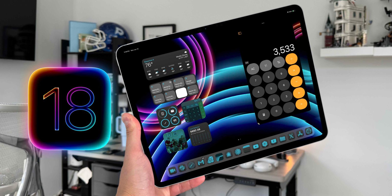
Apple has officially released iPadOS 18 Beta 1 for all developers to try out. I took the plunge and installed it on my main M4 iPad Pro so you wouldn’t have to. Surprisingly, despite plenty of bugs, it isn’t nearly as bad as I anticipated. So here are the best features coming to your iPad and what is still missing.
Be sure to watch our hands-on video with iPadOS 18 to get a true feel of what the new OS is like:
Supported iPads
The first question people had is if their iPad will be compatible with the new iPadOS 18 update. Below are all the iPads that will support it.
- iPad Pro (M4)
- iPad Pro 12.9-inch (3rd generation and later)
- iPad Pro 11-inch (1st generation and later)
- iPad Air (M2)
- iPad Air (3rd generation and later)
- iPad (7th generation and later)
- iPad mini (5th generation and later)
Love it or hate iPadOS, it’s amazing how far back Apple still offers support. Even the 2018 iPad Pro still gets this new update! Name another 6-plus year old device getting brand new OS updates.
New home screen
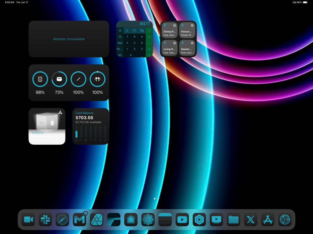
All the updates we got from iOS 18 were trickled down to the iPad. Some of the standout features to know about for the home screen are:
- Ability to place app icons anywhere on the screen
- Ability to enlarge and reduce the size of widgets directly on home screen
- Changing icon theme from light to dark mode
- Changing icon tint color to match the current wallpaper
- Changing app icon size
 Screenshot
I would say that it looks great 80% of the time. The tints and hues start to look off if you have a lot of color in your wallpaper, but if you use more monochromatic colors, then you can get a really nice look. Overall, I like this new personalization look. I wish you could do fully custom icons, but I’m glad Apple was able to give us at least this. Another nice tidbit to consider is that you can resize your widgets directly on the home screen. When you enter wiggle/jiggle mode (comment below what you call it), a little tab appears on the bottom right of the widget. You can pull that tab to change the widget size.
New Control Center
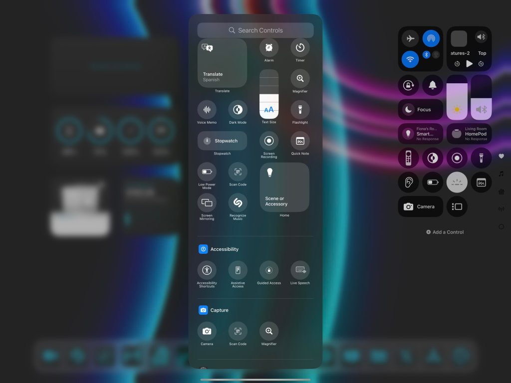
Control center got a huge rehaul both visually and functionally. The first major change is going to be visual. All of the icons look slightly different. They are either full circles when they are in the smallest version, or they are a pill-like shape when they are a larger icon. Apple also added different views for control center. So you can swipe down to add more pages of icons or even see a larger view of apps like Music, Homekit, and even all of your connectivity.
The big functional change is that it is not 100% rearrangeable. We have had the same control center for years now, so being able to move every icon around is a big deal to me. Not only can you move the icons around and order them as you please, but you can also remove them completely and also add new icons from 100s of Apple native controls. Third-party developers will also be able to create control center icons, which will be great!
 Screenshot
Calculator & Math Notes
If only this was available 10-12 years ago when I was still in high school and college. Apple has withheld from making a dedicated calculator app for the iPad because it didn’t want to put any old calculator app on the iPad. They needed to do it the Apple way. They 100% did that.
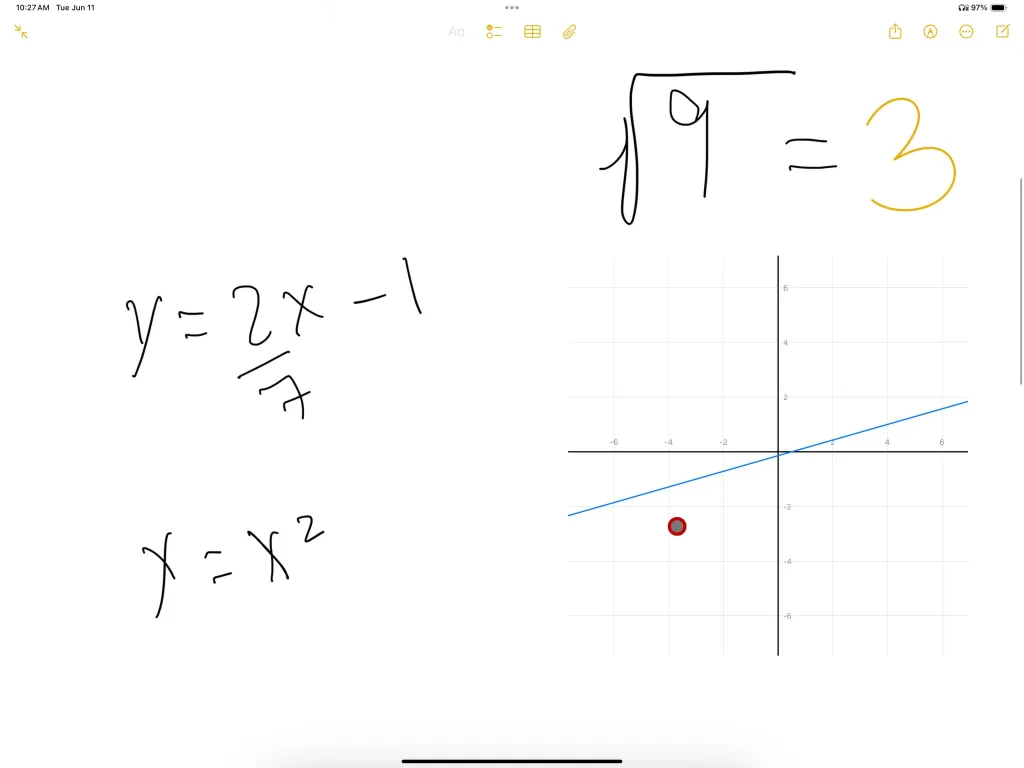
The calculator app itself is very familiar and very basic. It has a basic calculator for simple arithmetic and a scientific calculator for geometry and algebra types of problem-solving. But the game changer here is the new Math Notes. You an enter this mode via the calculator app or directly in the notes app. It takes whatever math equation you write and can instantly solve it. Not only that, but you can modify the equations, and the answer changes in real-time. Another awesome feature is that you can also write down a graph equation and it will graph it for you. The ability here seems pretty limitless. I have seen some physics equations used, geometry solutions, and proofs. I just wish we could get Apple to show us how a problem was solved instead of just giving the answer. Maybe in a future release.
There are so many more new features for iPadOS 18 and we are just scratching the surface. Let me know what you enjoy the most!
What’s missing?
Regarding iPadOS 18 and everything they showed we are still missing a few features. Most, if not all, have to do with Apple Intelligence. As of now, Beta 1 does not have any of the Apple Intelligence-related features. There is no new siri animations, no genmojis, no ChatGPT integration. All that will come later, so make sure you follow along.
But Apple also forgot to address many of the stuff plaguing iPads and iPadOS. People were waiting to see if iPadOS 18 would be the OS that would make them believe the iPad Pro is now a computer. And iPadOS 18 did not do that. I am still an iPad-first user. I am writing this on my iPad, but if someone is on the fence about it, there was nothing about WWDC and iPadOS 18 that would have enticed me to take the leap. Apple did not address:
- New stage manager improvements
- clamshell mode
- better pro apps
- better extended monitor support
- Samsung Dex-like experience when docked to Magic Keyboard
- Better Files App
People, including myself, wanted to see these things. But for now, Apple avoided all of that, making us wait yet another year.
Final thoughts
All in all, this update was a nice step forward. It added some nice new features and better personalization, and I am sure Apple Intelligence will be a net positive for day-to-day use. But there are still things that iPad users want.
What did you think of this update? Which iPad do you currently use? Was iPadOS 18 enough to entice you to get a new iPad? Let’s discuss this in the comments below
FTC: We use income earning auto affiliate links. More.

 6 months ago
142



 English (US) ·