Dhruv Bhutani / Android Authority
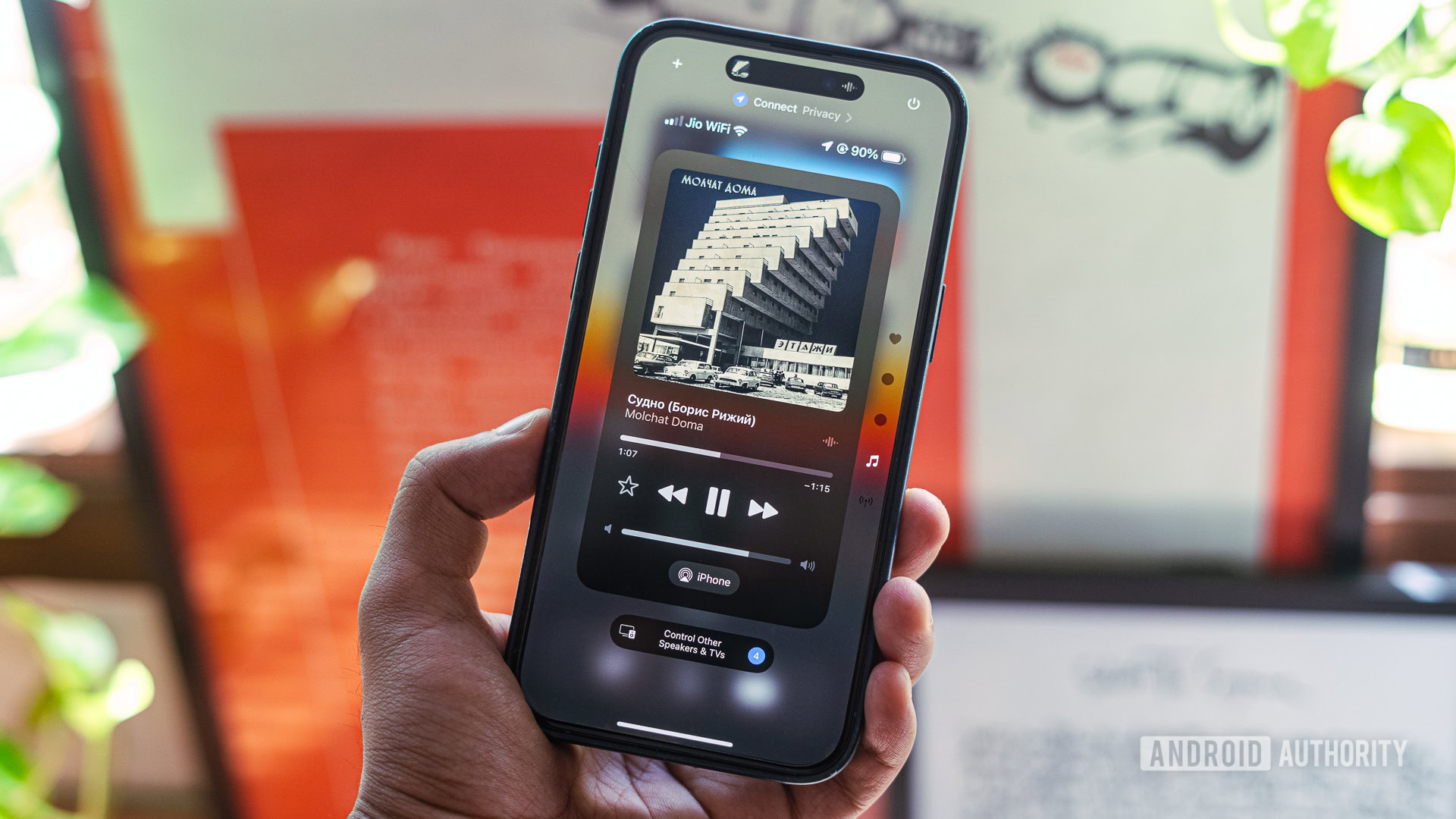
Between Apple Intelligence and sweeping changes to customization, Apple’s 2024 iOS 18 software upgrade for the iPhone is shaping up as one of its largest updates yet. Amid all the changes headed to iOS 18 is a complete overhaul of the Control Centre. A solid departure from the fixed pane approach of prior versions, Apple takes a customization-friendly, multi-pane approach with a twist. It’s astonishingly un-Apple-like in its customization potential while maintaining the very Apple-like focus on shiny aesthetics.
Now, Apple won’t release the update until later in the year, but as a tech enthusiast, installing the developer beta on my iPhone 15 Pro Max was the obvious thing to do. I’ve spent the last day exploring everything new with the upgraded Control Center, and I like what I see. So, without further ado, let’s dive right in.
Control Center on iOS 18 is astonishingly un-Apple-like in its customization potential.
Familiar but fresh
Dhruv Bhutani / Android Authority
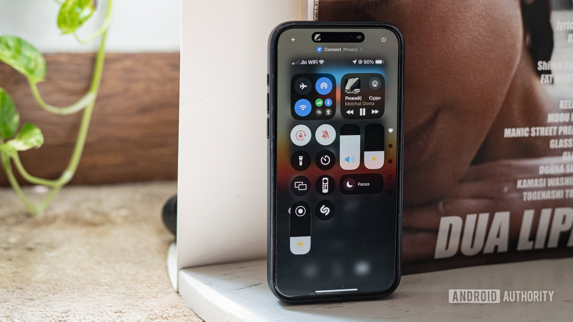
Basic interactions with the Control Center are exactly what we’ve come to expect. Just like on Android or previous versions of iOS, pulling down from the top right corner presents an overlay with quick controls for brightness, volume, essential network controls, and a music widget. I’m sure iPhone 15 Pro Max users like me would’ve appreciated the ability to pull down the control center from anywhere on the home screen, but improving ease of reach isn’t on Apple’s mind.
A 4x8 grid of quick access toggles and widgets offers loads of room to personalize.
Over to the interface, then. In previous versions, a single pane of widgets and toggles was essentially the entire interface. That’s been completely overhauled. In iOS 18, the entire Control Panel interface has been rethought as a 4 x 8 grid of icons that can span multiple pages. The Control Centre also takes a leaf out of overall customization on iOS, and every single toggle and icon can be resized, repositioned, or removed to let you create a personalized interface. It’s very nifty, and the user experience is very friendly, thanks to the smooth animations and seamless resizing of the grid.
Dhruv Bhutani / Android Authority
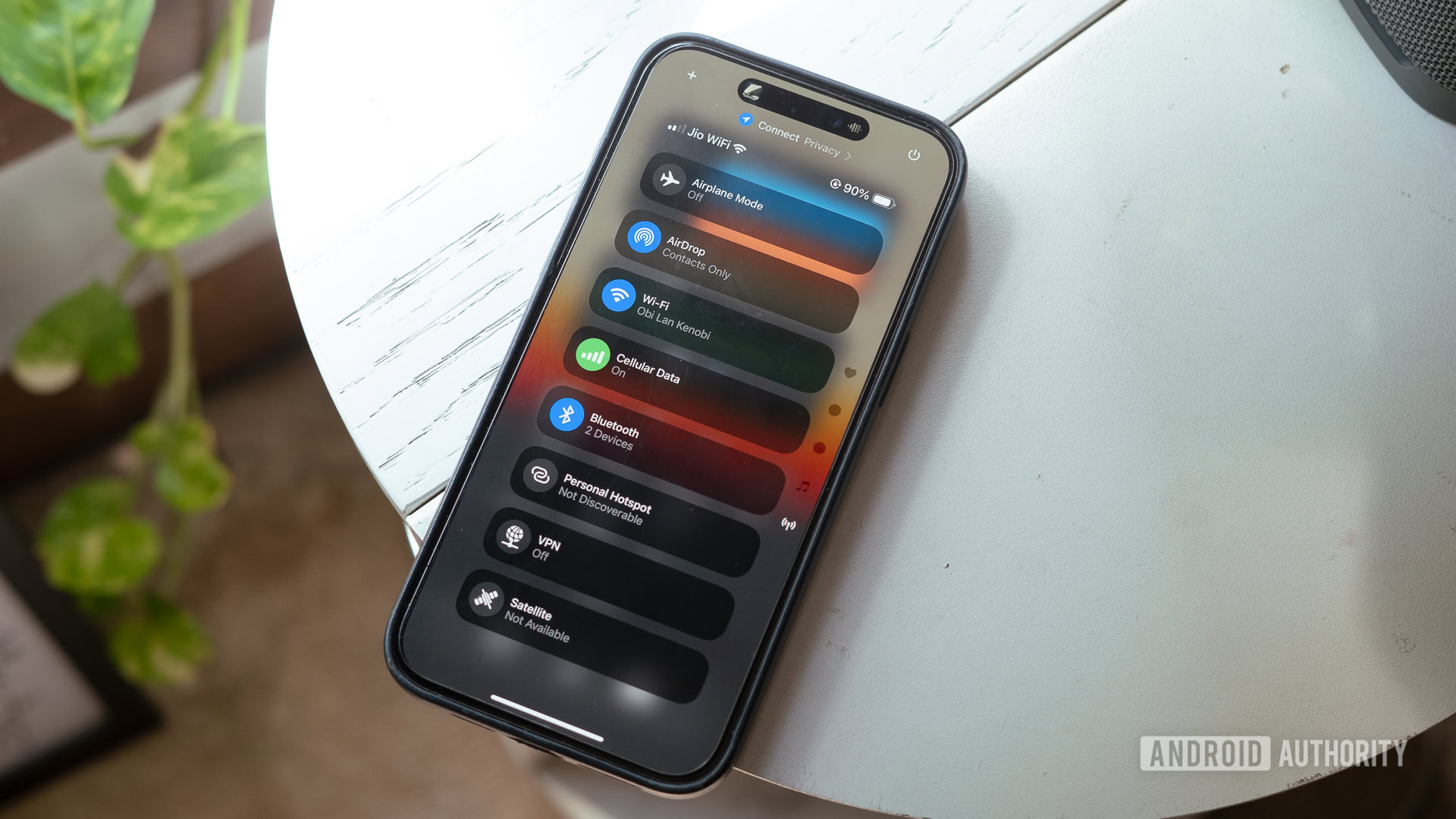
The other big change is that the Control Panel is no longer restricted to a single pane. Quick access toggles can straddle multiple panels. These panels are accessed by sliding your thumb up and down along the right-hand side of the screen. There are no restrictions on the number of toggles and widgets you can add here. In fact, you can add multiples of each kind, which can get chaotic rather quickly.
This being a beta, there are some bugs with elements overlaying where they shouldn’t, but nothing that breaks the experience. That said, I wouldn’t mind some guardrails being added before the final release to prevent less technically minded users from messing up the control center.
Third-party toggles in the control center have the potential to be incredibly useful.
Adding toggles to the control center is as simple as tapping the plus button in the corner. Most of Apple’s first-party apps offer useful additions, many of which can be resized to show more information or functionality. It’s not unlike Android’s Quick Settings control panel, which offers similar, though not as granular, functionality. Apple will also allow third-party devs to build their own options. Obviously, that’s not available just yet. Examples include a toggle to turn on your car’s climate control, which we’ll have to watch out for later this year. Apple has also added a button to access power settings directly, taking out a lot of the guesswork involved in figuring out button combinations to switch off your phone. Praise be.
Dhruv Bhutani / Android Authority
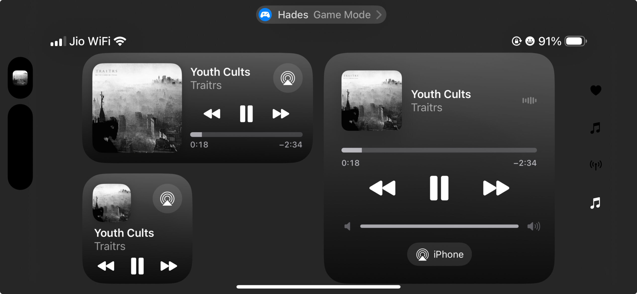
The other major change is more cosmetic but very useful nonetheless. Alongside the primary control panel pane, Apple has added two additional panels for a dedicated music widget and another for essential network controls. You might wonder why you need dedicated panels for the two, as they’re already present as widgets on the primary control pane. That’s easy. Apple now lets you get rid of all toggles in the control center, including ones that manage Wi-Fi, Bluetooth, or Airplane mode. Should you opt for a clean panel bereft of any toggles, or lacking music and network controls, the dedicated panes offer a quick and easy way to control playback or enable and disable essential settings.
How does Control Center on iOS 18 compare to Android’s Quick Settings toggles?
The notification shade experience on Android varies quite a bit depending on manufacturer skins, but it’s clear that iOS takes a fair amount of inspiration from Android more broadly.
Multi-pane controls have been around for a while on Android, except these tend to swipe horizontally. The vertical scrolling implementation in iOS 18 gives the toggles more breathing room, with customizable toggle sizes and locations allowing you to access what you need quickly. This has the added benefit of making one-handed navigation relatively easier.
Additionally, basic controls like the music player and screen brightness toggle are usually locked in place on Android devices. iOS 18 changes that by giving users the option to move the controls to their preferred location or remove them altogether. This frees up the whole panel for customization, which is far more flexible than Android’s minor reshuffling of toggle positions. Adding the music and network controls pane on iOS 18 is largely a by-product of the ability to remove those controls altogether from the control center, so I wouldn’t count the lack of those on Android as a miss.
When can I test out the new Control Center on my iPhone?
Mahmoud Itani / Android Authority
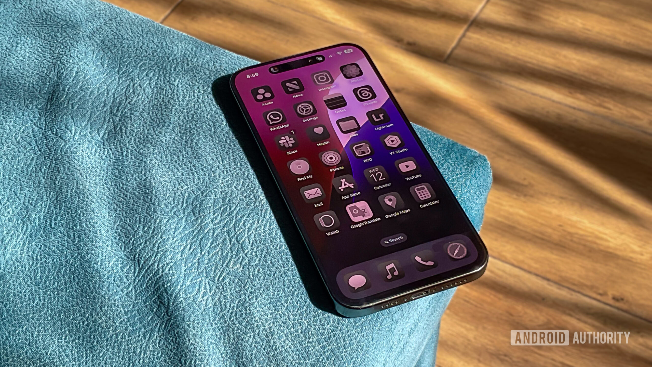
Apple’s typical timeline for a new software release tends to line up with the release of new iPhones. You can expect the full iOS 18 release to roll out sometime around September. A public beta rollout will begin sometime next month. For now, we’d recommend staying away from installing the developer beta on your primary phone. As is the case with beta software, I’ve encountered several bugs, and issues like overheating are common. These should be largely resolved by the time the public beta rolls out.
Control Center on iOS: More than an Android copy
It’s easy to see that iOS 18 takes inspiration from some of the flexibility Android offers but makes it its own through a refreshing, renewed focus on customization. That it manages to do so while maintaining a squeaky-clean aesthetic is a solid achievement.
iOS 18 customization is clearly inspired by Android, but makes it its own with vertical navigation and enhanced widgets.
Some of the additions, like the music player widget, might come across as redundant since you’ll likely want music controls right at the get-go. However, allowing users to switch things up is the right way to go. Elsewhere, I really hope to see the easy resizing of toggles copied over by Android. It’s a no-brainer.


 English (US) ·