
Rita El Khoury / Android Authority
“Never” is a strong word, but so are my feelings about this potential Android 16 change. This week, my colleague Mishaal Rahman revealed that Google is working on an interesting (read: horrible) redesign of Android’s notifications and Quick Settings drop-down menu. The change would separate these into two menus: notifications that are still accessible with a one-finger swipe-down and Quick Settings, which require a two-finger swipe gesture.
My initial gut reaction to this change was a loud “NOOOOOOOO” that resonated across the internal Android Authority Slack channels. That was followed by a few GIFs of table flipping and exploding head emojis and my colleagues’ pile-ups ranging from, “This is the worst day in the history of Android. I can’t believe this,” to some colorful expletives that my boss would fire me if I repeated here. Suffice it to say, we are not fans of this.
There are two distinct reasons why we do not like this change — or the idea of it since it hasn’t been implemented yet.
It’s a matter of principle and muscle memory
Edgar Cervantes / Android Authority
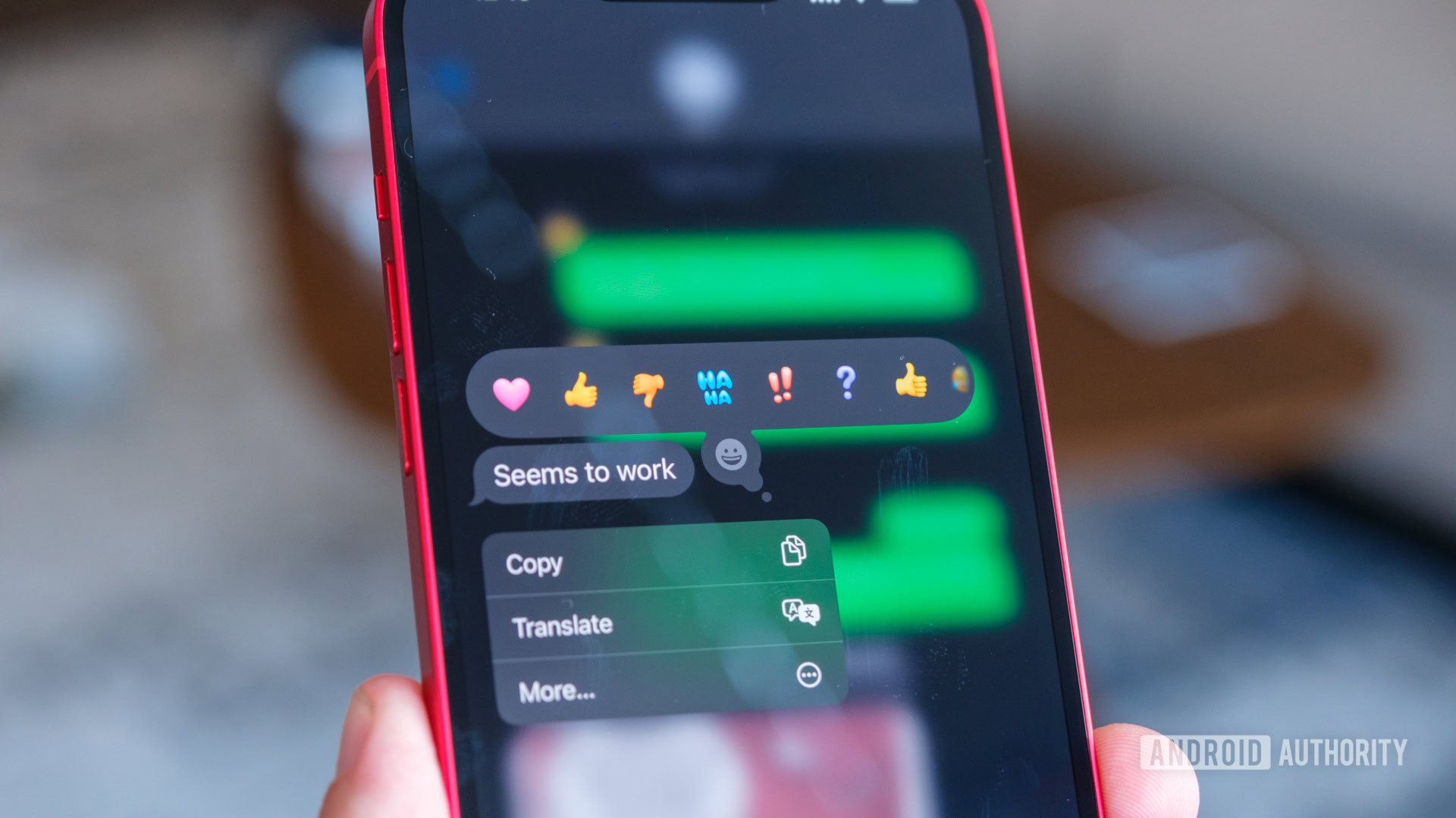
Stock Android has, for years now, put Quick Settings tiles and notifications in the same drop-down menu. You need to know one gesture to control most of your phone’s toggles or check the alerts coming from your apps. Unlike iOS where a swipe on the right side brings up the control center while a swipe on the left side shows your notifications, Android doesn’t require you to be precise in picking a side. Or to think about what you need before swiping.
It’s an easy gesture; it has worked for over a decade since Jellybean 4.1 in 2021; and everyone has learned it through sheer muscle memory. Well, almost everyone. Xiaomi and HONOR have already split up the notifications and toggles in their Android skins, and rumor has it that Samsung and OPPO will be splitting the notification shade in their upcoming software versions, too.

C. Scott Brown / Android Authority
The iOS-ification of Android irks me, especially when it happens gratuitously with a feature that has worked well enough for years. I’ve taught the single swipe to my parents, and now I’m supposed to tell them that they need to swipe differently to access notifications or Quick Settings?
But worse yet, it’s the fact that Google just can’t stop messing with the notification shade. Someone should launch a challenge to Google’s product managers and designers to leave that area alone for two consecutive versions of Android. But no, we had to go through the toggles that can be long-pressed to go to their respective settings menu, then the long-press was disabled, then it was reenabled but only to trigger a small pop-up for some toggles, then the toggles were made wider, then there were fewer of them, and so on. Just leave this alone for once, please, Google?
It’s a matter of single-handed use or not

The current implementation that Mishaal was able to trigger requires you to swipe down with two fingers to get to Quick Settings. (This is currently possible on Android, by the way, but we have the joint notification shade and toggles to avoid it.) The change would restrict the Quick Settings access to dual-handed operation since you won’t get them with the single swipe notification drop-down. It’s physically impossible to do a double-finger swipe-down with the same hand you’re holding today’s behemoth Android smartphones with — unless you have contortionist fingers.
Even while holding my phone with one hand and using the other to trigger the double-finger swipe-down now, I find that my palm cramps up due to some minor Carpal Tunnel weakness. So this would put this gesture firmly in the non-accessible category for many people with less finger dexterity.
Plus, even when I do my best to do a double-finger swipe-down, it’s almost a coin toss as to whether it’ll work or not. That’s likely because I have a case on and dragging from the very top of the status bar with two fingers is just impractical.
I don’t see how this two-finger swipe could ever come to a stable version of Android in its current implementation. Even if Google decides to move forward with the change, it would be absolutely mad to hide away the toggles behind a very inaccessible and clunky gesture. It will, most likely, end up adopting Apple’s approach of two swipe-down areas: left for notifications and right for Quick Settings.
Let me play devil’s advocate for a second, though
Hear me out, for a second, though. This change isn’t all that bad, in theory.
After calming down, putting my pitchforks away, and straightening the tables I had flipped when I first saw this, I watched the full video to see how it’s supposed to look and took a few minutes to reflect on it.
For one, I do like the new smaller Quick Settings toggles. The current ones are just way too big for no good reason. Having four main toggles on top and many more smaller ones below is perfect, so I wouldn’t have to swipe sideways across many screens to find all the functions I enable and disable on an almost daily basis. This is something ASUS has offered on ZenUI as an option for a couple of years, and I’ve always thought it was great to have that choice.
Robert Triggs / Android Authority
Two, I can see some benefits to having separate notifications and Quick Settings areas. The two features, to be fair, are not related functions from a User Experience (UX) point of view. It’s just that Android shows them both in the status bar, and dropping that down reveals all the notification details and all the fast toggles. So, from a purely logical UX perspective, it’s not that silly to keep them separate. Plus, going back to my parents’ argument, while it is true that they’ve learned a single gesture and it’ll be hard to teach them new ones, it’s also true that they sometimes end up accidentally turning off Wi-Fi or data or something crucial on their phone when they were just attempting to see their notifications. Maybe separating the two would cause fewer accidents and irked calls to help, “Rita, my phone is all black now!” “Why yes, Dad, it’s called dark mode; let me tell you how to turn it off.”
Anyway, my point is that there’s a bit of reason behind the madness, but I just hate that I’d have to erase 12 years of muscle memory and start anew if this change ends up being implemented in Android 16.
Oh and, if it’s still a dual-finger Quick Settings drop-down gesture in its final form, then I’m sticking to my guns and not updating to Android 16. I’m at an age where technology newness is not worth cramping up my hand several times a day. You can take Android 15 out of my dead cold hands, Google, but at least they won’t be contorted trying to turn on the flashlight.

 English (US) ·