Andy Walker / Android Authority
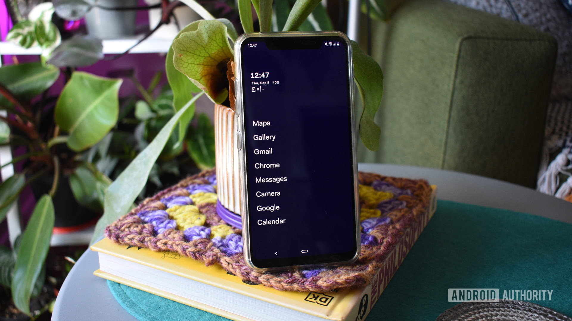
The app launcher is the very heart of the Android phone. You use it daily, often without notice, to launch apps, view widget information, check the time, and enjoy your wallpapers. While many OEM Android launchers are excellent, there are some seriously left-field options if you want to try them. I’m not just taking Nova Launcher alternatives, either. Below, I round up some unique Android launchers well worth a go.
Pie Launcher
Andy Walker / Android Authority
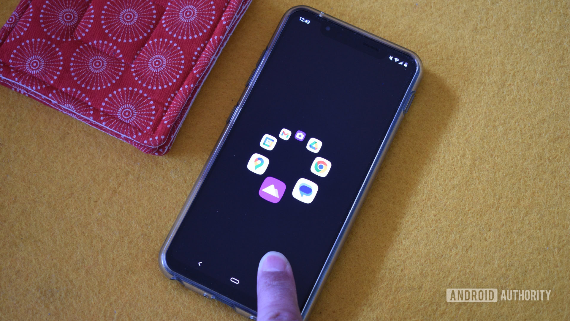
Pie Launcher combines an option wheel with quick gestures to launch apps in one smooth motion. By default, it displays a completely icon-free screen, but the circular pie menu pops up when you touch any part of the display. To launch an app, hover over or pull in the direction of its icon and lift your finger.
The launcher fits only a handful of apps, but this little detail and unique icon layout make it effortless to use one-handedly. You can also tap the home button to find a more traditional app launcher grid layout. I haven’t encountered any other Android launcher that utilizes this wheel (sorry, pie) mechanic, and it works well to narrow distractions and focus on intentional app launches.
Discreet Launcher
Andy Walker / Android Authority
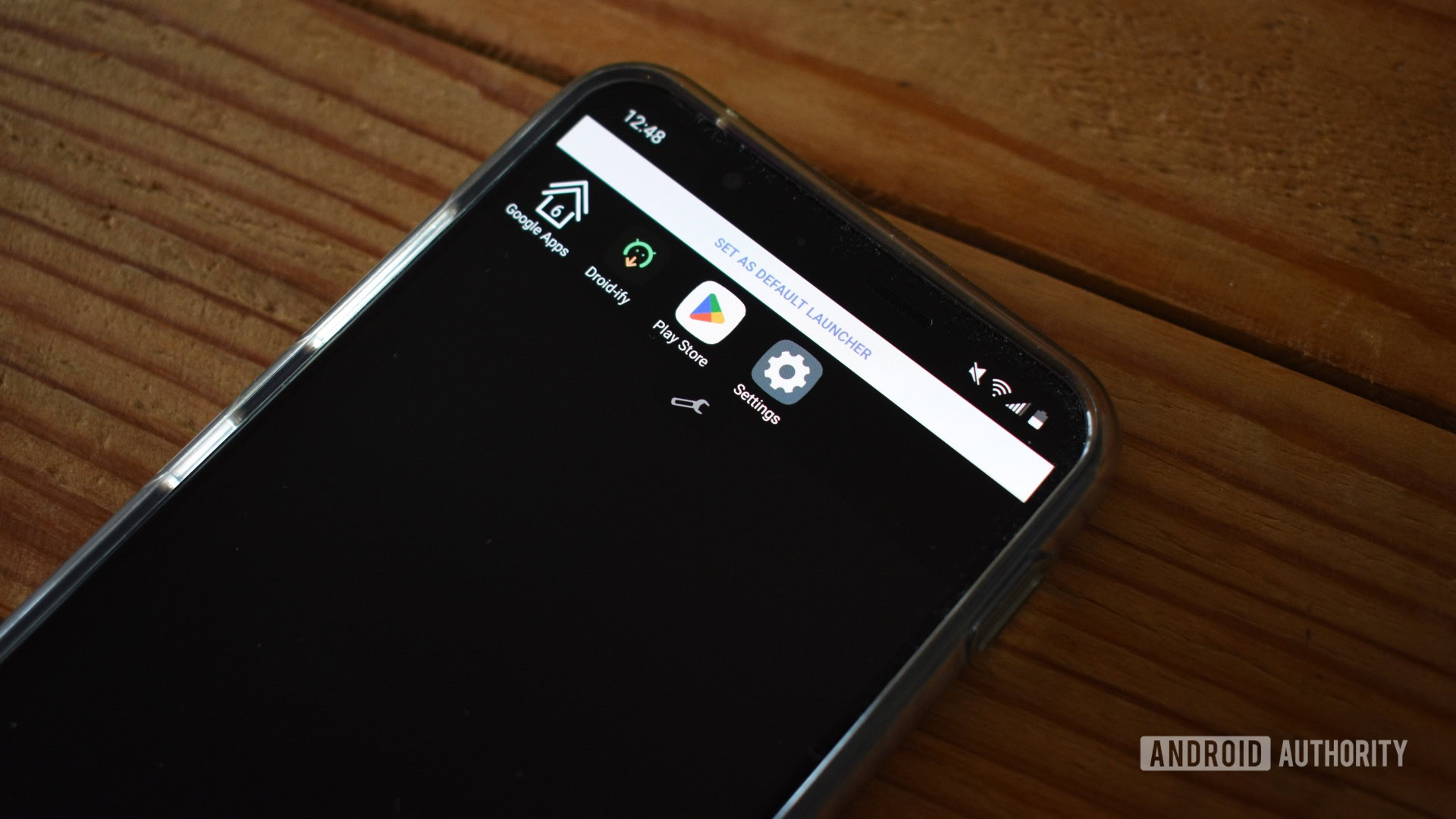
Discreet Launcher is another minimal launcher. True to its name, it provides an icon-free home screen that gives way to a traditional grid app drawer when you swipe up. But swipe down, and a customizable favorites menu shade appears from the top of the display. This is a great little design addition, even if it’s utilitarian in design. You can pin individual apps or folders of apps for better organization and customize several facets of its operation.
Yantra Launcher
Andy Walker / Android Authority
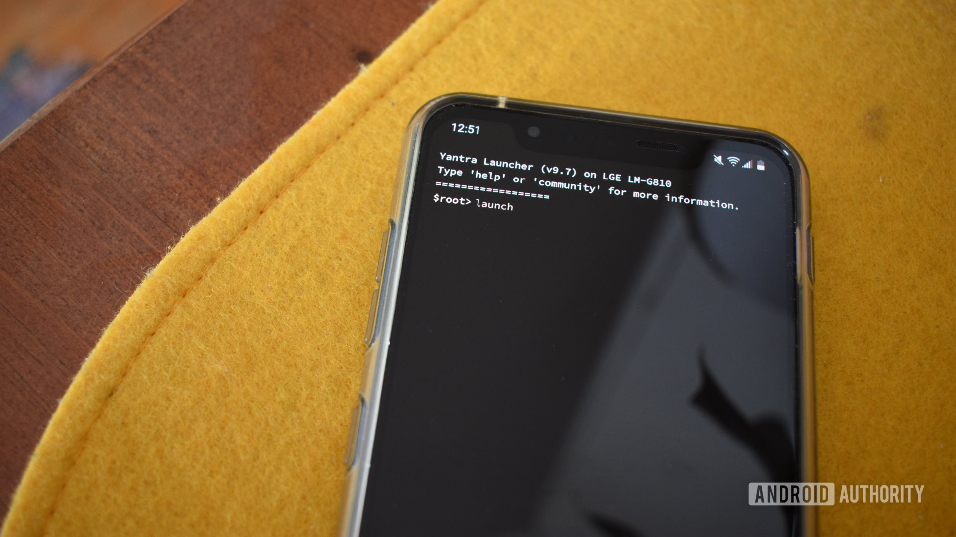
A surprising number of command-line Android launchers are available, but Yantra is the best example. Visually, you get what you’d expect — an all-black screen with contrasting script, a list of your previous commands like an actual terminal window, and other fun info, including the launcher’s version and your phone’s model number.
To launch an app, type in “launch” followed by the app’s name or tap the Launch option along the bottom control bar. This bottom bar will also populate as you type with apps that match the string. It takes a little getting used to, but it’s remarkably fluid once you get used to the workflow.
Some actions were buggy when I tested them; they never affected the core functionality. Using Yantra was hugely entertaining, like few Android launchers these days.
ReZ Launcher
Andy Walker / Android Authority
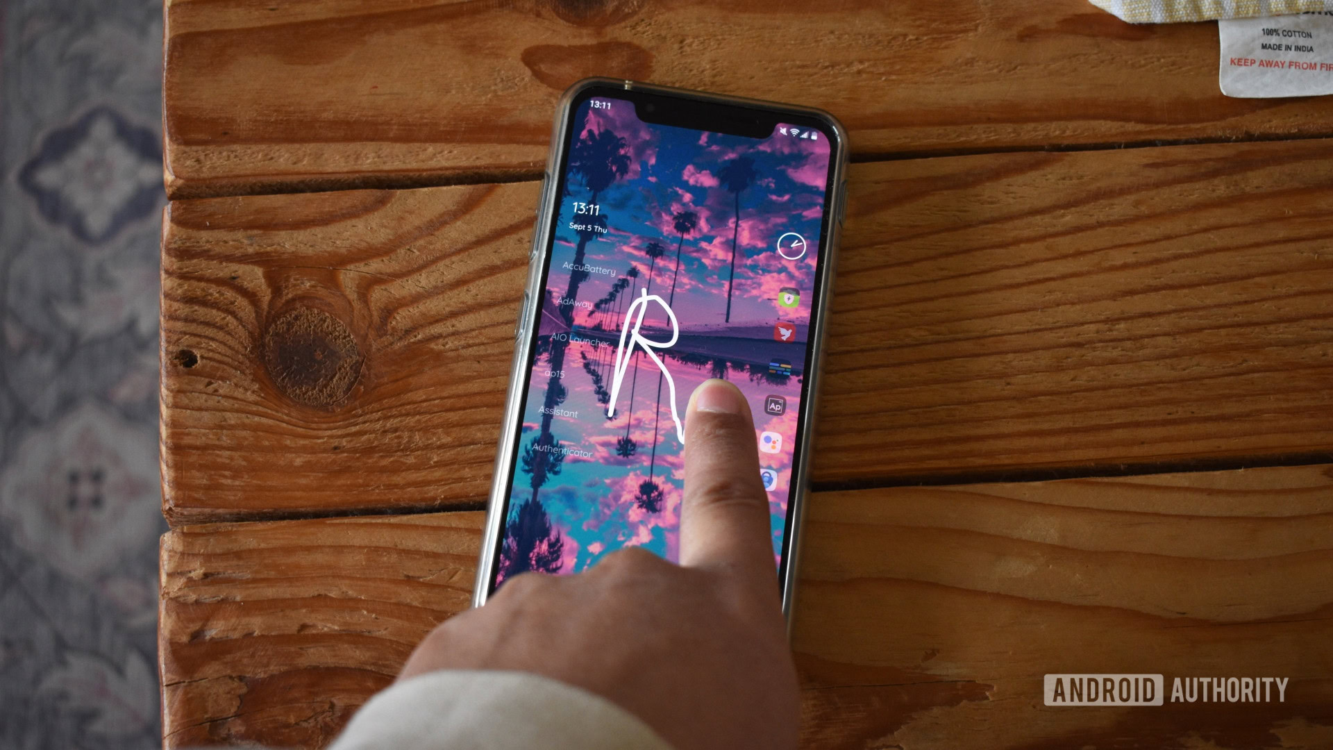
On the surface, ReZ Launcher seems to be another simplified launcher displaying minimal apps alphabetically with a dock running along the bottom of the screen. But scribble a letter with your finger, and you’ll discover its hidden search smarts. For example, scribble the letter “s” to avail a list of apps starting with or containing that letter. You can scribble sequential letters to narrow down the search, too.
It’s a strange experience, as searching for apps this way takes a little more time than using a search bar and the keyboard. However, I intended this list to document unique Android launchers, and ReZ certainly fits the bill.
Before Launcher
Andy Walker / Android Authority
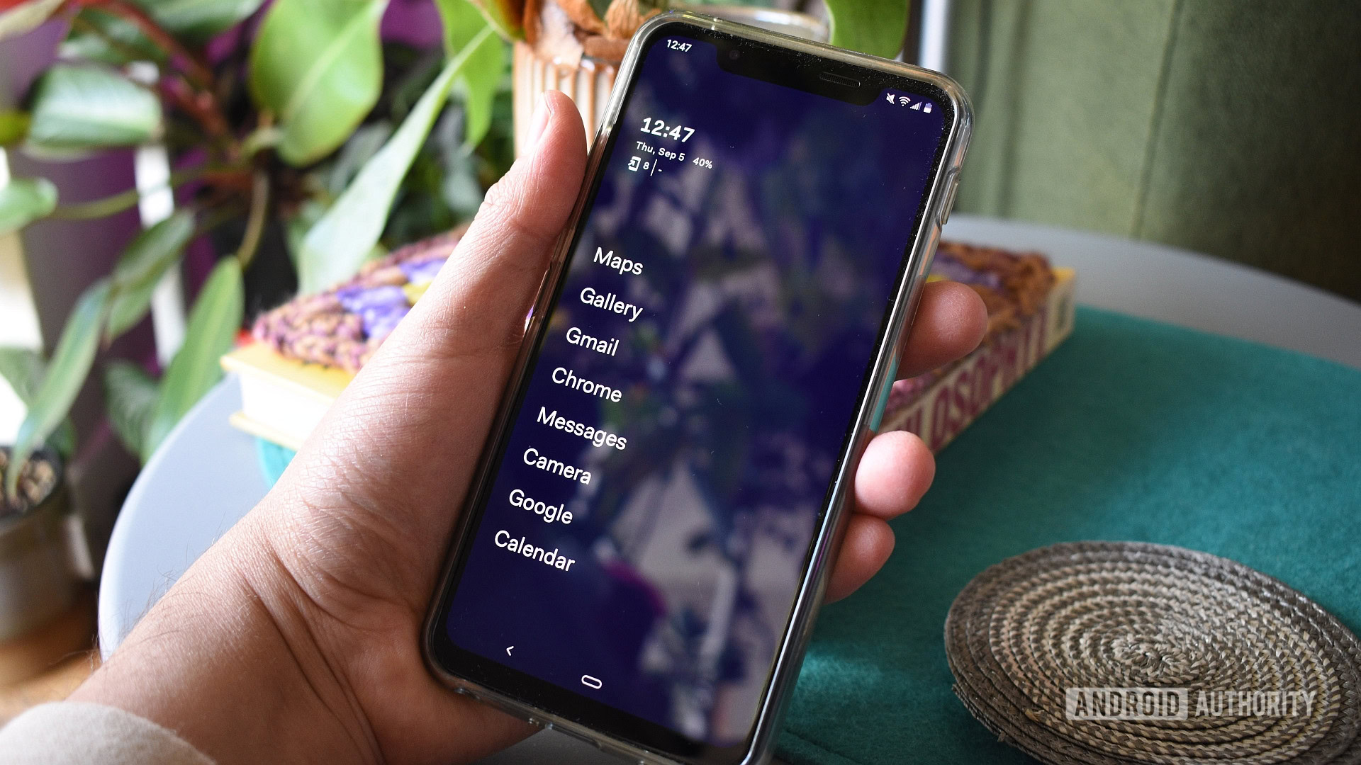
Before Launcher is among my favorite launchers on this list. As one of the many productivity-focused launchers available, its goal is to clear clutter and reduce immediate visual distractions.
The default home screen contains a list of eight icon-less apps presented in large, bold font. You can also enable clock, date, and unlock counter widgets above this list. Swipe to the right, and you’ll find a notifications manager. This is Before’s party piece, as it suppresses notifications and keeps a running list of those you’ve received. Finally, swipe left to open a traditional list of searchable apps.
I’m on the fence about minimalist launchers providing more focus for wayward smartphone users, but I do like Before’s clean, uncluttered stylings.
Win-X Launcher
Andy Walker / Android Authority
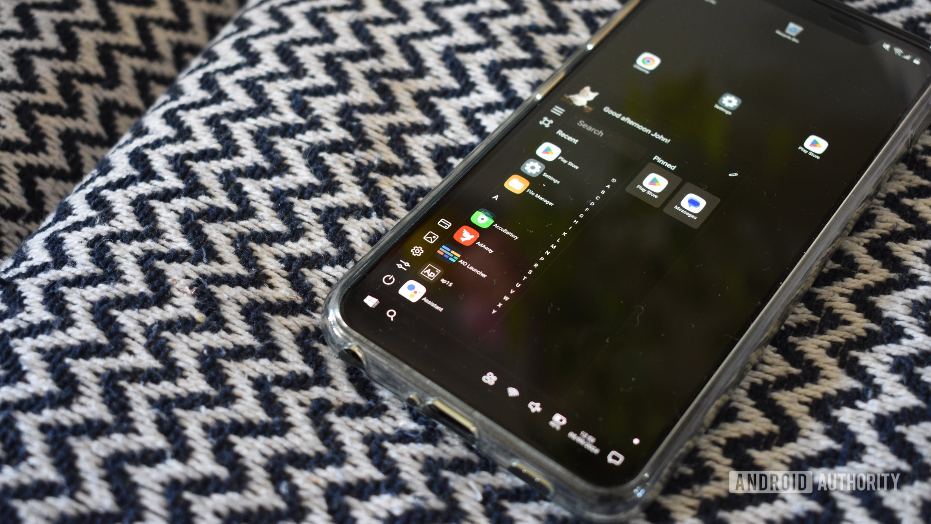
Have you ever wanted to run Windows on your Android phone? Win-X gives you a decent idea of what it could be like. I greatly enjoyed using this launcher, especially because it provided a view into a quirky timeline where Windows Mobile still existed.
So, how far do the Windows-inspired elements go? You can pin shortcuts to your “desktop” or tap the start button to launch the start menu/app launcher, which is surprisingly functional. It offers a space for pinned apps, an alphabetical list of apps, and an option to search said list. You can even access a “This PC” dialog, which lists the storage options with traditional Microsoft nomenclature and built-in image and audio players. There’s also a Microsoft folder from which you can install Word, Excel, and other Office apps.
Importantly, Win-X isn’t a launcher made by Microsoft (you’ll need Microsoft Launcher instead). I also don’t think its design is conducive to productivity, but it’s certainly a fun Android launcher to use on foldables, Android tablets, and for Windows enthusiasts.
Minimalist Productivity Launcher
Andy Walker / Android Authority
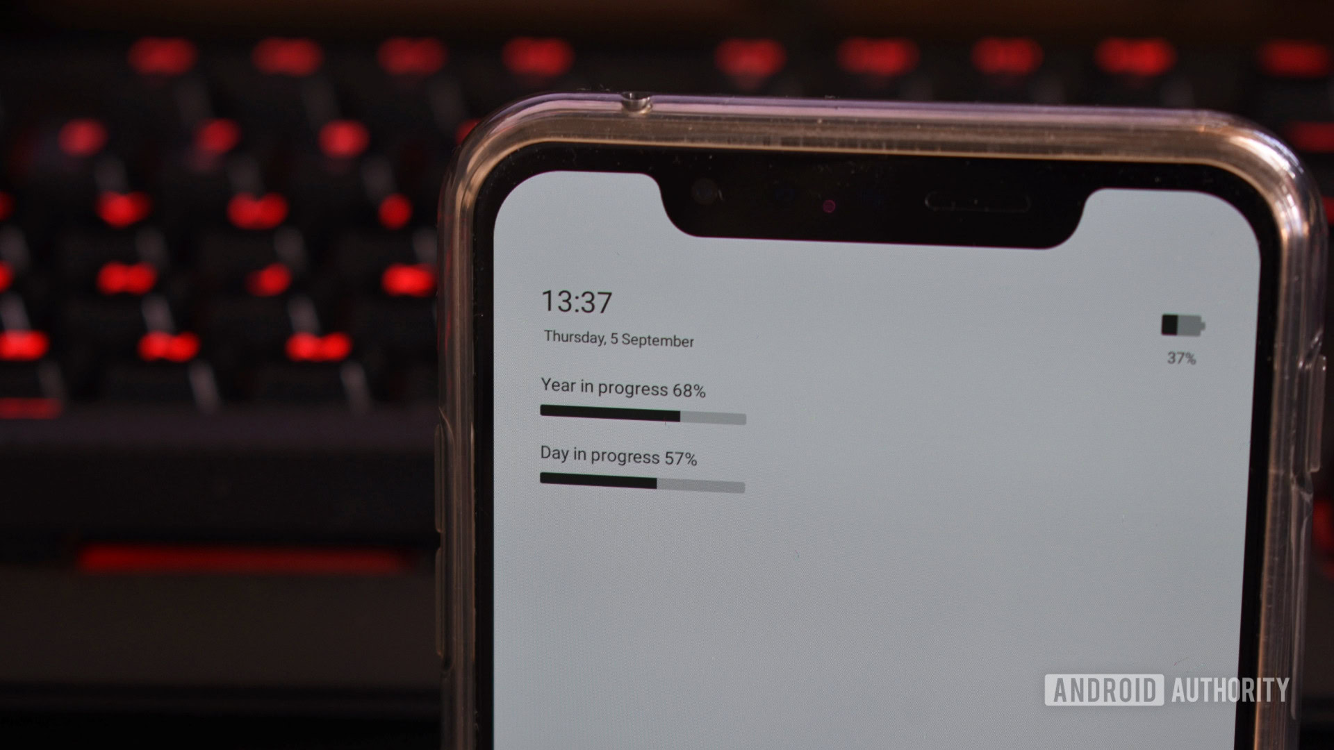
Minimalist is similar to Before in that both launchers focus on reducing visual clutter, but I really appreciate Minimalist’s stripped-down design. By default, it displays the year-in-progress and day-in-progress widgets as horizontal bars, which can be decidedly disconcerting. Scroll to the left, and you’ll find an alphabetical list of installed apps.
There’s an array of customizations on offer, including theme colors, options to use custom icon packs or no icons at all, and various gestures.
ap15 Launcher
Andy Walker / Android Authority
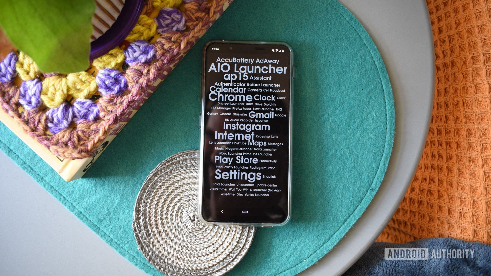
Word clouds were an essential part of blogs in the early 2010s, allowing visitors to visit tag pages in a jiffy, but this setup works surprisingly well for an efficient Android launcher, too.
ap15 Launcher is designed entirely around this idea. All your apps are displayed in a word cloud of sorts, making for a strangely cohesive modern art aesthetic. Tap on the app’s name to open it, and that’s pretty much it. The more often you tap an app, the larger its font grows, making it easier to seek out and select the apps you open often.
AIO Launcher
Andy Walker / Android Authority
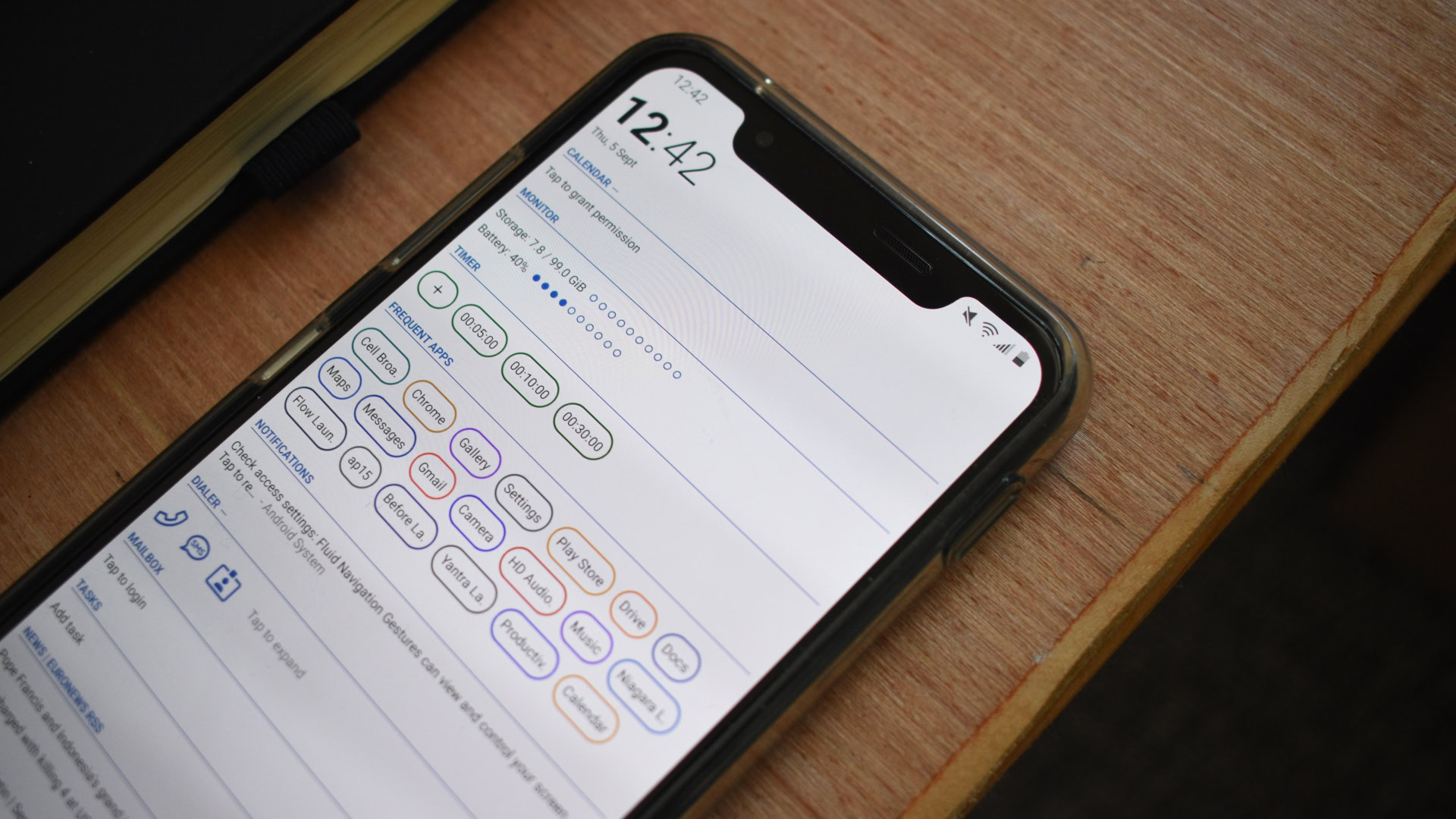
Plenty of minimalist launchers are on this list, but it’s time for some maximalism. More is more, and that’s the logic embraced by AIO Launcher.
For being so cluttered, AIO is well organized, functional, and pleasing to the eye. Much information is on display here, including exchange rate data, a Bitcoin value graph, a full-sized call dialer, and an RSS widget. This counts towards the launcher’s functionality, though, as you often don’t need to launch a specific app to view the info it displays. AIO also lets users select various widgets to include here, while additional themes are also on tap.
Are there any other unconventional Android launchers out there?
Rita El Khoury / Android Authority
As mentioned, there are plenty of unconventional and unique Android launchers out there offering varied design philosophies. But there are some I couldn’t include every single one. Here are a few other launchers well worth a mention:
- Unlauncher: I enjoyed using Unlauncher thanks to its tiny file size and swift functionality. It doesn’t do much beyond the traditional minimal launcher but is open source.
- Ratio: Ratio is another focus-first launcher that splits apps into categories, includes a separate screen dedicated to app conversations, and has a bottom dock. It didn’t quite resonate with me, and it’s way too buggy for daily use.
- Lens Launcher: It was difficult to choose between Lens and Pie for the primary list, but Lens lost out due to its lack of a real novelty feature. It displays all apps on the home screen. When you select a specific app, its icon increases in size, while others fade to the background. It’s a cute visual effect but doesn’t add to its usability.
- Niagara: Niagara has become one of the best Android launchers, so including it on this oddball list felt like a cop-out. But, in many ways, Niagara is left-field regarding traditional launcher design. It has gained many additional smart features, including widget support and Privacy Space support for Android 15.
- Kvaesitso: My personal favorite Android launcher, Kvaesitso combines the minimal launcher aesthetic with a search-rich, tag-based app organization system. It also supports widgets, gestures, and external search providers.
Unique Android launcher: FAQs
The coolest Android launcher is AIO Launcher. It offers so much customization and card options for maximalists. However, “coolness” is subjective.
In my experience, Discreet Launcher was among the fastest Android launchers I’ve used. ap15 Launcher also makes it incredibly easy to launch apps with just one tap.
There are plenty of Android launchers that weigh in at under 1MB, including KISS and Mini Desktop.


 English (US) ·