The iPhone 16 Pro is very similar to its predecessor, but adds the Camera Control and now has a slightly larger display. That means iOS users are getting another great phone in 2024. However, with the new series' big selling point — Apple Intelligence — only available months after launch, if you don't plan to swipe up and down the side of your phone, you could probably just buy the iPhone 15 Pro instead (or an Android!).
Sometimes, it feels like I’m the only Android user in my friend group. I’m not — there are two or three of us — but it’s still an isolating feeling when you know you’re one of the green bubbles breaking up the iMessage party. Sometimes, that isolation is bad enough that I’m almost willing to switch to iOS until I remember what else I’ll give up. For several years, moving away from Android meant losing color-matched themes, skipping out on the ability to place apps anywhere I wanted, and living without creature comforts like an always-on display or a 120Hz refresh rate.
Now, that gap between iOS and Android isn’t quite as big, and it’s letting some of that temptation creep back in. After all, iOS 18 is more customizable than ever, RCS has made messaging a little less awkward, and Apple Intelligence is on its way (or so we’ve been told). So, I pulled my personal SIM out of my beloved Pixel 9 Pro, downloaded an eSIM into a brand new iPhone 16 Pro while also pocketing a vanilla iPhone 16, both of which we bought for the purposes of this review (we always buy our Apple test devices), and set out to see if the grass is greener on the other side of the 2024 Android vs iPhone divide.
New buttons, same story
Ryan Haines / Android Authority
In some ways, it’s fitting that I swapped from a Pixel 9 Pro to an iPhone 16 Pro for my annual dip into the world of iOS. After all, it wasn’t long ago that I wrote about how Google had created my favorite iPhone, the larger Pixel 9 Pro XL. I praised almost every inch of its hardware, happy that the camera bar had become an island and that the waterfall displays had dried up. It felt like Google had finally built a flagship Pixel worthy of leading the Android fleet, and it was premium enough to go toe-to-toe with the best that Apple had to offer. I wasn’t so much praising Google for making an iPhone as I was rejoicing that it was righting some of its previous hardware wrongs.
And yet, when Apple sticks to its design principles and churns out yet another set of well-built flagship iPhones, I can’t help but feel a little disappointed. Whereas I felt like Google was taking a long-awaited step forward with the Pixel 9 series, diving into the iPhone 16 and 16 Pro felt like I was unboxing the previous iPhone 15 series all over again. Yes, the build quality is on point, and yes, the button placement is so consistent (save for a few additions) that my grandma could pick one up and start using it without issue, but it’s harder to get excited about sustained excellence. It’s like when Real Madrid wins the Champions League — fans are excited, but they also expect it to happen.
It's easy to pick up an iPhone 16 and know your way around, but I wouldn't call it exciting.
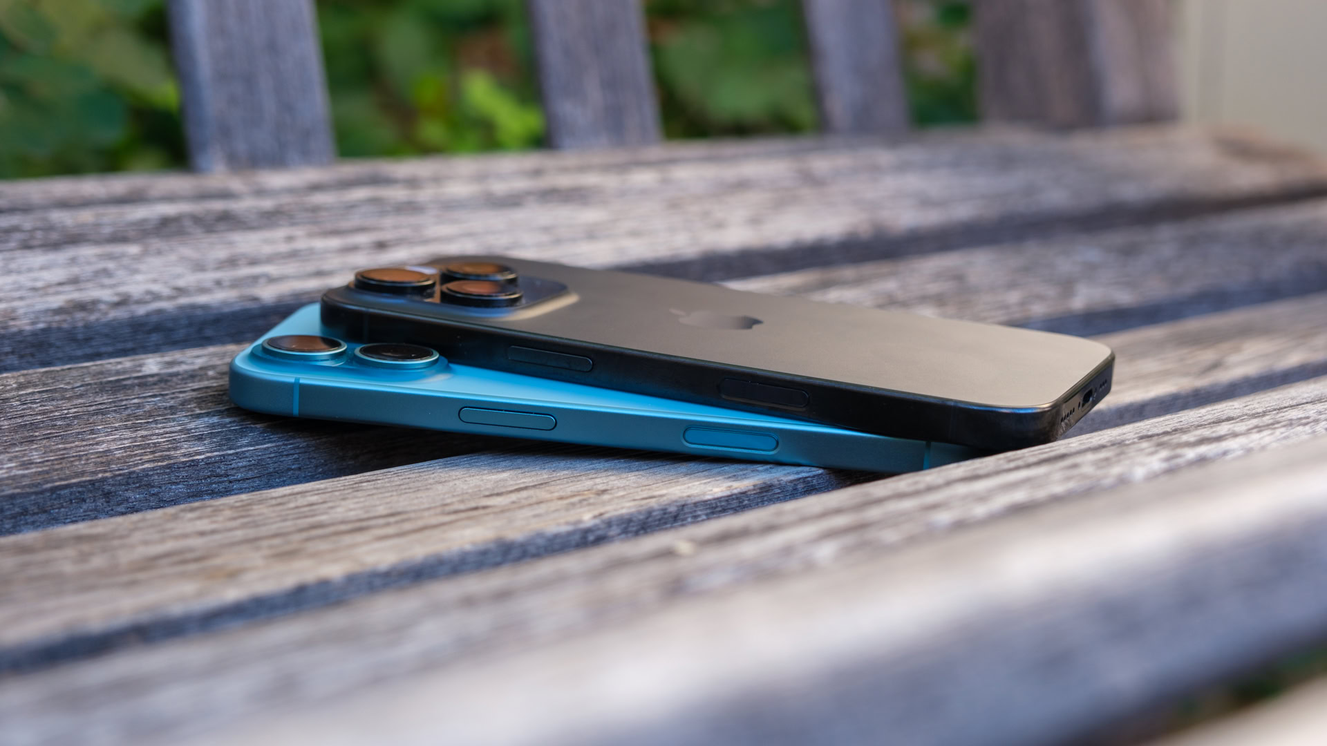
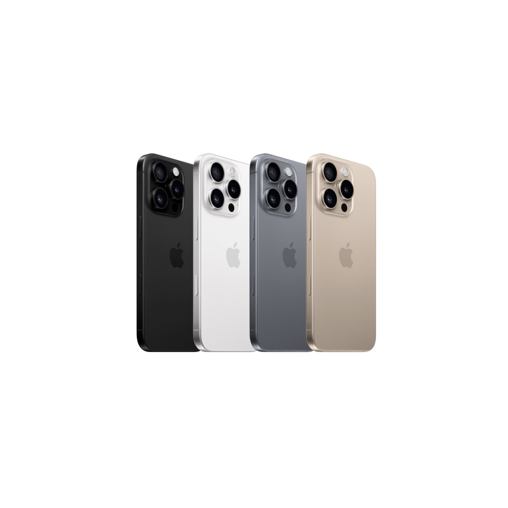
Slight boredom aside, the iPhone 16 and iPhone 16 Pro do feel great in the hand. Apple’s sharp edges softened a bit with the iPhone 15 series, and they’re the same this time around. The combination of Corning-made glass and aluminum keeps the iPhone 16 feeling remarkably light, and the titanium frame on the iPhone 16 Pro certainly seems like it’s here to stay. This time, though, I think Apple has improved its color treatment, as I haven’t noticed the same level of smudging on my Black Titanium finish that many reviewers saw on the iPhone 15 Pro and Pro Max. It’s certainly about as sharp as the color black can be, pairing a frosted back with a satin frame, both of which are easy to wipe clean.
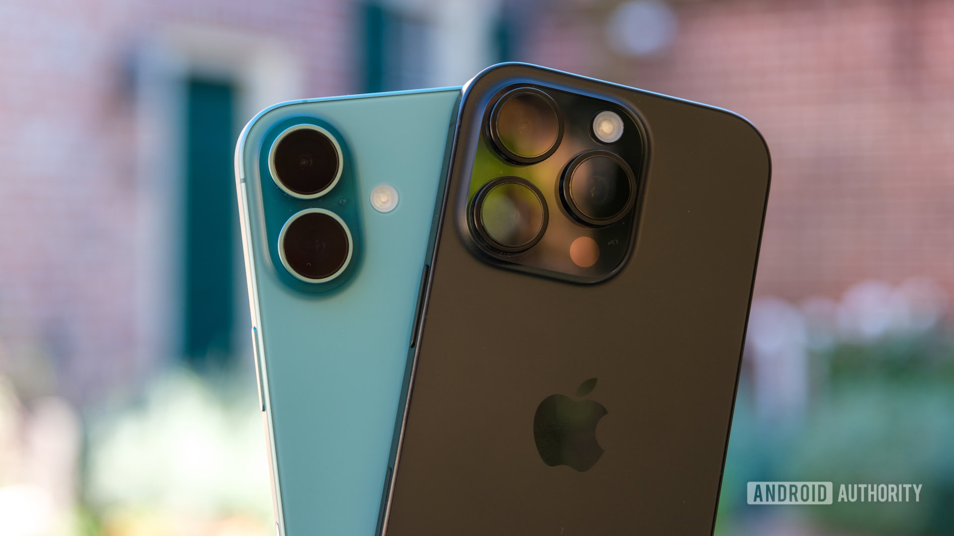
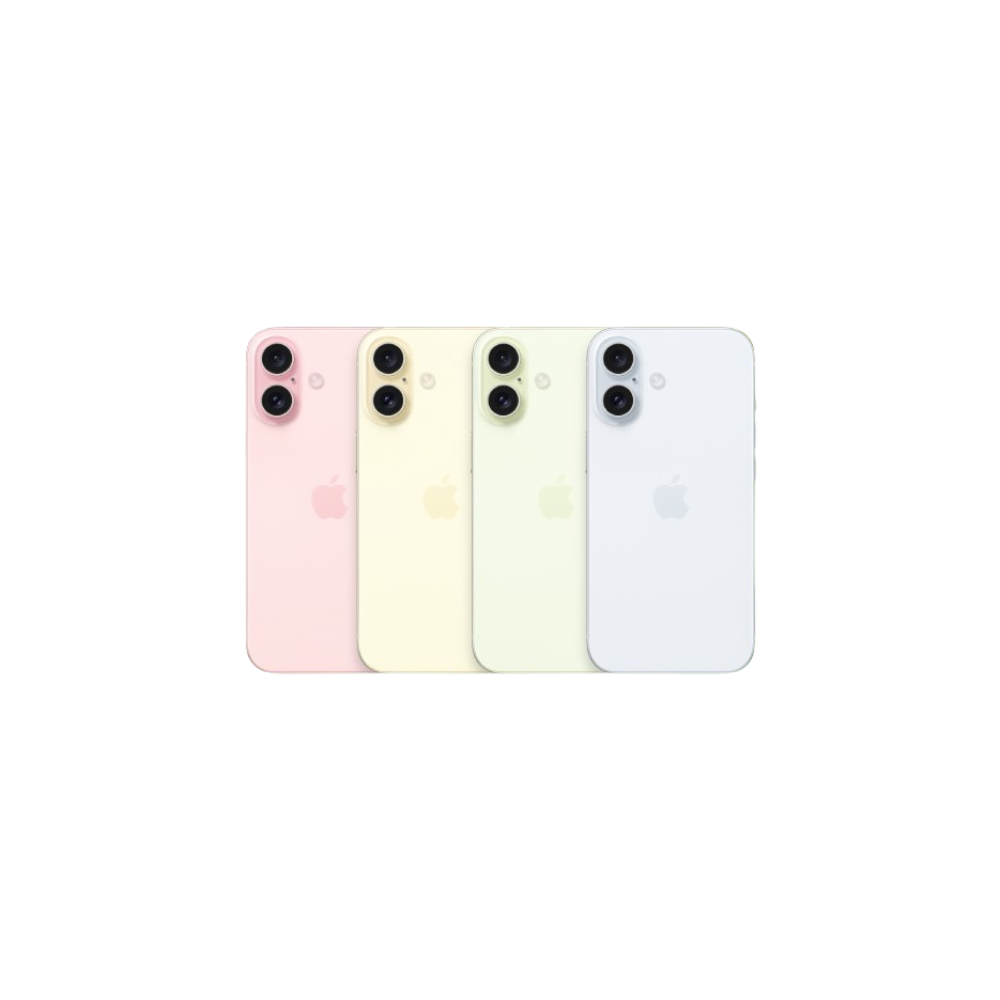
But where the iPhone 16 Pro looks good for its understated color, the iPhone 16 shines for just how vibrant it is. Apple swapped its palette of previously pastel finishes for a handful of much punchier tones, including the Teal finish that currently calls my desk home. It’s just colorful enough that I’m tempted to show it off without a case. Outside of the new coat of paint, the iPhone 16 has more differences in its design than the iPhone 16 Pro, too. Its previously diagonal cameras now sit one above the other, while it’s swapped the classic mute switch for a more programmable Action Button. I’ve kept mine programmed as a mute button, but I’m sure someone out there is being more adventurous with theirs. I might get more use out of it if I could program a double-press differently from a single-press, but that’s not the case.
The other new button that graces the side of the iPhone 16 series — all four models this time — is called the Camera Control. If you ask Apple, it’s much more than a button, but to me, it’s kind of just a button. It has a silly level of overlap with the Action Button because you can use either one (or both) to open your camera. That’s not to say I wasn’t excited about the Camera Control at first because I thought physical camera controls sounded great. I tried my hardest to use it for a while, but I’ve noticed my reliance on it trailing off as days with the iPhone 16 Pro turn into weeks. Yes, it’s an easy way to open your camera settings, but once they’re open, it’s much faster to scroll and select from the display itself, defeating the point of a swipeable button. It’s also proving difficult to overcome the muscle memory of pressing an on-screen shutter button or simply using the volume button like I always have.
Even though I haven’t fallen in love with Apple’s new buttons in the way that I might have expected, it’s not to say that the changes to the iPhone 16 series have been all bad. I quite like that all four iPhones now come in different sizes. Yes, it means you’ll have to be more careful about which case you buy for your new phone, but it also means that the case will offer a tighter fit and better coverage — at least if you pick up the dual-camera iPhone 16 or iPhone 16 Plus.
Ryan Haines / Android Authority
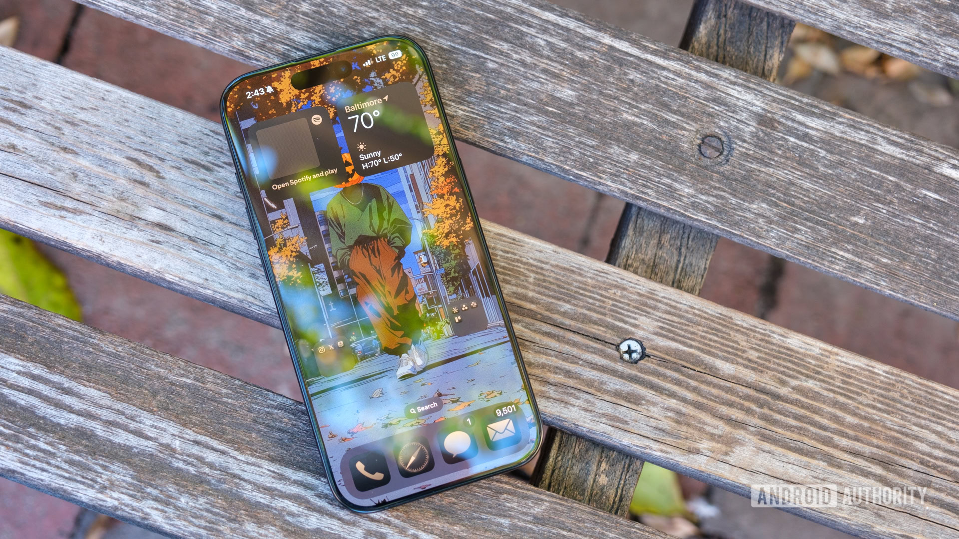
Should you decide on that base model, you’ll get an iPhone that’s exactly the same size you’ve used for generations. Its Super Retina OLED still sits at a perfectly palmable 6.1 inches, complete with a woeful 60Hz refresh rate and once again missing an always-on display. There’s almost nothing else worth pointing out about Apple’s most affordable iPhone 16 — from the front, it’s practically the same phone I reviewed in late 2023.
The iPhone 16 Pro, on the other hand, decided it was time for a growth spurt, jumping to a 6.3-inch Super Retina LTPO OLED panel that’s the same size as my beloved Pixel 9 Pro. And honestly, I appreciate the extra real estate. Perhaps it’s the fact that I’m coming straight from one 6.3-inch device to another, but it barely feels like I’ve had to retrain my grip outside of memorizing the different button placements. However, Apple’s smaller Pro is slightly smaller than the Pixel 9 Pro, thanks to razor-thin bezels — apparently Apple’s thinnest ever. They’re certainly slim and look quite nice, but we’re nearing the point where people might start accidentally pressing the edge of their display while reaching for something else. Of course, if you want the biggest Apple boi out there, the iPhone 16 Pro Max is available for even more cash. My colleague Paul checked out that one, and you can hear all of his thoughts in the video below.
iOS 18 feels more like Android than ever
Ryan Haines / Android Authority
As you can probably tell by now, my issue with the iPhone has never been its hardware. Has it always (or ever) been exciting? No, but it’s always been reliable. An iPhone is an iPhone is an iPhone, as it were. Google probably wouldn’t have made two versions of the Pixel 9 Pro if not for the success of the smaller iPhone Pros. Instead, where I’ve usually run out of patience with switching to an iPhone has been, well, iOS. Every version since the dawn of time — at least since I first used the iPhone 7 back in the day — has looked and felt almost identical, right up to the point that it’s as dull as the overall iPhone design.
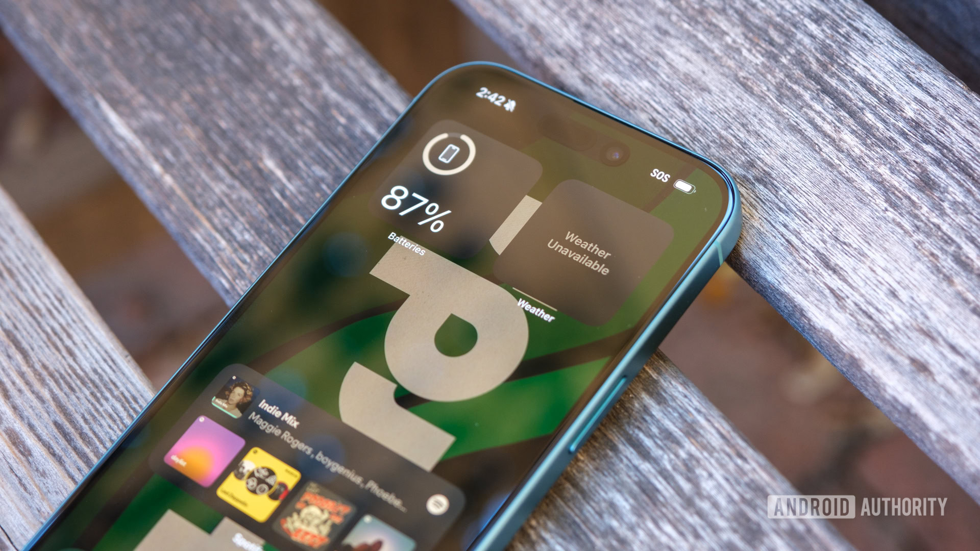
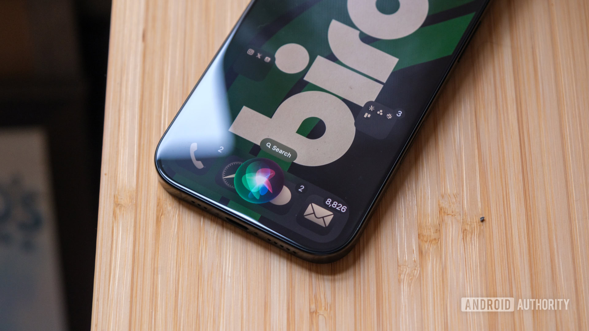
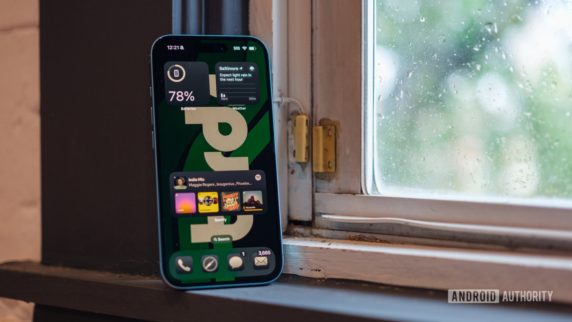
But now, the times are finally changing. Apple is finally acknowledging a few things that Android has always done better, and it’s finally making a version of iOS that’s at least a little bit more fun. And by that, I mean I can finally customize iOS 18 in a way that makes it usable. After years of using extra widgets and random apps to sink the ones I need to the bottom of my display, I can finally place apps and folders anywhere I’d like — which means that, yes, this is the first thing I did with my new iPhone. I no longer have to live with a wallpaper that’s blocked out by things I’ve never used, but rather, I can organize my layout to complement my chosen image.
With a cleaned-up Home Screen and color-matched app icons, iOS 18 feels quite a lot like Android.
Flexible organization isn’t the only boost to come out of iOS 18, either — I can color-coordinate my apps now, too. However, this piece of Apple’s customization overhaul could still use some work. Yes, it’s nice that I can swap between large and small icons and choose a light theme or a dark one, but Apple’s color choices are less than impressive. As soon as you decide to recolor your app icons, they all swap to a dark gray base, which makes it almost impossible to see any color darker than a light beige. So far, I’ve tried a red layout to match the Philadelphia Phillies (my childhood team) and an orange one to match the Baltimore Orioles (my adopted hometown team), and both have felt like I was trying to pass a colorblindness test even though I have perfect vision.
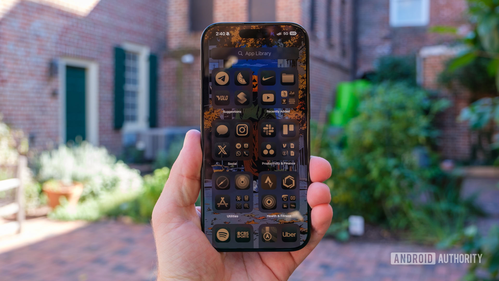
After a bit more fine-tuning, I finally have a home screen that I’m mostly happy with. I might be the baseball jinx this year, but such is life. I’ve swapped the sports-themed wallpaper for a hipster version of Ichabod Crane, and I’ve slimmed my layout down to four main apps with folders for social and work apps just above them. It’s almost, dare I say, Pixel-like, with just one key exception: Apple’s App Library stinks.
If you’ve ever used an Android phone, you know how convenient the app drawer can be. Sometimes, like on a Pixel, it gets sorted alphabetically, while others, like a Samsung Galaxy device, it populates in the order you download apps. It’s easy and clean, and there are no folders unless you make them.
The App Library, on the other hand, sometimes feels like I’m trying to find my way through an actual library but without the Dewey Decimal System as my guide. I mean that iOS 18 sorts everything in its App Library into folders based on purpose. You get one for Entertainment, one for Social, one for Travel, and more — all the way down to a catch-all folder called Other.
Ryan Haines / Android Authority
My problem with this is that some of the sorting decisions make no sense. Apple’s weather app gets shoved into the Other folder, while the phone app gets sorted into Social. Translate lands in Other, yet somehow, our benchmarking apps like 3DMark and Geekbench 6 land in the Utilities bin. Mix in the fact that you can only see seven apps in each category at any one time, and you almost have to memorize your entire iPhone when you want to find something. I thought I kept my iPhone pretty lean, downloading only the apps I use, yet I’m constantly tapping on two or three folders before I find what I want.
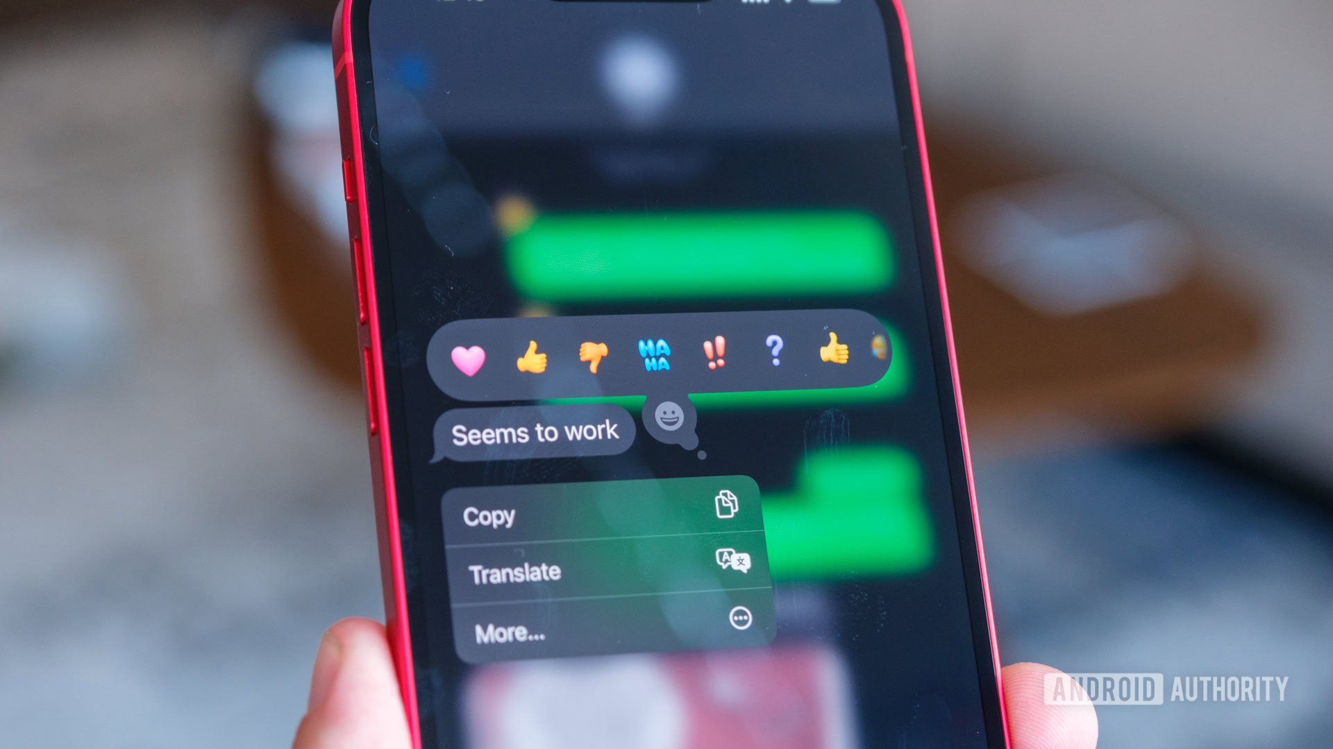
It’s not all bad, though, I promise. I haven’t even mentioned the best part of iOS 18 yet: RCS support. No, I know it’s probably not the most exciting piece for longtime iPhone users, but as a guy ready to return to his beloved Pixel, I’m glad it’s here. Apple finally “got the message” and made sending full-resolution pictures and videos easier across Android and iOS. RCS support opens the door for read receipts and typing indicators, too. I’m generally not one to use read receipts, but I’ll happily welcome a step toward feature parity in messaging. Now, I just have to convince my Android friends who use Samsung Messages to take the RCS plunge, too.
I’m still waiting on Apple Intelligence
Ryan Haines / Android Authority
Of course, you’ve probably noticed one big piece of iOS 18 that I haven’t touched on. That’s right, it’s Apple Intelligence — or rather, the lack thereof. Yes, it’s coming, the teasers at WWDC and the Glowtime launch event have told us as much, but it’s not here yet. Does that make it much harder to review Apple’s latest set of flagship phones? You bet it does.
However, we have a pretty good idea of what Apple Intelligence will look like when its beta rollout finally begins. Apple has already promised a new, more conversational, better-informed Siri, a slate of tools to rephrase and proofread just about anything you write on your phone, and an Image Playground that should go toe-to-toe with Google’s Pixel Studio and Samsung’s Portrait Studio. And yet, none of it is available at this time. Most of it will never become available to most iPhone users — save for those with the iPhone 15 Pro series or any of the iPhone 16 models.
This is where I'd put my review of Apple Intelligence... if it had any!
Surprisingly, Apple’s slow, steady AI rollout leaves me more conflicted than anything else on the iPhone 16 and 16 Pro. On the one hand, I respect that it’s introducing features slowly to fix them a few at a time rather than all at once. On the other, people are already paying higher prices than ever to put a flagship iPhone in their pocket, and they’re doing so with the promise of future features. There’s a loose timeline for when Apple Intelligence will be ready beyond the beta stage, but for now, you just have to trust the company with your $800 or more.
I’m sure by the time we reach the full Apple Intelligence rollout, everything will feel pretty smooth. After all, top-level optimization is the name of Apple’s game. In the meantime, though, I can’t see anyone buying an iPhone 16 for the promise of AI.
Control button aside, Apple has its cameras figured out
Ryan Haines / Android Authority
What I can see people buying an iPhone 16 for, however, is the cameras — or at least those on the iPhone 16 Pro. I get why people like them, because they just work. The processing isn’t as good as on a Google Pixel, and the zoom isn’t as impressive as on an Ultra-grade Samsung Galaxy device. However, the overall experience is straightforward, whether you use the camera control or not.
Processing aside, it’s pretty easy to compare the iPhone 16 cameras to those on the Pixel 9 series, Pro or not. Basically, everyday users get two cameras, while those willing to go Pro get three. Apple’s base model packs the same 48MP primary and 12MP ultrawide cameras that its predecessor had, complete with the same 10x maximum zoom and the same silly claim that the 2x optical sensor crop makes it feel like you have four total cameras to work with. There’s a visual change to the iPhone 16’s camera setup, too, now that the sensors sit one above the other so you can shoot 3D video to later watch on the Apple Vision Pro — something that everyone with a base-level iPhone surely owns.
You get more megapixels to play with, but the results are fairly familiar.
The iPhone 16 Pro, on the other hand, actually does have four cameras to work with, and it no longer lags behind its Pro Max sibling in terms of functionality. It now has the same 12MP 5x optical telephoto sensor as Apple’s largest iPhone, and it picked up the 48MP ultrawide upgrade to boot, joining the same 48MP primary camera found on the base iPhone 16. I am, of course, counting the 12MP selfie camera as Apple’s fourth, as any other justification seems silly.
Anyway, camera changes aside, I think the real reason I enjoy snapping photos on the iPhone 16 Pro as much as I am is Apple’s Photographic Styles. They’re not brand-new — they’ve actually been around since the iPhone 13 series — but Apple has expanded its styles from four basic options to around 15 that you can swap between. I always start with the Standard look, which is the straightforward iPhone color profile you’re probably used to, but I’ve come around to the Stark B&W, a modified version of Amber, and a shot or two with the Vibrant profile when the lighting allows for it. The Photographic Styles function quite a lot like Instagram filters, but they’re far more customizable, like a film simulation on a mirrorless Fujifilm camera.
With all that out of the way, let’s get to some camera samples. Most of the shots below are straight from my iPhone 16 Pro, simply because I’ve needed its longer zoom range over the last few weeks. However, I’ll also be sure to point out any that feature different Photographic Styles. Also, forgive the overwhelming red and brown shades — it’s all I’ve got now that it’s fall in the Mid-Atlantic.
As always, I’ll start with the primary camera, which I used for most of my adventures. I still think it’s a bit too wide for everyday shooting at the equivalent of a 23mm focal length, but the 2x central crop fixes most of my complaints on that front. So long as I remember to punch in, I’ve been pretty happy with what the iPhone 16 Pro can do. The modified Amber Photographic Style I’ve been using adds a nice pop to the pumpkins at the top left, while the Dramatic one makes the New York City subway look brighter and more sterile than reality.
Honestly, though, I’ve leaned so heavily on Apple’s Photographic Styles this year because, otherwise, there’s not much to get excited about. The default color profile is accurate but a little bland, and unlike Google’s Pixel camera or Samsung’s Galaxy flagships, there’s no magic bump in processing after you press the shutter. What you see is generally what you get, which is great if you nail your composition but not nearly as forgiving as I’d like.
When you punch out to the new 48MP ultrawide camera, it’s the same story. You can still jump from one Photographic Style to the next or simply roll with the default look that Apple reverts to whenever you open the camera. Of the shots above, I’m happiest with the way that the crab statue seems to frame part of the Baltimore marina and the way that the 13mm-equivalent focal length makes the music pavilion to the right look larger and more imposing.
Of course, we’re not just here to zoom out. If you’re after a new phone that can punch in, the iPhone 16 Pro is an obvious winner over its base-level counterpart. It tops out at 25x zoom to the iPhone 16’s maximum of 10x, making it the far more flexible pick. The shot to the left illustrates just how far I am from One World Trade Center, but I managed to pinch all the way in on the antenna right as it reaches the clouds. I’m not sure I’d share the 25x zoom image — it’s okay at best — but the 5x telephoto sensor at least lends a hand up to the 10x zoom length. Once again, though, there’s no magic touch after you press the shutter button.
Dropping the lights, I’m less impressed by the iPhone 16 Pro after dark. Although the middle shot of the neon sign is nice and moody, both the statue of Bill the goat to the right and the lights to the left suffer a bit as you look closely. The people surrounding the statue are noticeably fuzzy, especially when the light hits the bright white of the uniforms, and the glow of the harbor lights would be cool in a movie but is less impressive when you’re just trying to capture the scene.
On the bright side, Apple’s video capabilities on the iPhone 16 series remain second to none. You’ll have to grab the iPhone 16 Pro for fancy features like 4K at 120 frames per second or recording in the ProRes format for later editing, but the iPhone 16 is no slouch. It still packs solid stabilization and supports Apple’s Action Mode.
Apple knows how to put on a performance
Ryan Haines / Android Authority
Despite my reasonably obvious Android preference, Apple has always done one thing just a bit better than anyone else: Build an in-house chipset. For years, the Bionic chip rocked up to our benchmarks like an Olympian returning to a high school track meet, putting up numbers that most Android chipsets couldn’t quite match. There wasn’t necessarily a big difference in day-to-day performance, but Apple knew how to make its chipset look good on paper, and it usually paired it with less onboard RAM than a comparable Android flagship.
Well, in true Apple fashion, some things just don’t change. In the same year Google started shipping all of its Pixel 9 models with 12GB of RAM or more, Apple remains content to ship its flagship series with 8GB of RAM across the board, no matter how much storage you decide to spring for. This time, that RAM is backing up the updated 3nm A18 chipset in the iPhone 16 and the even more powerful A18 Pro in the iPhone 16 Pro. Yes, for the second year running, Apple has one chipset for its base pair and another for its premium models, but at least they kind of have the same name this time.
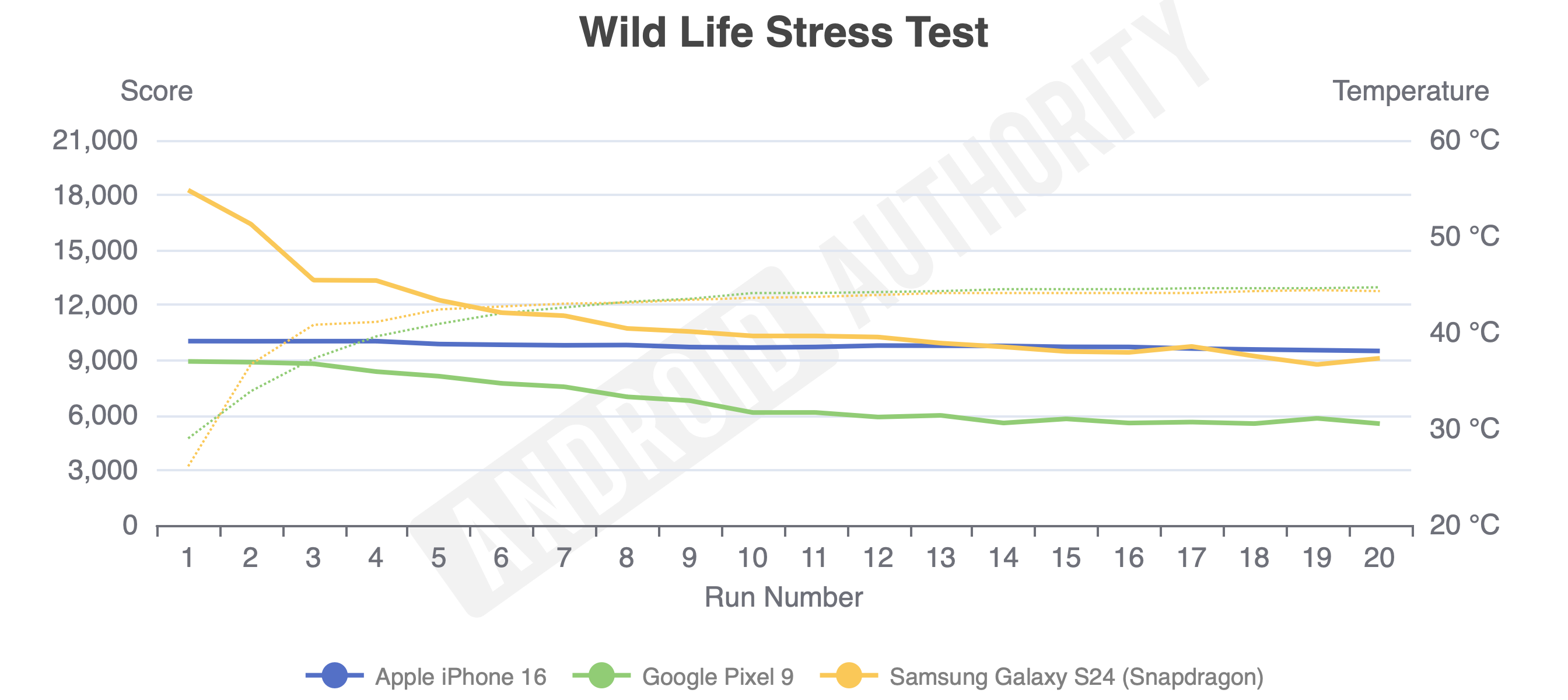
As always, I sat down and put both of Apple’s updated chipsets through as much of our testing gauntlet as I could manage while my colleagues tested the iPhone 16 Pro Max. And by that, I mean my colleague Rob Triggs and I had to rework most of our tests because Apple refuses to make things nice and easy. When I finally got results for the CPU-based Geekbench 6 test and our GPU-intensive 3DMark stress tests, I was surprised: Apple’s lead isn’t nearly as big as it once was. It’s still ahead in terms of single-core and multi-core Geekbench 6 performance on both chipsets, but the iPhone 16 Pro comes up short of Samsung’s Galaxy S24 Plus across our slate of graphics tests with a steep drop in just the second of 20 runs.
The base iPhone 16 tells almost the same story, staying ahead of its Android rivals in terms of CPU performance but putting up graphics numbers that land just behind Samsung throughout a stress test. Apple’s sustained performance is more consistent than Samsungs — there’s very little dropoff from the first run to the last — it just doesn’t start quite as high.
Ryan Haines / Android Authority
By now, you know that our controlled benchmarking doesn’t mean too much when it comes to actual performance, though, and this is no exception. When you set the latest iPhones free from their benchmarking bonds, they feel as smooth and performant as any other flagship phone. I’ve primarily been using the iPhone 16 Pro during my weeks with Apple’s pocket-sized duo, and it’s easy to see how people get comfortable inside the walled garden — it just works.
Over the last few weeks, I’ve put the A18 Pro chipset through a speedrun of adventures. I took the iPhone 16 Pro on a one-day work trip to New York City, used it as my camera of choice for the All Things Go music festival, and brought it to Annapolis, Maryland, for a US Naval Academy football game. It didn’t shy away from any of my day trips, killing time scrolling social media, tuning out the longest train ride of my entire life while streaming Spotify, and successfully navigating me through a crowded city on the way to Navy-Marine Corps Stadium. However, I did notice one rather uncomfortable flaw during my adventures: The A18 Pro chipset runs warm. It didn’t take much to heat my iPhone 16 Pro, either — an hour of Apple Maps or a long enough session with the camera was enough to make the titanium toasty.
Unfortunately, with that uptick in heat comes another problem: The iPhone 16 Pro’s battery life is satisfactory at best. In addition to our performance benchmarks, we put both the iPhone 16 and iPhone 16 Pro through a controlled battery drain, and the results were generally less than impressive. Apple’s in-house, highly-optimized chipset came up well short of the Samsung Galaxy S24 and the Google Pixel 9 Pro across everything from 4K recording to web browsing. The only exception was while playing 4K video, where Apple’s best more than doubled the Pixel but just edged Samsung’s smallest flagship. The base iPhone 16 fares a little better, outperforming the iPhone 16 Pro across every category but the 4K playback without heating up nearly as much.
In real life, that works out to an iPhone 16 Pro that you’ll probably end up charging almost every day. Some days, I reached bedtime with around 25% charge remaining, which was fine to sleep on, but it usually meant I was reaching for a charger before lunchtime the next day. Compared to the Pixel 9 Pro, a phone I could easily stretch to 36 hours or more, I’m questioning Apple’s excellent optimization.
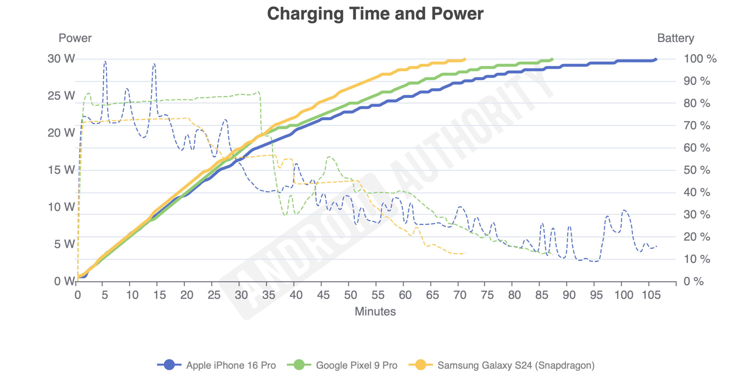
Worse, Apple’s wired charging doesn’t make up for the battery shortcomings. In a world where Google’s comparable Pixel 9 Pro is capable of 27W wired charging and the Galaxy S24 is capable of 25W wired charging, Apple seems content to cap its smaller phones at just 21W. Granted, the iPhone 16 and iPhone 16 Pro have smaller batteries than their Android counterparts, but it’s not a great excuse when they charge so painfully slowly. Apple might have adopted USB-C, but it hasn’t made it any less confusing.
Ryan Haines / Android Authority
The iPhone 16 Pro, for example, took 106 minutes to trickle its 3,582mAh cell from empty to full — a full 20 minutes longer than the Pixel 9 Pro needed for its 4,700mAh battery and about 30 minutes more than the Galaxy S24 required for its 4,000mAh cell. The iPhone 16 was about the same, taking 107 minutes to fill its slightly smaller 3,561mAh battery.
Maybe you can make up for the woeful wired charging with up to 25W MagSafe wireless charging, but then you’ll have to buy a specific charger, as the more universal Qi2 wireless charging is capped at 15W. On the bright side, you don’t need a top-end USB PD PPS charger to fill up the iPhone 16 or iPhone 16 Pro the way you would for most Android flagships.
The iPhone 16 and iPhone 16 Pro are good, but they haven’t swayed me
Is it possible to check off nearly all the boxes but fail the assignment? If so, that’s what the iPhone 16 and iPhone 16 Pro do. They’re both good phones that fit comfortably in my hand, offer incredible software support, and pack reliable rear cameras that are easy to pick up and go. Apple’s build quality remains some of the best (though Google is now on equal footing), and I appreciate how simple it is to set up a new iPhone if you’ve ever used one before. However, the assignment was to sway me from my Android loyalties, and I don’t think either phone did that — nor do I think this generation will draw many other Android users over, either.
Yes, Apple gets high marks for finally making plans to bring AI to the table, letting users customize their home screens in a brand-new way, and adopting RCS to make cross-platform communication easier, but I’ve already been able to do most of that on Android phones for years. Google has used RCS in Google Messages practically since the day I started here at Android Authority, and customization is what brought me to Android in the first place, back when I begged my parents for the HTC Droid Incredible 4G. Well, that and HTC’s clock widget, which I believed was the coolest way to tell time.
Perhaps worse for Apple is that many of its other new iPhone 16 features simply fail to excite me. I haven’t used the Action Button as anything other than a mute switch, and the Camera Control has only proven useful in a few particular scenarios. Add the fact that Apple Intelligence just isn’t here yet, and a large part of me feels like I’ve reviewed the iPhone 15 series all over again. Sure, the iPhone 15 and iPhone 15 Pro were good in their own right, but it’s not what you expect when Apple promises a host of new features.
If you were to break it down feature by feature, I still think I’d rather have the Pixel 9 ($799 at Amazon) or Pixel 9 Pro ($999 at Amazon) in my pocket over either of Apple’s smaller flagships. Google gets the edge in terms of charging, on-device theming, and the maturity of its AI features while at least tying Apple with its long-term software support. Sure, you’ll still show up as a green bubble to your iOS-toting friends, but now you’ll be a green bubble with read receipts and typing indicators, thanks to RCS. If you only think you need two rear cameras, lean towards the Pixel 9. If you want a third, the Pixel 9 Pro remains my favorite Android phone to launch in a long time.
I wouldn’t just reach for a Pixel over a new iPhone, either. When Apple rolls out the iPhone-est iPhone to ever iPhone, it becomes so much easier to be excited about the more unique Android offerings like Motorola’s Razr (2024) ($699 at Amazon) and Razr Plus (2024) ($999 at Amazon). Both are dual-camera flip phones, probably the best US-based examples of their class. The Razr Plus (2024) sets the bar for the largest cover screen on a flip phone, pairing it with 45W wired charging and taking a bold risk by ditching its ultrawide camera for a telephoto alternative. Motorola’s more affordable Razr (2024) plays it a little safer with more traditional cameras but packs just as much fun into its slightly larger battery and marginally smaller cover display.
I could go on, picking out Android phones that do one thing or another better than the iPhone 16 series — there are plenty of them, including the obvious ones like the behemoth Galaxy S24 Ultra ($1419.99 at Amazon) or the regular Galaxy S24 models. And yet, I know that it would be wasting my breath for so many iPhone users. Apple’s walled garden is hard enough to get out of once you’ve invested in it, and I can understand why when its broader ecosystem is so much more mature across other categories, such as tablets, smartwatches, laptops, and much more. Google and Samsung are getting there, particularly Google now it has a genuinely great smartwatch in the Pixel Watch 3, but neither brand’s respective gardens are quite as fine-tuned yet. But I also don’t see Apple’s patch of land as one poised for further growth into the Android landscape unless its central device, the iPhone, turns over a new leaf. Who knows, maybe the promise of a folding iPhone will one day change my tune.


 English (US) ·