Robert Triggs / Android Authority
As you probably know by now, I switch phones — a lot. It goes with the territory as a reviewer. But the important part is I get to pick out the things I like and don’t like about every flavor of Android under the sun. And, even though there are more versions of Android than I care to count, I seem to spend most of my time between Google’s Pixel UI and Samsung’s One UI.
Both are great, albeit very different Android skins, and they’re jam-packed with features. My colleague, Haroun, picked out a few that he’d like to see Samsung send Google’s way, and now it’s my turn to do the opposite. Here are the five things I think One UI could borrow from Pixel UI.
Clean up the bloatware
Ryan Haines / Android Authority
In my eyes, the first and most obvious thing that Samsung needs to take from Google is a subtraction rather than an addition. Bloatware is the bane of my existence — and I don’t think I’m exaggerating. We haven’t complained about Samsung’s One UI bloat too much because it’s less aggressive than what Motorola puts into Hello UX, but I still think it needs to go.
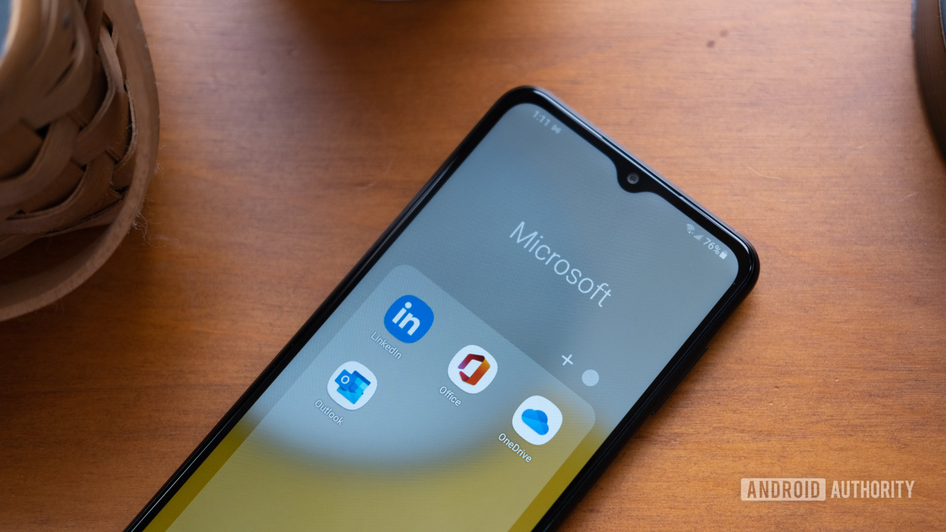
When you set up a new Samsung phone, no matter the price point, you will get quite a few apps you didn’t ask for. I don’t mind the additions like Facebook and Spotify too much, as people would probably download them anyway, but Samsung tosses its own bloat in there, too, with Global Goals, a News app, and Shop Samsung, which is a store to, well, buy more Samsung stuff. And yet, the bloat that annoys me most is Samsung’s Microsoft folder, which is home to LinkedIn, Microsoft 365, OneDrive, and Outlook — none of which you really need. After all, Google Drive, Gmail, and the rest of the G Suite are just a tap or two away.
On Pixel, however, the setup process is clean and simple. You might be prompted to download an extra app or two — usually just Google Wallet and Google TV — but it’s nowhere near what Samsung pushes on you. I think that if Samsung can follow Google’s lead and ditch its own messaging app, it can do the same for the random bloat it puts on your phone.
Copy Google’s calling features
Andy Walker / Android Authority
Now that we’ve taken something away, let’s add something useful — Google’s Pixel-exclusive suite of calling features. Sure, Samsung offers Live Translate, which makes it easy to talk to someone in a different language, but it’s nowhere near the Google Assistant-powered options you get on a Pixel device. Adding some of these would be a good chance for Samsung to follow Google’s lead on Feature Drops, too.
I know it’s not as easy for Samsung to lift a bunch of Google Assistant features as it sounds — it might hurt Bixby’s feelings — but I’d love the convenience of something like Call Screen, where I can filter junk from important calls with the press of a button. I can’t count how much time I’ve saved in the last few years simply by letting my Pixel hear about my car’s extended warranty or that EZ Pass wants to collect money from me (that’s also a scam).
On top of Call Screen, having Samsung snag the one-two punch of Hold for Me and Wait Times would be nice. Obviously, the first takes care of being put on hold without you having to listen to hours of generic music, while the second estimates how long you’ll probably have to sit on hold. Honestly, they’d both be handy because, like a true Gen Z-er, I don’t want to spend time on the phone with people I don’t know.
Learn from Pixel UI’s colorful themes
Ryan Haines / Android Authority
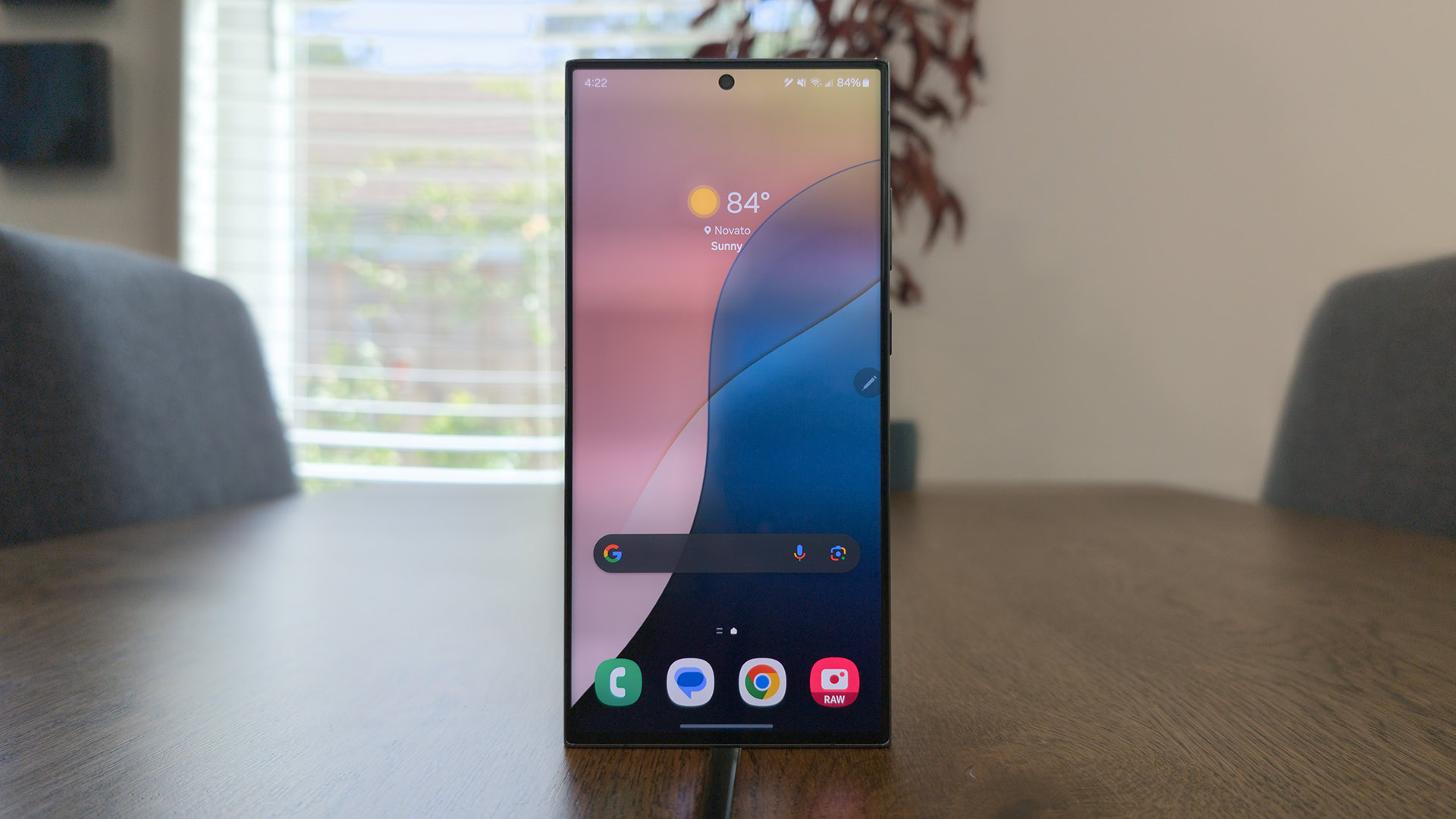
Customizing your Android skin is nothing new — it’s always been the platform where you can sit your apps and widgets anywhere you want. However, Google shook things up when it introduced its Material You design language, making it easier to match different parts of your device to your wallpaper and personalize different accents like the clock on your lock screen. Now, I think Samsung should follow suit.
And yes, I know you can already match the color of your app icons to the AI-generated wallpaper of your Galaxy device; I just think Samsung could take a page out of Google’s coloring book. For whatever reason, Samsung’s color profiles seem a bit more vibrant than Google’s — almost in the same way that its cameras process reds and greens. It’s not a bad thing — it’s certainly easy to pick out the colorful app icons — but sometimes the colors seem too bright while scrolling through the app drawer.
Samsung's themes are colorful, but it could use Google's eye for design.
Samsung could also follow Google’s lead of incorporating more than one color into its menus while we’re at it. Right now, Pixel UI uses one primary shade for its app icons, but it works several different hues into the Quick Settings and other menus. One UI, on the other hand, seems to pick one color and put it everywhere, making the apps, Quick Settings, and menu highlights look identical.
Also, if Samsung wants to nab the clock design I used on the Pixel 8 Pro above, I’d welcome that, too — it easily beats the Galaxy’s stable of analog designs that have been around since the Galaxy S7 series.
Simplify some camera capabilities
Edgar Cervantes / Android Authority
One of the better parts about switching from Pixels to Galaxy devices is that I always have a great camera in my pocket. That said, Google and Samsung are about as different as can be when it comes to their controls. Whereas Google took eight generations to bring any manual control to its top-end Pixel, Samsung has always been about granular control over everything from white balance to ISO — even if you need Expert RAW for some of it.
Now, I don’t want Samsung to get rid of Expert RAW because I know some people rely on it to get the most data out of their images, but I do want to see it streamline some of its other features. Take astrophotography, for example — on a Pixel, you angle your camera at the night sky and press the shutter. It should start a countdown, sometimes several minutes long, and then all you have to do is grab your phone when it’s done.
With Samsung, you have to download Expert RAW (a second camera app), head to the settings menu, open Special Photo Options, and toggle Astrophoto to on. From there, you can use an AR sky guide to line up the stars, set your shutter duration, and wait. You should get a solid result, but the process is nowhere near as streamlined as it is on a Pixel device, which probably means fewer people will be willing to jump through hoops to try it out.
Listen to Now Playing
Ryan Haines / Android Authority
Last, I’d like to see Samsung pick up one of my favorite Pixel UI features — Now Playing. Google prompts you to activate Now Playing during the setup process of any Pixel phone, and I opt-in every time. Yes, it probably means that my phone is always listening to pick up the music around me, but I guess I’d rather know it’s listening than pretend it’s not.
Now Playing is just an incredibly helpful feature whether you care about it listening or not. You might not realize how many times per day there’s some form of music playing in the background, but that’s where Now Playing comes in. It works like Shazam, identifying the names of songs and singers, but it kicks in automatically and, in my experience, is much quicker than pulling up an app and pressing the button. Now Playing might be the least helpful of my suggestions — at least for some people — but I like the idea of never missing a song again.
Which Pixel UI feature would you most like to see on One UI?
0 votes
Overall, I still prefer the clean minimalism of Google’s Pixel UI to the infinite customization of Samsung’s One UI, but there’s room for the two to learn from each other. I don’t want both Android skins to feel identical — which would drive me crazy as a reviewer picking out differences — but there are certainly some clever tricks that can be passed both ways. In the meantime, I’ll keep switching back and forth every few weeks or so.



 English (US) ·