Adam Birney / Android Authority
TL;DR
- Google Maps on Android Auto is getting a refreshed lane guidance UI.
- The new UI spreads out all lanes and clearly highlights the correct lane, making it much easier to read.
- The design refresh is already rolling out to users, and it should reach all devices in the coming days.
Google Maps on Android Auto is getting a small but significant change that should help you stay in the right lane. The updated lane guidance UI is larger and more spread out, making it much easier to read.
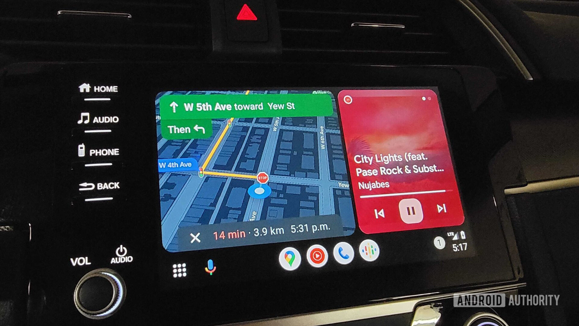
Google Maps has had lane guidance for a while, but the older Android Auto UI was a bit cramped, with lanes often overlapping or appearing too close together. Drivers had to pay close attention to identify the correct lane, which could get their attention off the road long enough to miss an exit or get in an accident.
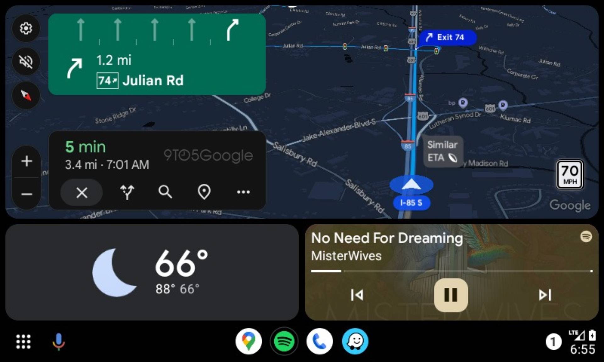
Thankfully, Google has given it a much-needed design refresh (via 9to5Google), and it now spreads out all the available lanes above the directions in the top-left corner of the navigation UI. As you can see in the attached screenshot, the correct lane is properly highlighted, while the other lanes are grayed out.
It’s a minor change, but it greatly improves readability, allowing you to identify the correct lane with a quick glance. This new lane guidance design has started rolling out to users, and it should show up on all devices in the coming days.
Got a tip? Talk to us! Email our staff at [email protected]. You can stay anonymous or get credit for the info, it's your choice.



 English (US) ·