Rita El Khoury / Android Authority
TL;DR
- The latest Google Maps update for Wear OS introduces a redesigned Tile, replacing the previous pill-shaped buttons for “Home” and “Work” with three blue circle icons under a “Search & go” section.
- Apart from a cleaner interface, the new UI also offers enhanced functionality.
- Additionally, the update adds two new complications to the watch face — “Search Maps” and “Show map.”
Google Maps for Wear OS has received a few useful updates of late. The most notable, of course, has been the addition of public transit directions, which happened earlier this year. Now, the Mountain View tech giant has rolled out yet another update that enhances the user experience. As part of this update, users will see a redesigned Tile and have access to two complications (i.e., features displayed on the watch face apart from the time).
So, what exactly does this update entail?
You can now ‘Search & go’ and access a handy microphone
Previous versions of the Google Maps Tile on Wear OS featured two large pill-shaped buttons, labeled Home and Work. These were certainly functional but felt cluttered and visually overwhelming. The latest update has redesigned the interface (via 9to5Google). Instead of the two pill-shaped buttons, you now get to see three blue circles under a section called Search & go.
Don’t worry, you haven’t lost access to your home and work shortcuts. They’re still there but appear within the Search & go section. In the photo below, which shows the difference between the previous and current interfaces, you’ll notice that the first circular icon represents your home address, and the second (a briefcase) for your work address. There’s also a third icon (a microphone) that lets you access voice search.
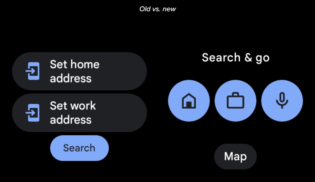
Below these three circular icons, there’s a Map shortcut, which Google has, in fact, been testing for the last few months. This is a pretty solid change from the old view, but we think it looks cleaner and is more user-friendly.
New complications added for ‘Search Maps’ and ‘Show map’
The changes don’t end there, though. Google has also added two new complications to the watch face. One of these is for Search Maps, while the other is for Show map. The former allows you to quickly launch voice input, making it easier for you to search for locations.
If you’re not seeing these changes yet, be sure to update to version 11.137.0703.W of Google Maps for Wear OS to access the redesigned interface and features.
Got a tip? Talk to us! Email our staff at [email protected]. You can stay anonymous or get credit for the info, it's your choice.



 English (US) ·