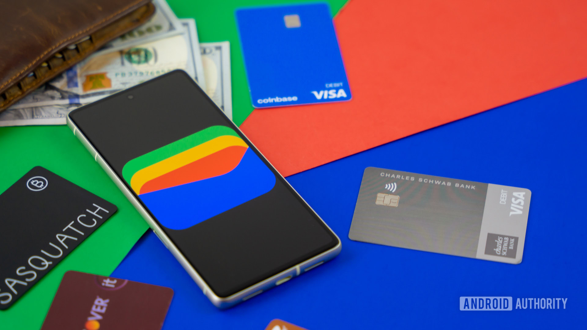
Edgar Cervantes / Android Authority
TL;DR
- Google is exploring adding back the Google Pay branding in certain areas within the Google Wallet app. These changes are not live, but we managed to activate them for a quick look.
- Google is also exploring a new divider before the Everything Else option when adding new items to Google Wallet, giving the menu some visual distinction.
It’s fair to say that Google Wallet has had a couple of identity crises. Google finally settled on the Google Wallet identity in 2024 for the US, choosing to integrate most of Google Pay‘s functionality into Google Wallet (although the Google Pay app continues to exist in some global markets). However, it seems that Google has not completely moved on, as we continue to spot new clues indicating that the “Google Pay” branding could return in the Google Wallet app.
You're reading an Authority Insights story on Android Authority. Discover Authority Insights for more exclusive reports, app teardowns, leaks, and in-depth tech coverage you won't find anywhere else.
An APK teardown helps predict features that may arrive on a service in the future based on work-in-progress code. However, it is possible that such predicted features may not make it to a public release.
Google Wallet v24.44.695355101 comes with hints that indicate Google still wants to keep some of the Google Pay branding in the app, despite the Pay branding being deprecated in favor of the Wallet branding in key regions like the USA.
Google has been working on a new UI, codenamed “Swan Lake,” specifically for the Google Pay branding, which is odd given that it is no longer relevant in the Wallet app. We managed to activate the new UI, and you can see it compared to the current UI in the screenshots below:
As you can see, the UI is primarily the same, but the “Google Pay” branding makes a return. The Add to Wallet button becomes Add, and we see the Google Pay branding in the header too. In the account switcher menu, we see Google Pay settings instead of Wallet settings. The functionality remains unchanged, so the change is only in the branding.
The strings do not discuss Google’s intention behind this test, so we have to speculate. It could be that Google doesn’t want users to forget the Google Pay branding, so it is making it prominent within the Google Wallet app. It could also be that Google could be bringing more erstwhile Google Pay features like peer-to-peer payments to Google Wallet, and the branding would be right at home in such a case. It could even be that Google is still confused about what to call its payment and wallet solution, and it is exploring another rebranding (we’ve lost count of how many times Google has gone between Pay and Wallet at this stage).
Either way, we’ll keep an eye out for more clues to help us piece together this puzzle. This change is not currently live in the Google Wallet app and may or may not roll out to users in the future.
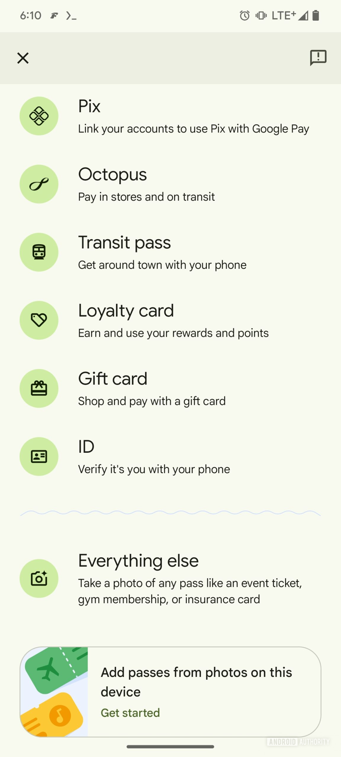
Speaking of UI changes, this version of the Google Wallet app also introduces a minor one. The Everything Else option when adding a new card to Google Wallet is now separated by a divider from the rest of the options.
AssembleDebug / Android Authority
This looks better and adds an element of visual distinction. It’s not a significant change, but it separates potentially actionable cards from photographs of miscellaneous items. This change is live for users in this version of the app.
What do you think about these UI changes? Should Google revert to the Google Pay branding? Let us know in the comments below!
Got a tip? Talk to us! Email our staff at [email protected]. You can stay anonymous or get credit for the info, it's your choice.


 English (US) ·