Edgar Cervantes / Android Authority
TL;DR
- The “Recents” section in the Files by Google app has switched from a 2×2 grid format of folders to a carousel of rectangular cards in the latest beta version.
- The carousel view makes navigation to select files easier for users.
- The new carousel displays individual file previews, with file names, extensions, and a three-dot menu for sharing, deleting, or starring files.
Files by Google, an Android app, has recently undergone a pretty substantial change in beta. Until recently, the “Recents” section featured folders like Camera and Screenshots in a 2×2 grid format. To view the contents of a folder, you’d need to tap it, and all the files within it would open in a grid view. But the Recents sections might soon get a major overhaul if the changes we can see in beta version 1.4374.x are anything to go by.
In the latest beta version, the “Recents” section displays a carousel of rectangular cards that show a preview of individual files, including documents and images (via 9to5Google). This essentially makes your navigation to a document or image quicker, given that you won’t need to tap into a folder to access a particular file. You can compare the difference between the old and new interfaces in the outlet’s image below:
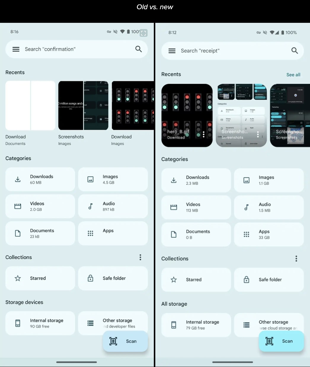
Another noteworthy feature that the reporting outlet spotted is that the cards within the carousel show the name of the file and the extension, alongside a three-dot menu, which will allow you to share the file, delete it, or add it to your Starred folder. Additionally, tapping the card will open the image or document in full-screen mode. There’s also a See all option in the top-right section of the Files by Google app, which you can select to view all your folders.
While interesting, this isn’t the first time Google has used a carousel-style display within one of its apps. The reporting outlet, for instance, noted that this feature is reminiscent of the carousel on the Memories page of the Google Photos app. If you’re yet to see this feature, be sure to update to the latest beta version and wait a couple of seconds for the carousel view to come up.
Got a tip? Talk to us! Email our staff at [email protected]. You can stay anonymous or get credit for the info, it's your choice.


 English (US) ·