With today’s iOS 18 and iPadOS 18 releases, Federico Viticci at MacStories is back with his annual in-depth review of Apple’s latest updates.
Federico, everyone’s favorite opinionated and caffeinated madman, leaves no stone unturned in these reviews. This time, we get an in-depth look at all of the iOS 18 changes, big and small, and Federico’s broader thoughts on the state of Apple’s ecosystem.
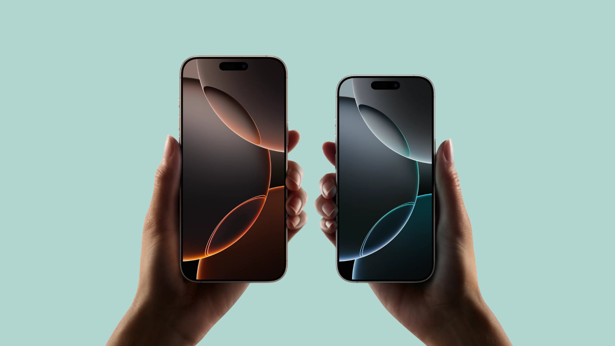
Throughout his review, Federico explains that iOS 18 is “a smaller update than previous years, but a fun one nonetheless.” It starts from the Home Screen changes, which he describes as a “substantial rethinking of the Home Screen and how it can be customized.”
“Despite some lingering limitations on icon placement and widget sizing options, I consider the more dynamic iOS 18 Home Screen layout a success. Apple managed to keep the ideological sanctity of the iPhone’s icon grid while opening it up to users’ creativity, and that’s a great thing in my book. The new system keeps the underlying grid system, so it’s difficult to make something that looks bad or chaotic, but in allowing empty spots between icons, it opens up more personalization possibilities for everyone.
An almost Android-like level of customization combined with the design ethos of iOS is very much a theme for me this year, and the new iOS 18 Home Screen is yet another reflection of it.”
I was particularly excited to read Federico’s opinion on the Photos app redesign in iOS 18. I’m a big fan of the changes, and it sounds like he is, too:
“Earlier in the summer, I thought Apple was going to revert Photos’ drastic redesign like they did with Safari three years ago; instead, they adjusted it based on user feedback, but they stuck with their underlying vision, and I think that was the right call. I do miss the carousel at the top of the screen that I covered in my first impressions story in July and still hope Apple will bring it back eventually. All things considered, though, I believe the company landed on a solid redesign that turns Photos into more than just a bucket to browse your photos. Now, it’s something more like a destination where you can take pleasure in rediscovering memories.”
As always, I will direct you to MacStories for Federico’s full iOS 18 and iPadOS 18 review. I’ve read all of Federico’s reviews over the years, and this one might just be his best. It’s different and more personal than ever, offering a fantastic look at the current state of Apple’s software platforms and a preview of what could be next.
Be sure to join the Club MacStories membership program to unlock even more from MacStories, including some special content from Federico’s review.
And of course, check out 9to5Mac’s full coverage of iOS 18 as well. We’ve got roundups of new features, how-tos, and much more.
FTC: We use income earning auto affiliate links. More.

 3 months ago
20


 English (US) ·