Robert Triggs / Android Authority
Google is pretty well known for building multiple apps to do virtually the same thing — like its five different messaging apps, for example. It seems like its weather app is about to receive the same treatment. Thanks to a source, we’ve learned that Google is making a new one to debut alongside the upcoming Pixel 9.
It’s worth mentioning Google launched a complete redesign of its existing weather section of the Google app last year, which makes launching yet another weather app so soon even more surprising.
The new app will be a part of the existing Pixel Weather app (com.google.android.apps.weather), which was previously only used to provide weather information for the clock app. While the app will be available on the Pixel 9 first (in fact, it will be preloaded from the factory), it will eventually make its way to older Pixel phones, too. We’ve got our hands on a non-final version of the app, which obviously might not be exactly the same as the final build, but it still gives us a good look at what Google is planning for its new weather app.
Minimalism over everything
The first thing I noticed when opening the app is how minimally it’s designed — the background is a simple gradient, running from the top to the bottom of the screen, changing its color to match the current weather conditions. The biggest element on the screen is the current temperature text, written in bold font, with an icon representing the current weather conditions instead of the degree symbol. One casualty of the minimalism of this design is the weather frog — it seems it just didn’t fit in with the rest of the theme.
Below the temperature are the familiar cards providing all the information you’d expect from a weather app — hourly and 10-day forecasts, humidity, sunrise and sunset, wind, AQI, visibility, UV index, and pressure. The interesting new development is that the cards (except the hourly forecast) can be permanently repositioned by holding them down and moving them around.
Tapping on the 10-day forecast opens a similar widget-based UI, albeit with fewer elements and non-adjustable cards.
The location selection screen is familiarly simple but places a little more emphasis on the current weather conditions and the temperature than the old design.
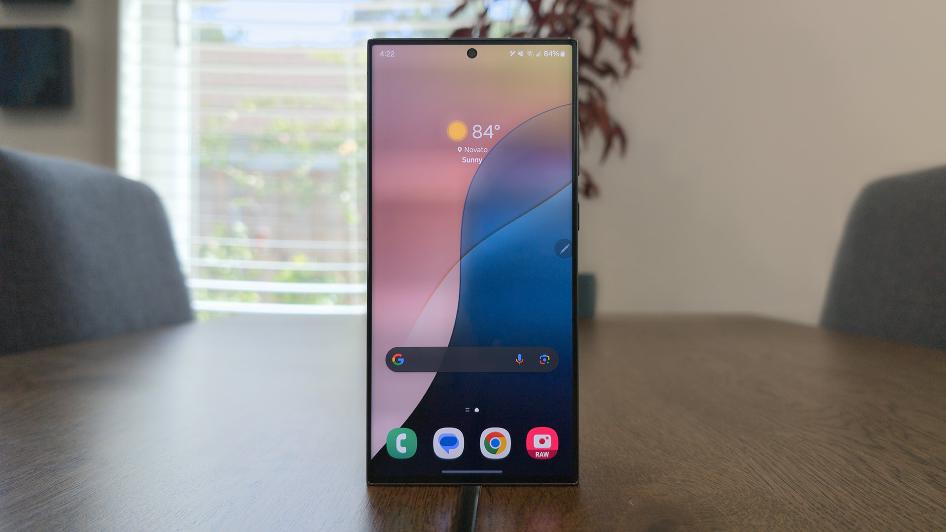
One interesting omission in the new app is the lack of animations of any kind (at least in the version we tested) — the current weather app has little animations in the card and backgrounds, as you can see below.
It’s intriguing to see Google introduce a Pixel-exclusive weather app, especially after launching the redesign of the older weather app not long ago. What do you think about the redesign? Let us know in the comments.
Do you like the look of Google's new weather app?
0 votes


 English (US) ·