Photos App Changes
Apple responded to tester feedback about the Photos app, and there have been some changes to streamline the design. The carousel that allowed users to swipe through different Collections from the main Photos grid has been removed entirely, making the app less confusing and repetitive.
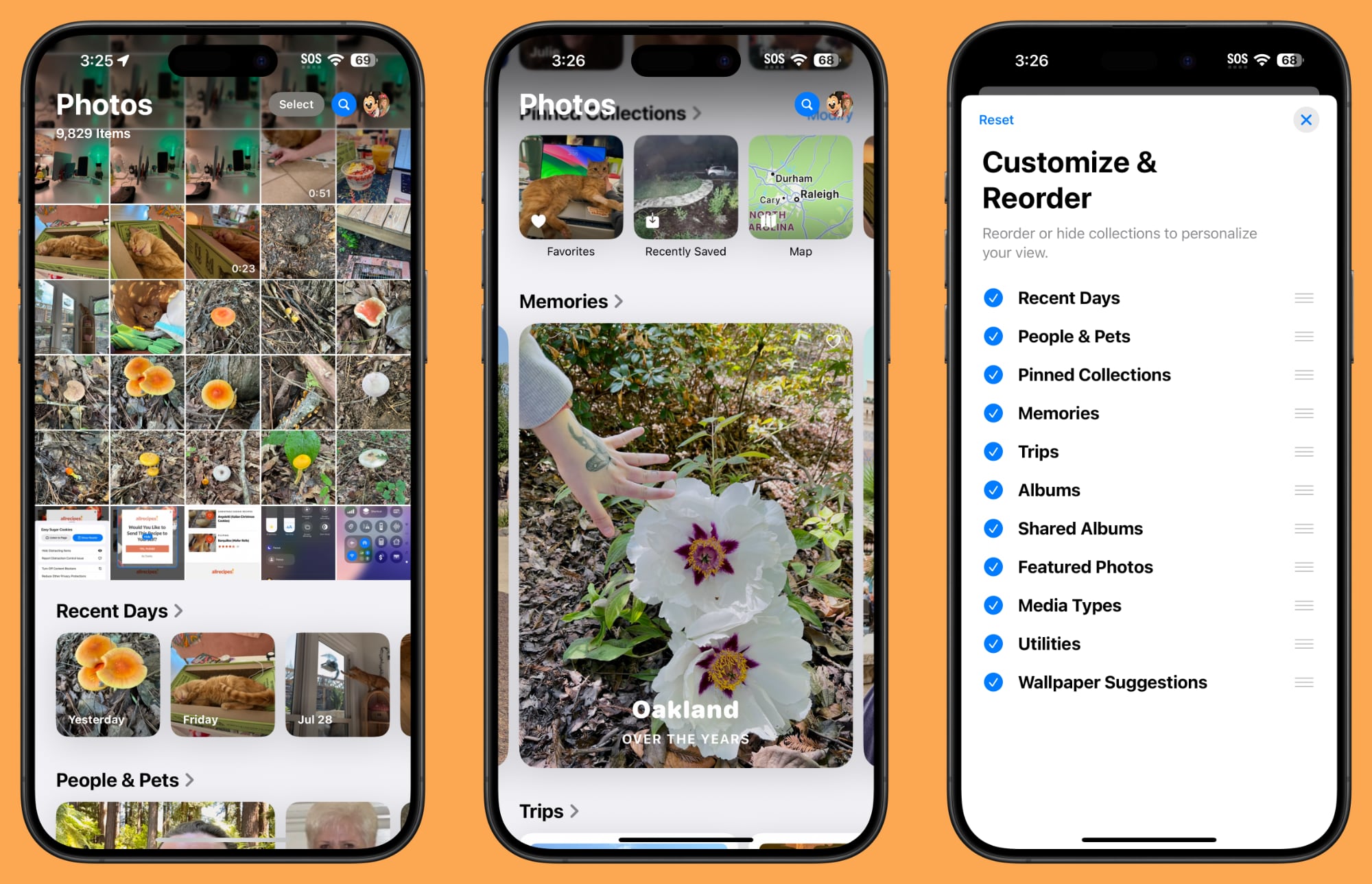
The Photos app still has a unified one-screen design, opening up to the photo grid where you can see all of your photos. With the update, more grid images can be seen at once, and you can scroll down to get to Collections.
Users who have multiple albums will see their albums higher up in the Photos app, and Recently Saved content is now integrated into the Recent Days collection. The order of Collections can be customized, as customization tools remain. You can decide what you want to see in the Photos app and where.
Distraction Control in Safari
Apple added a new Distraction Control feature to Safari, which allows iPhone users to hide distracting elements from a webpage or article. Sign in windows, cookie preference popups, GDPR notices, newsletter signup banners, autoplay videos, and more can be hidden from sight.

Distraction Control is not an ad blocker and it will not hide dynamic elements on a page, such as ads. You can use the feature to temporarily hide them, but when an ad refreshes, it shows back up. It is meant for static page elements.
Distraction Control can be accessed from the Safari webpage settings. Tap on the settings and then choose the Hide Distracting Items option. From there, you can tap the element on the page that you want to hide. Distraction Control does not sync, and page elements must be hidden separately on each of your devices. You can reveal anything hidden by going into the settings and tapping on Show Hidden Items.
Home Screen Options
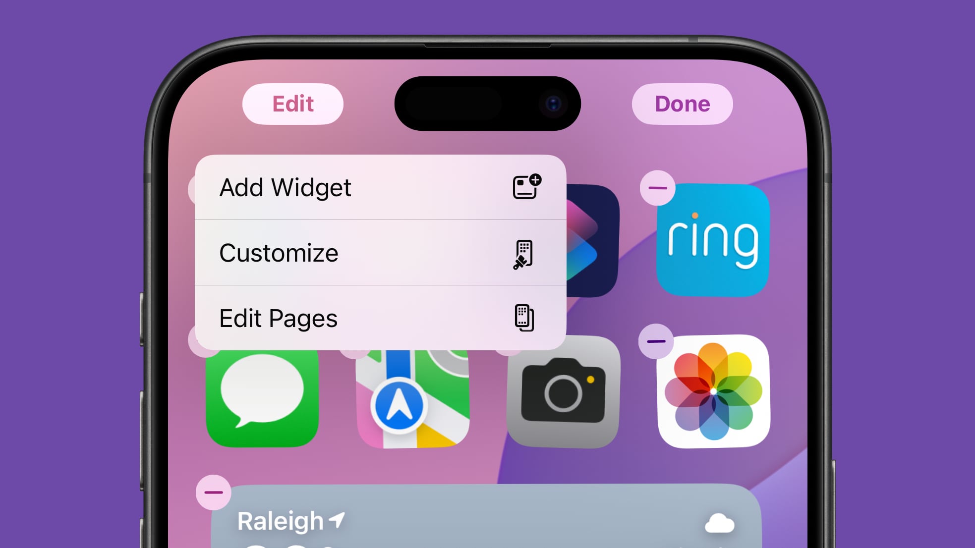
If you long press on the Home Screen and choose "Edit," there is a new "Edit Pages" option. With this setting, you can delete entire Home Screen pages, or hide them from view. This is the same interface you can get to by tapping on the three dots at the bottom of the display when in the Home Screen edit mode, it's just clearer with better labeling.
Dark Mode Icons
Apple changed some Dark Mode options, redesigning the Maps icon once again and updating the Find My icon. The Maps icon is now black, white, gray, and blue, with Apple eliminating the other colors, while Find My now has more obvious rings in different shades of green.
Dark Mode Search
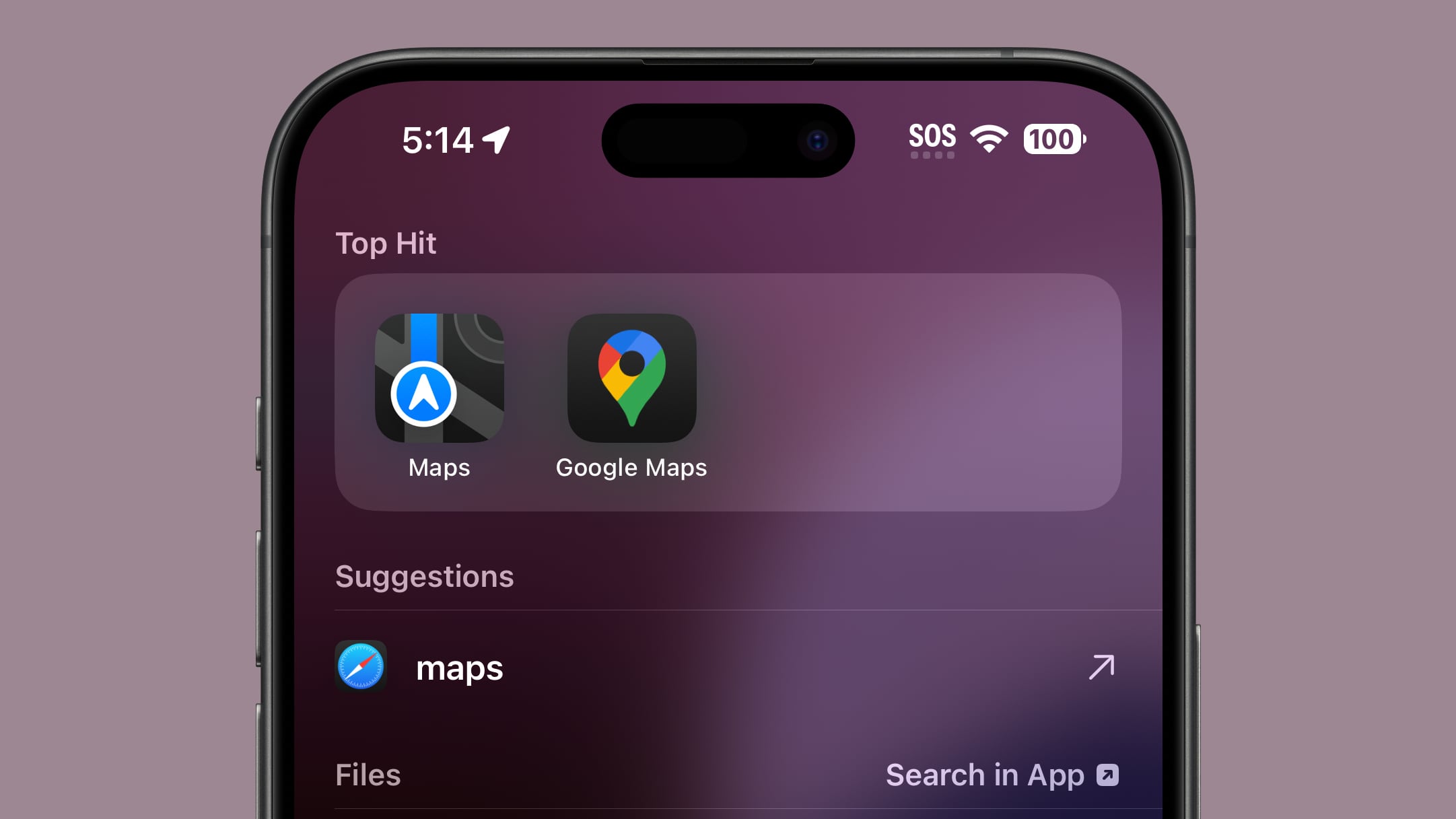
When you search for an app using the search interface, the app icon now correctly shows up in Dark Mode when Dark Mode is turned on. Previously, search showed Light Mode icons.
Control Center
Apple has altered the design of some Control Center icons.
Several icons have larger graphics:
- Voice Memo
- Stopwatch
- Airplane Mode
- Home
- Remote
- Shortcuts Open App option
- Calculator
- Scan Code
- Magnifier
- Wallet
- Tap to Cash
- Assistive and Guided Access
- Hearing, Live Captions, and Left-Right Stereo Balance
- Switch Control, Voice Control, Full Keyboard Access, Assistive Touch, Apple Watch Mirroring, Control Nearby Devices, and Eye Tracking.
- Almost all Vision Accessibility icons
And there are several design changes:
- Orientation Lock is now a red lock with a pink arrow.
- Screen Recording has a smaller inner dot and a thicker outer dot. When activated, the outer circle is a darker red, the inner circle is the same bright red.
- Screen Mirroring has different sized rectangles with one darker and one lighter.
- Cellular Data now has four signal bars instead of an antenna.
- Orientation Lock now has a gray arrow instead of a white arrow.
- Shortcuts now includes a black and white version of the Shortcuts icon.
- The Low Power Mode toggle battery graphic shows less of a charge and the battery outline is now gray instead of white. When it's on, the battery level and outline both turn yellow.
- The Live Speech toggle has a white keyboard and a gray sound wave instead of the opposite.
- Headphone Accommodations now has an ear icon instead of a headphones icon.
- The Vehicle Motion Cues toggle now has a car icon instead of just dots.
- Smart Invert's colors have changed (white main, and gray star, instead of the opposite).
Apple has also removed the non-functional Bluetooth Power Toggle setting that popped up in the last beta.
More New Changes
Know of a new feature in iOS 18 beta 5 that we left out? Let us know in the comments below.
This article, "Everything New in iOS 18 Beta 5" first appeared on MacRumors.com
Discuss this article in our forums



 English (US) ·