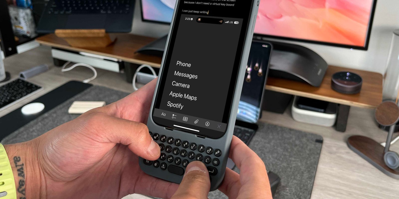
Earlier this year, Clicks announced their Clicks Keyboard case for the iPhone 14 Pro and 14 Pro Max. They wanted to bring back the tactility of a physical keyboard to the modern smartphone. As someone who loved using Blackberry Pearl and Bold and the T-Mobile Sidekick back in the day, I was immediately intrigued. But I also had a lot of questions, like: Will the total package be too big? Will it drain my iPhone battery? Is it a true daily product or more of a nostalgic gimmick? To my surprise, the Clicks Case was actually awesome for many reasons. But also has room for improvement. Here is my Clicks Keyboard Case for iPhone review.
If you want to get a hands-on look and video review, be sure to check out the YouTube video below!
Clicks Keyboard for iPhone
I wanted to give the Clicks Keyboard a fair shot, so I used it on my iPhone 15 Pro Max for over two weeks. I would remove the case for other use cases in some situations, but we will get to that in a bit. The review is broken down into the hardware, the software (because there are some nice software shortcuts), and my overall experience.
Clicks hardware
The case itself is very well-built. The Clicks team had the tough task of creating a relatively premium product while keeping it lightweight. They were fully aware that making this case out of heavier materials would be a non-starter for some customers because they had to consider the weight of the iPhone and the case combined. They combined soft plastics and silicon to make this case both protective and malleable so you can confidently remove and put back the iPhone multiple times a day. Another piece to consider is that since the case runs off of the iPhone battery, there is no battery in the case, which will significantly reduce the weight. So the first thing you notice is actually how lightweight the case is, especially considering what you are getting.
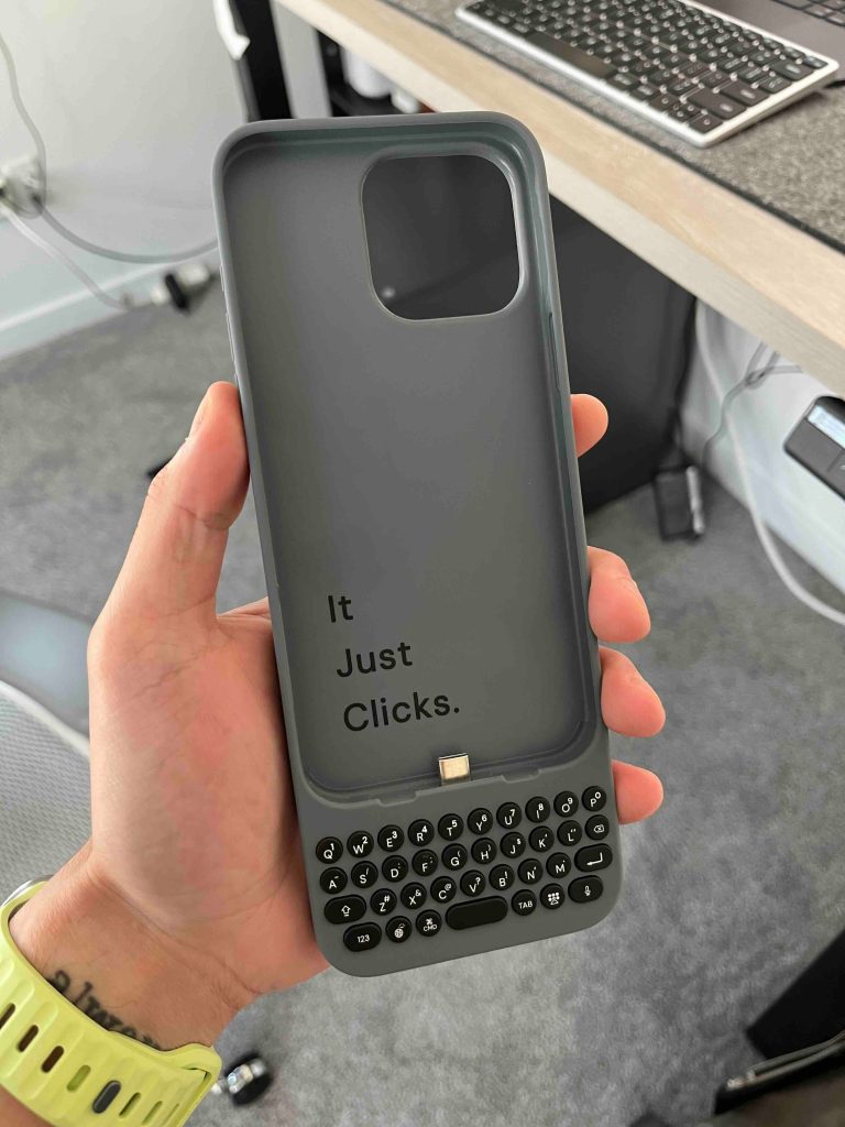
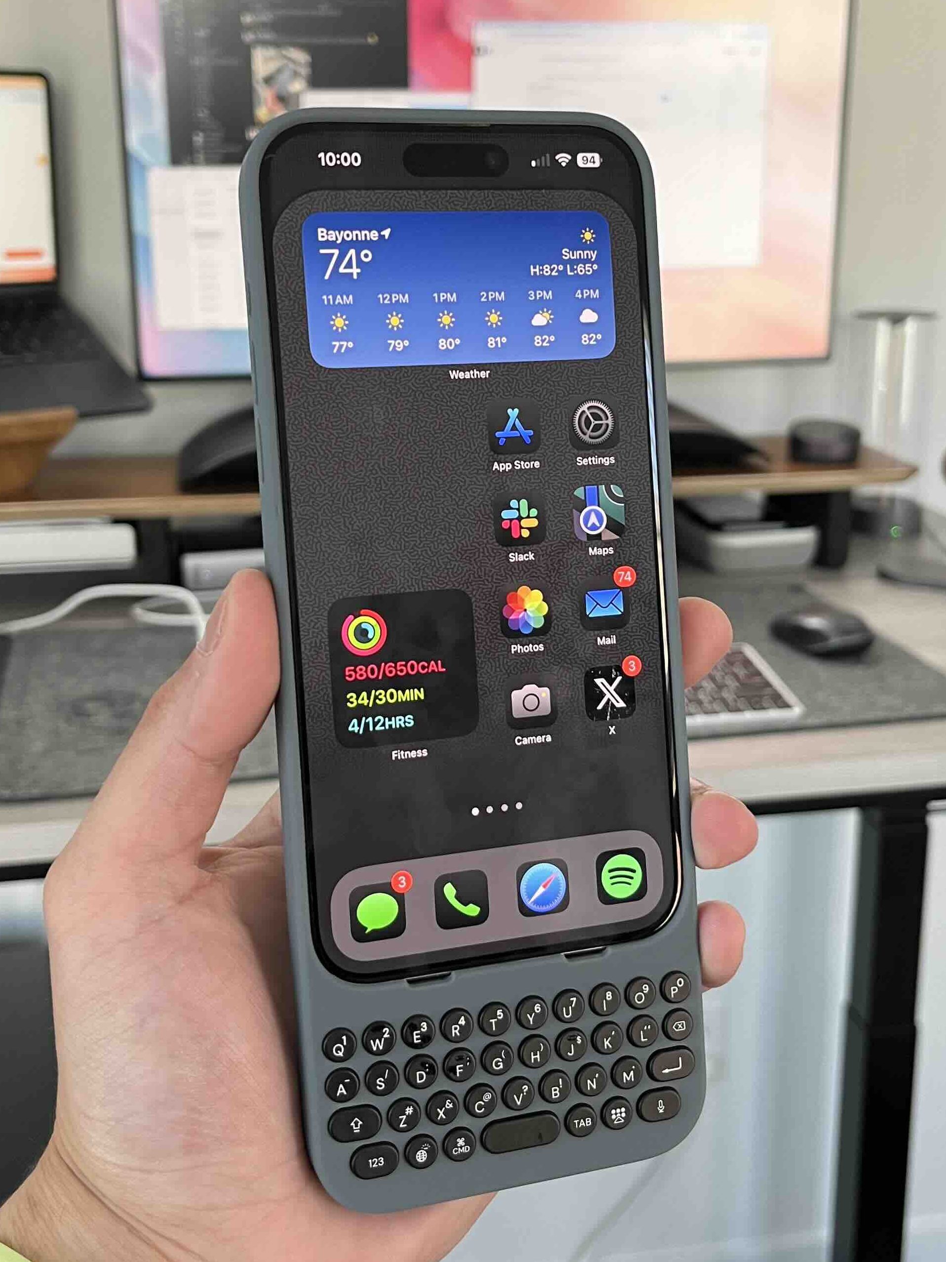
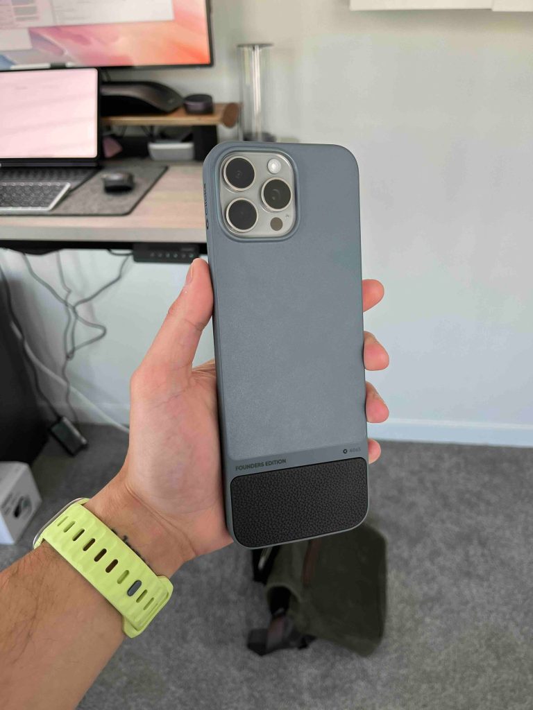
Again, I am using the largest case for my iPhone 15 Pro Max and below are some of the specs
- 65g in weight (62g for the 15 Pro model)
- USB-C for charging
- Supports fast charging power passthrough
- QWERTY keyboard layout
- Four colors: London Sky, BumbleBee, Miami Beach, Royal Ink (I have the London Sky variation)
The keyboard
Clicks decided to mimic the layout of the iPhone virtual keyboard. I think this was a great idea because it makes it extremely familiar since iPhone users will use it. Everything is placed where you would expect it to be, from the Caps Lock button to the enter key and the backspace button. So it is just a matter of training your hands and fingers to type on a tactile keyboard again. When I first started using it, I was immediately brought back to 2005 when I typed away on my Blackberry. The keys are very similar. They are round and have just enough give to make it satisfying to press it down but enough resistance to avoid accidental presses.
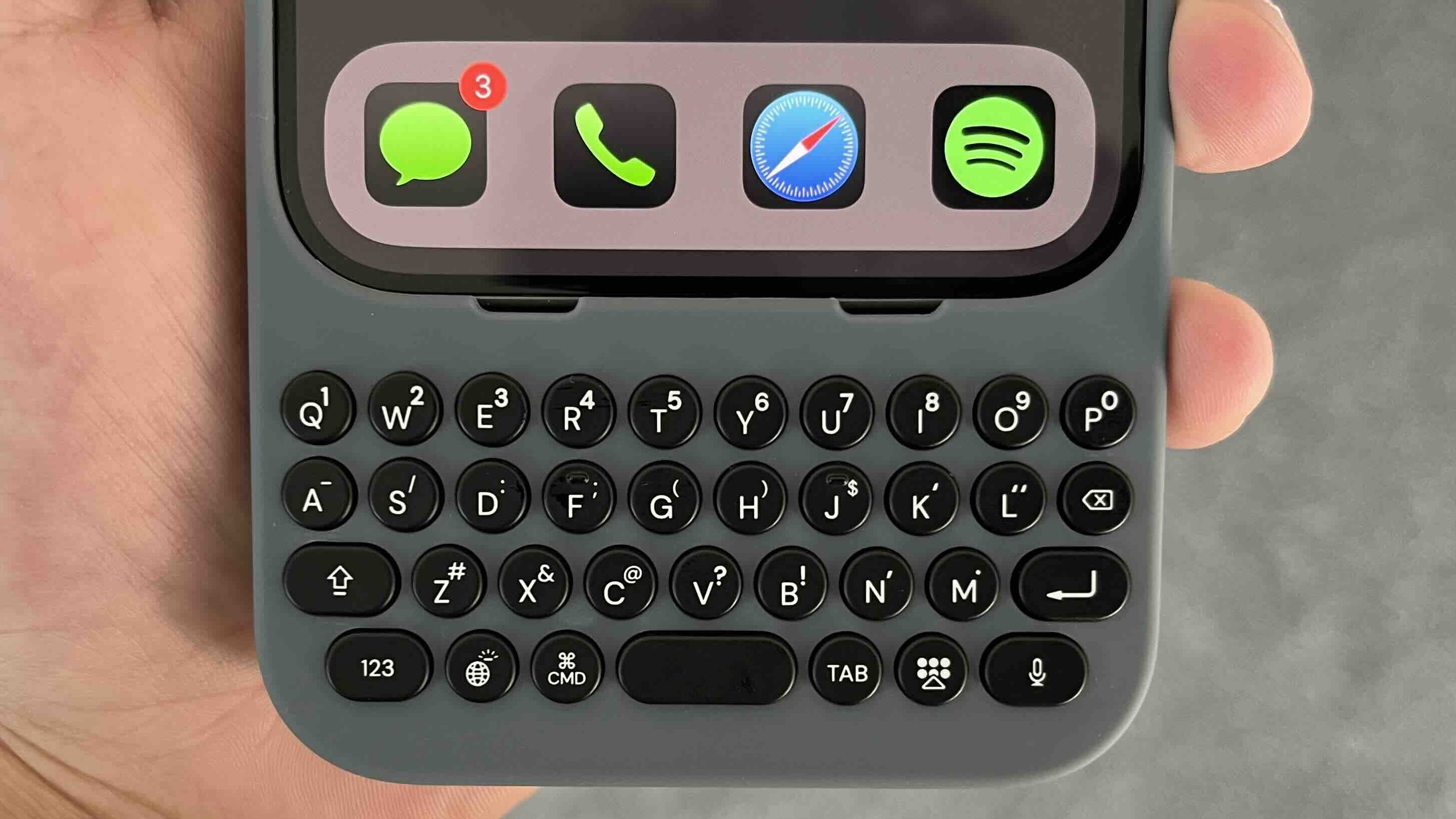
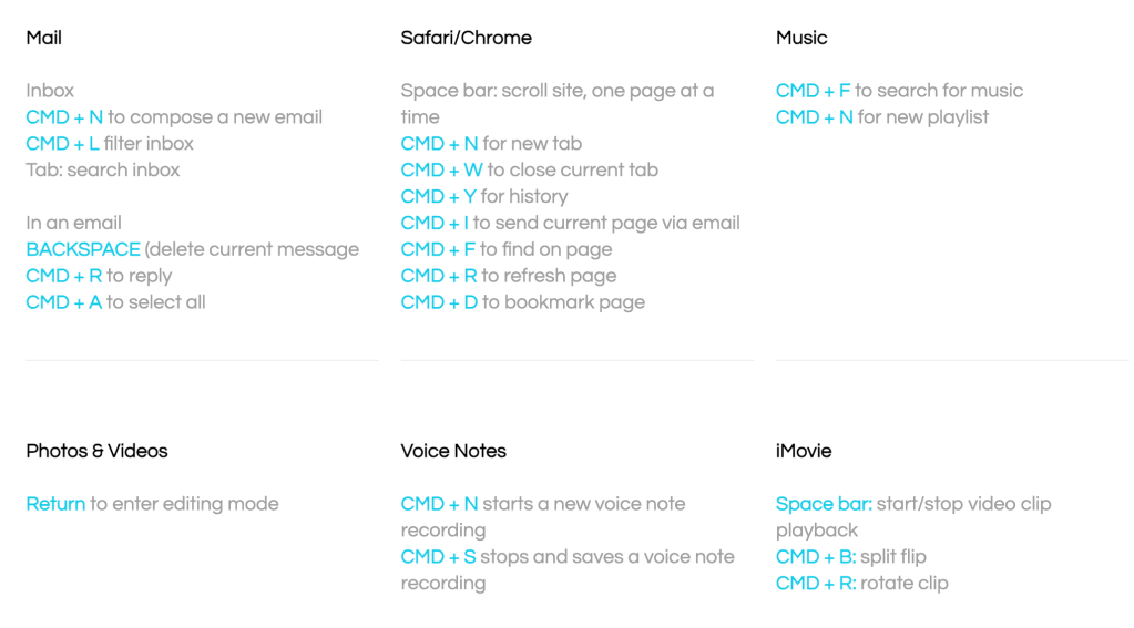
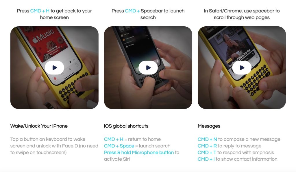
When you first get the device, a QR code in the packaging tells you to follow a get-started guide. The guide teaches you how to put the iPhone in the case and then how to use the keyboard. What I like about this guide is that it shows that the keyboard allows you to perform shortcuts natively. You can go home by pressing CMD+H or bring up spotlight search with a CMD+space. Below is a list of all the shortcuts they provide and even some apps that will allow them. These shortcuts really made learning and navigating the case very efficient.
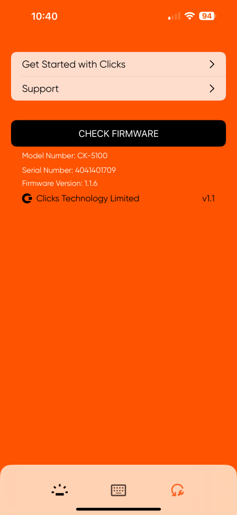
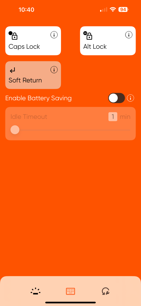
The Clicks app
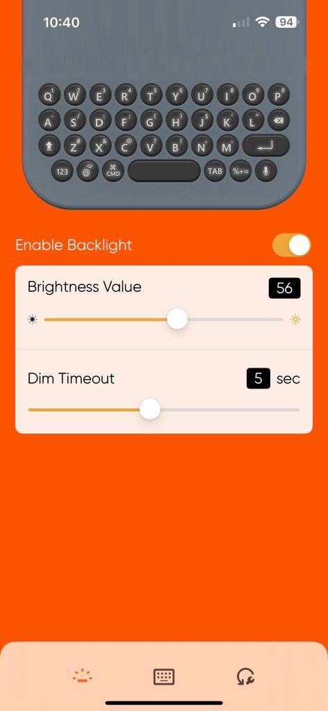
The corresponding app is very simple. It’s there for a few reasons:
- Keyboard brightness control (yes its backlit!)
- Battery saving mode
- Caps Lock, Alt Lock, and Soft return settings
- Firmware updates
The biggest feature here is battery management. When Apple introduced the USB-C port to the iPhone, it opened up the iPhone to be used with many accessories. But one thing that happens is that when a device is plugged into the USB-C port, it will ALWAYS draw a bit of power. So, the battery setting will physically cut power off to the case if it is idle for a certain amount of time. This will stop that phantom drain when it is still on your device. The soft return feature is also a must, it allows you to decide if you want the ENTER key to either skip a space down or be your SEND button when in a messaging app!
 Screenshot
My experience – the good
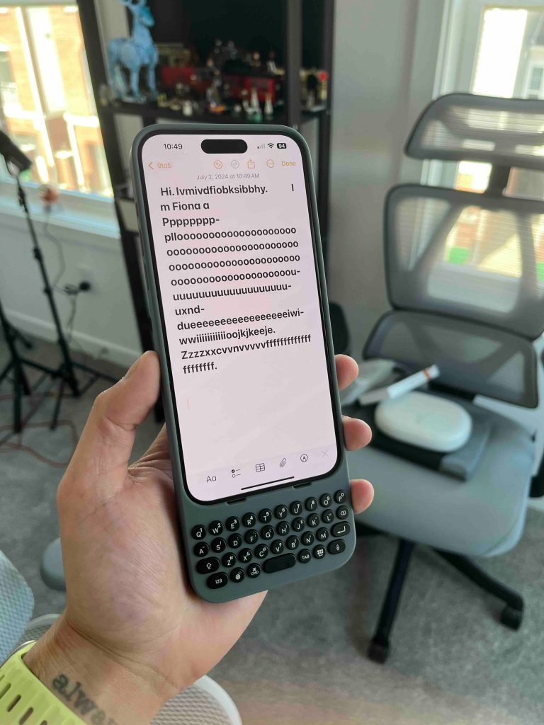
Overall, I am a big fan of this product. It took me about three or four days of fully committing to the keyboard to get good with it. I still type faster on my iPhone keyboard, but something about physically pressing down keys is just so satisfying. So, I have been using this for iMessage and the Notes app and sending short and long emails. It’s been a pleasure to use daily. My absolute favorite shortcut is using the Space bar to scroll through websites. So you do not need to even touch the iPhone screen.
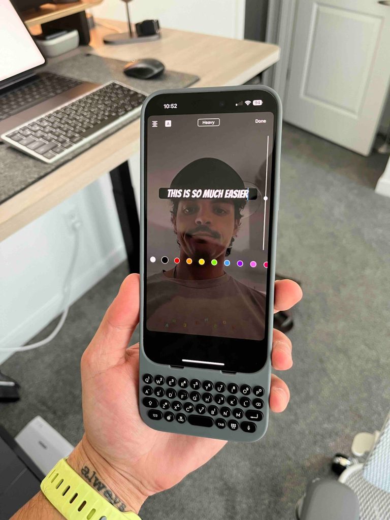
One of the biggest selling points is that when you are using this Clicks case, it completely opens up the iPhone display. If you really think about it, the virtual keyboard takes up almost half of your entire iPhone screen in any situation. So now, if I am sending messages, I can see more of a conversation in one glance, or I can edit a YouTube short with the content taking up the entire screen. I think this is where the value really starts to come in. You do not realize how much of the display is being wasted on the virtual keyboard.
Lastly, its a great conversation starter. Pull this thing out in public, and someone will 100% ask you about it!
What needs improvements
This is a first-generation product, so there is always room for improvement. Two things need to be updated for this to tick all the boxes. Firstly, they should add MagSafe. I understand that they were trying to cut out anything that added additional weight, but I think including Magsafe magnets would have been a nice touch. With the case on, you can still wirelessly charge the iPhone, but it must be flat. If you have a flat Magsafe puck, you will feel the magnets, but if you have a standing Magsafe charger, it will not be strong enough to hold the iPhone and case together.
Secondly, the USB-C port. I spoke to the Clicks team about this and for the USB-C iPhones (not the lightning versions), Clicks had to decide if they wanted to allow for charging or data. They could not choose both. As someone who uses their iPhone for content creation, I constantly offload footage from my iPhone to my Samsung T7. So I use that USB-C port daily. This means that every time I need to do that, I need to remove the case because there is no data passthrough on the case itself. Unfortunately, this also means that if you use wired carplay, you need to remove the case to get Carplay working.
One thing to note is that if you purchase the versions for the 14 Pro and 14 Pro Max, data will work with the case. Again, the limitation of the iPhone 15 lineup has to do with the USB-C port. So, the lightning port, in this case, actually gives you more usability when using the case.
Pricing, availability & final thoughts
The Clicks case is currently on sale for the iPhone 14 Pro and Pro Max and the entire iPhone 15 lineup. I wish I had a smaller iPhone to compare the sizes and see how they felt because I think smaller iPhones will be better for usability. The smaller versions are $139, and the larger version is $159. They are available directly from the Clicks website, but they recently partnered with Best Buy to make them available there (I would order through Best Buy for faster shipping or in-store pickup!)
All in all, I do enjoy this product. I see it as more of a tool I keep with me versus something I have on my iPhone all day. The typing experience is amazing, and the overall feel just brings you back to a simpler time. So I would say this has been surprisingly great. What do you think about this? Is this something you would use or get? What was your first smartphone prior to the iPhone era? Lets discuss below!
FTC: We use income earning auto affiliate links. More.

 5 months ago
137



 English (US) ·