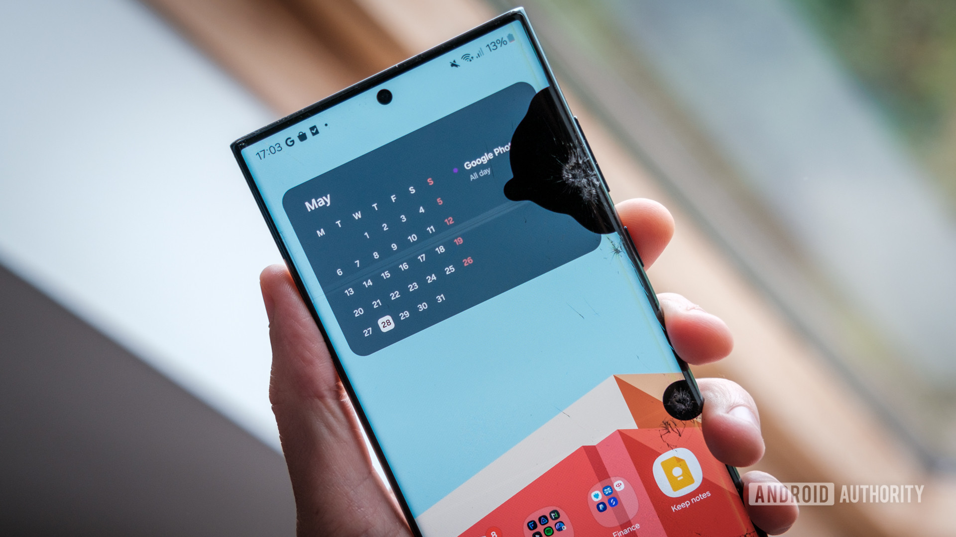
Robert Triggs / Android Authority
As someone who reviews phone cases for Android Authority, I don’t often use a naked smartphone. When I get a new device, it’s nearly always to review cases. But when the Google Pixel 9 came in, I decided to do something different. After I had finished testing way too many Pixel 9 cases, I decided to bare it all and use the phone without a case for a few days.
Daring, I know.
And man, what a mistake. All of the grip and comfort that I judge cases on was immediately thrown out the window as I held on to the phone for dear life.
A slippery slope
Ryan Haines / Android Authority
Glass sandwich designs with metal rails certainly look nice, but in practice, they’re extremely slippery. Even the buttons are nearly flush with the sides, which, again, looks great, but provides absolutely nothing to hold on to.
If I had to describe my experience in one word, it would be stressful. Every time I pulled that $800 bar of soap out of my pocket, it felt like I was playing a round of Squid Game just to check my email.
The phone didn’t fare much better when I set it down. The raised camera bar meant that only a fraction of the back was touching the surface, so any slope at all would cause the phone to slide onto the floor. It was somehow worse than setting the phone screen down, which, as far as I’m concerned, is a cardinal sin in the tech world.
Looking at the other recent smartphones I’ve tested, it seems that at this point, everyone is favoring aesthetics over usability.
Do you think modern phones are too slippery?
0 votes
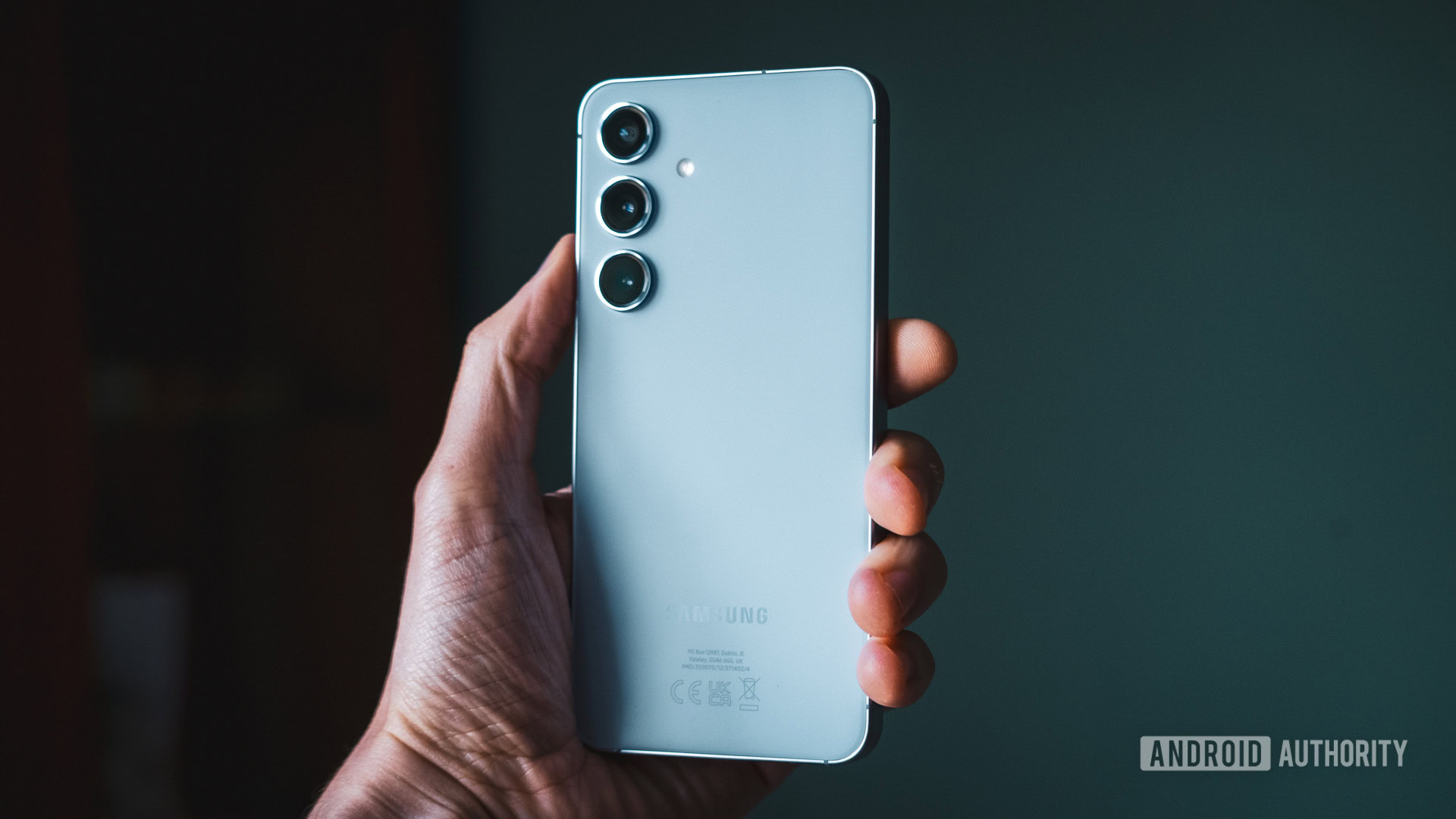
Robert Triggs / Android Authority
Galaxy S24
Obviously Apple’s iPhones are the original offenders, but the Samsung Galaxy S24 series follows the exact same design principles. In fact, the frosted back of the Galaxy S24 is even more slippery than the Pixel 9.
And for what? So they can look better in advertising photos? I see no practical advantages to glass sandwich smartphones when it comes to actually using (or even holding) the device. We can pretend that this is progress, but in reality, all of the gains of more resistant materials like Gorilla Glass Victus 2 are lost if you drop the phone twice as often.
The only advantage is for OEMs like Apple, Samsung, and Google, who can upsell you on a case you otherwise wouldn’t need.
The good old days
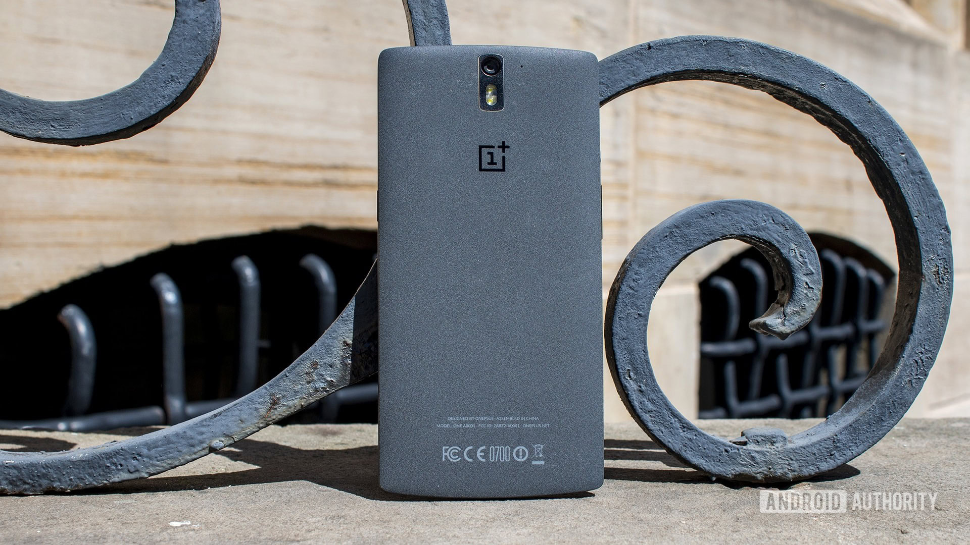
For reference, the phone I’ve used the longest is the OnePlus 8 Pro from 2020. With a glass back and a waterfall screen, it feels like a device at the turning point for smartphone designs. It’s still a glass sandwich, but it doesn’t have the slick, flat aluminum rails that Apple inflicted on the smartphone world with the iPhone 12 later that year.
If you go back a few years in OnePlus’ history, you can find phones with incredible grip and great aesthetics. The sandstone finish on the very first OnePlus phone back in 2014 was an iconic part of the design, and although the brand has since adopted glass backs, it still sells first-party sandstone cases. That’s what I used on my OnePlus 8 Pro for years.
Older smartphones had interesting designs that weren't slippery.
Around the same time period, the Nokia Lumia lineup often featured matte plastic backs that were not only more grippable but could also be swapped out. Others, like the LG G4, had a spiffy leather backing that added grip and looked great. The bamboo backing on the Moto X is another example.
Nowadays, a few phones offer interesting backing materials, but they tend to be niche. The Poco X6 Pro is one, with a bright yellow pleather backing, but the rest of the phone leaves a lot to be desired. Others, like the OnePlus 11 Jupiter Rock edition, are more of a press piece than a true mainstream product.
Apple, Samsung, and Google have continued to pull from the same design language for nearly four years, only changing the shape and placement of the camera bump.
An easy fix
Nick Fernandez / Android Authority
So, what’s the best way to get texture on your glass sandwich phone? You guessed it, a case.
My current favorite case, the Mous Limitless, comes in leather, bamboo, walnut, fabric, aramid fiber, and acetate finishes. However, it’s limited to just part of the phone’s back. The sides are made of a thicker hybrid material for better drop protection and grip.
There are full-leather cases from Bellroy or Mujjo (for iPhones, at least), microdot grips from dbrand and Caseology, and even more subtle patterns like the Casetify Ripple. All of them offer far more grip than the bare aluminum and glass builds you find in modern smartphones.
You need a case to get decent grip on modern smartphones.
I understand that some people value the thinness of modern smartphones, and although I still think you’re wrong, there are options for this, too. The Mous Super Thin is the thinnest case I’ve tested, but cheaper Spigen options are also great. Thinborne even makes a thin case that’s covered in aramid fiber.
What will it take for smartphone manufacturers to at least experiment with these materials? Are we going to be stuck with glass sandwiches forever? It’s been four years, more than enough time for another paradigm shift.
After a few days, I was ready to run back into the open arms of my favorite case. Maybe I’m biased after spending so many hours testing them, but it really does feel like the true smartphone experience starts when you slap a case on your shiny (and slippery) new device.
That’s my opinion, and now it’s time for yours. If you don’t think modern smartphones are slippery, head to the comments section and tell me why I’m wrong — see if you can change my mind on this! I’ll do my best to respond to as many comments as possible to get the conversation going. Also, feel free to share if you do agree with me — I’d love to see who’s on my side.


 English (US) ·