Ryan Haines / Android Authority
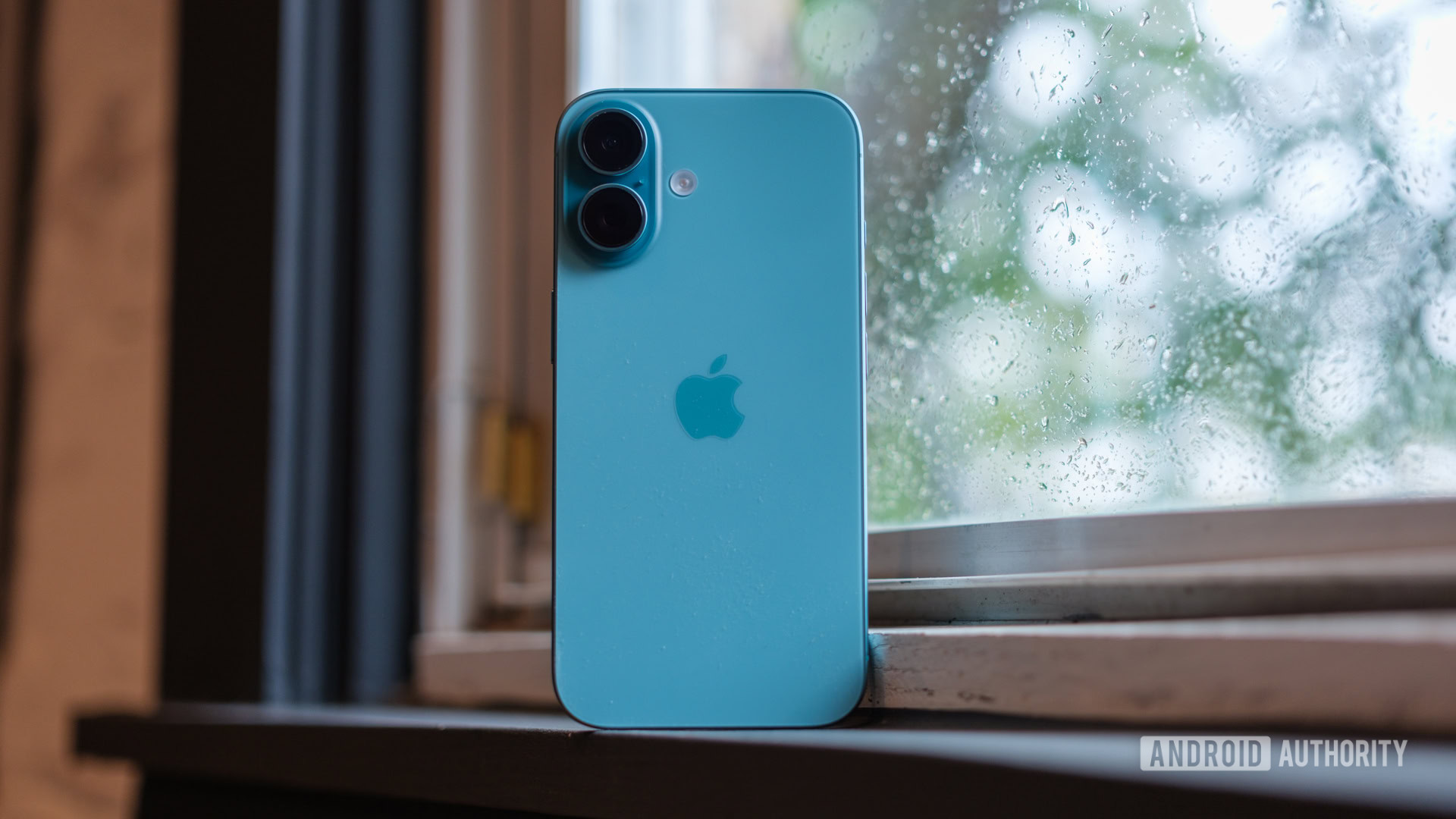
It’s tough to top the feeling of unboxing and setting up a brand-new phone. Even if you restore all of your data and apps, it feels like you’re getting a fresh start. That fresh start usually comes with a whole bunch of exciting new features, too, but they’re not always easy to find. Now that Apple has added some new buttons and ways to customize the look and feel of iOS 18, setting up an iPhone 16 can feel more complicated than ever.
Thankfully, we’ve already had a few days with the entire series, and we’ve picked out a few things that can make your iPhone 16 feel more personal right out of the box. Here are a few tips and tricks to get the most out of your iPhone 16.
Apple iPhone 16 tips & tricks
Tap into the Camera Control
Ryan Haines / Android Authority
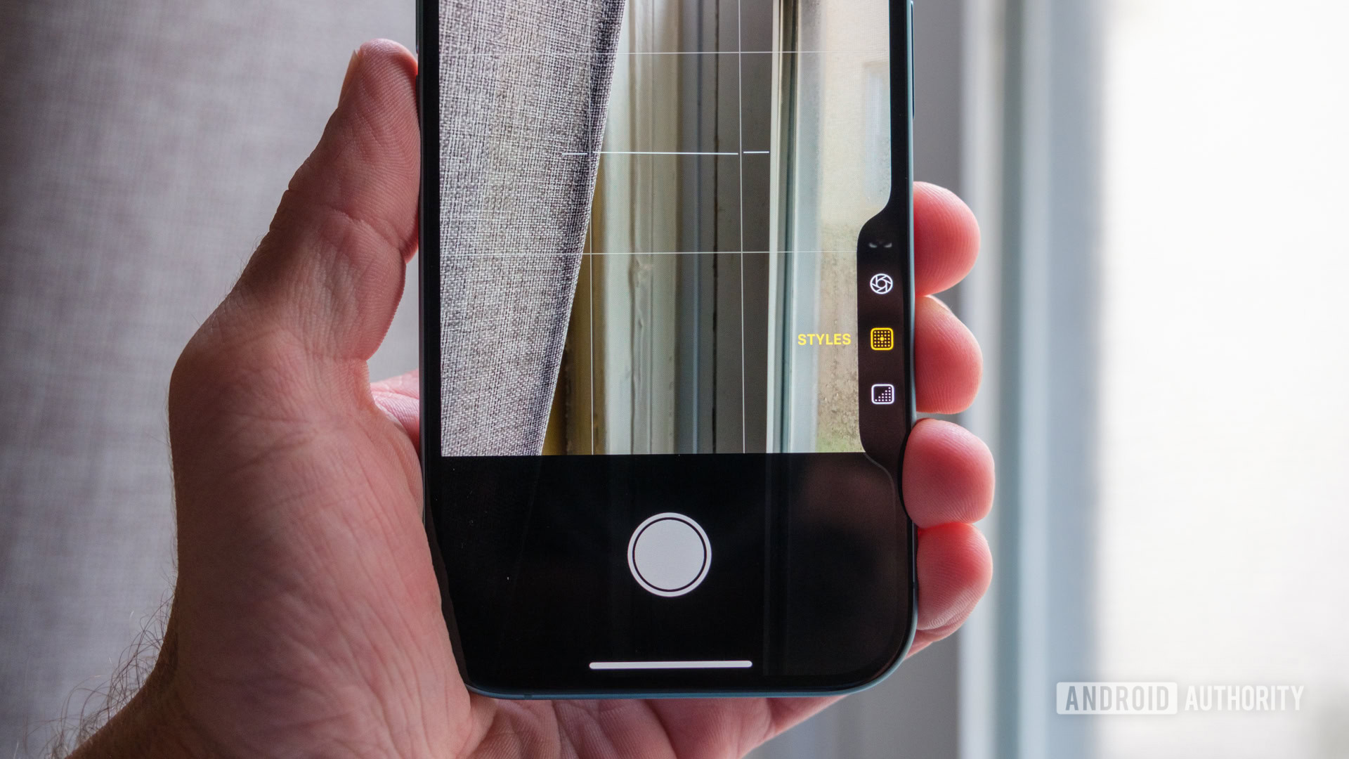
Of course, there’s no better place to start exploring the iPhone 16 series than with the Camera Control. After all, it’s the one new button (that’s not just a button) that makes its way to all four iPhone 16 devices. The Camera Control isn’t hard to find as you feel your way around your new iPhone — it sits low on the right side, right around where the 5G window used to be — and is pretty easy to reach in either landscape or portrait orientation.
When you start to play with the Camera Control, you’ll quickly realize why Apple didn’t want to call it a button. Although it technically is one and can easily be used to trigger the camera shutter, it does so much more than that. Rather than poorly explaining how to open and use the Camera Control, I’ll run through what each type of press does.
- Firm press: Opens the camera and also triggers the shutter.
- Single half-press: Opens the previous menu to scroll through.
- Double half-press: Opens the overall camera menu to change settings.
Using the Camera Control works like this: Press the button once to open your camera, then lightly tap it twice to swap between zoom, depth, exposure, and Photographic Styles. Once you’ve chosen a setting, you can reaccess it with a single light tap. You should know, however, that you don’t have to swipe on the Camera Control itself to control your setting — instead, it’s much easier to swipe up and down on the edge of your display.
Rearrange your Home Screen
Ryan Haines / Android Authority
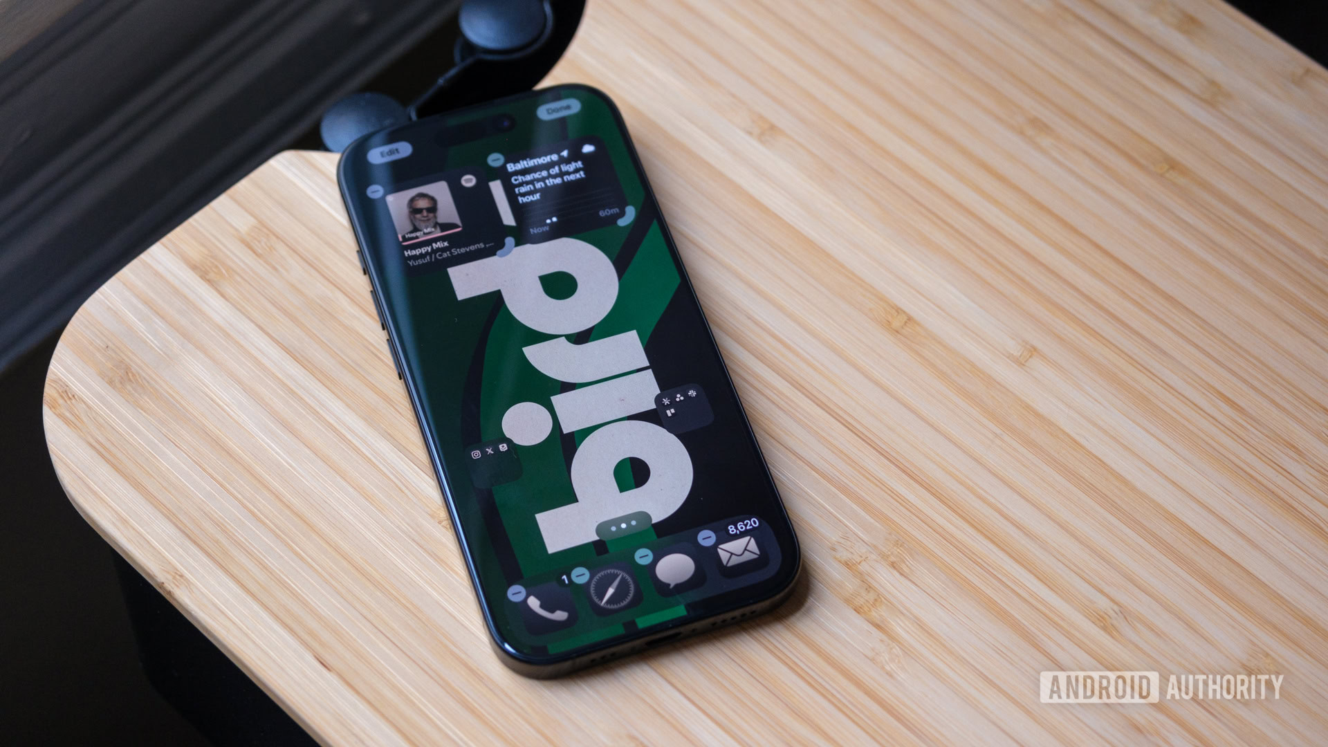
One of the key pieces of iOS 18 is that it now feels more like Android than ever. And by that, you can finally rearrange apps and widgets so they don’t all float to the top of your screen. As someone who loves a clean, simple setup, iOS 18 has been music to my ears. Thankfully, rearranging your home screen is no different than in previous versions of iOS; you just have more control over it. So, when you’re ready to mix things up, simply long-press on your wallpaper and start dragging things around.
Right now, I’m running with a lean, mean layout reminiscent of my usual Android preference. That means I only have a social folder and a work folder within reach, as well as my four essential apps (Messages, Mail, Safari, and the dialer). I kept Weather and Spotify widgets at the top, too, but I’ve relegated everything else to the App Library on the side. It’s not quite as second nature as swiping through an app drawer, but I prefer it to the clutter Apple previously forced on me.
While you’re rearranging, you may as well check out Apple’s colorful new app icons. You can change them via the same long-press on your wallpaper and then tap the Edit and Customize buttons — in that order — to open up app settings. From there, you can fine-tune your icons: Light, Dark, Automatic, or Tinted. The first three are pretty straightforward, while the last one lets you match your app icons (and parts of some widgets) to a color in your wallpaper.
Customize your Control Center
Ryan Haines / Android Authority
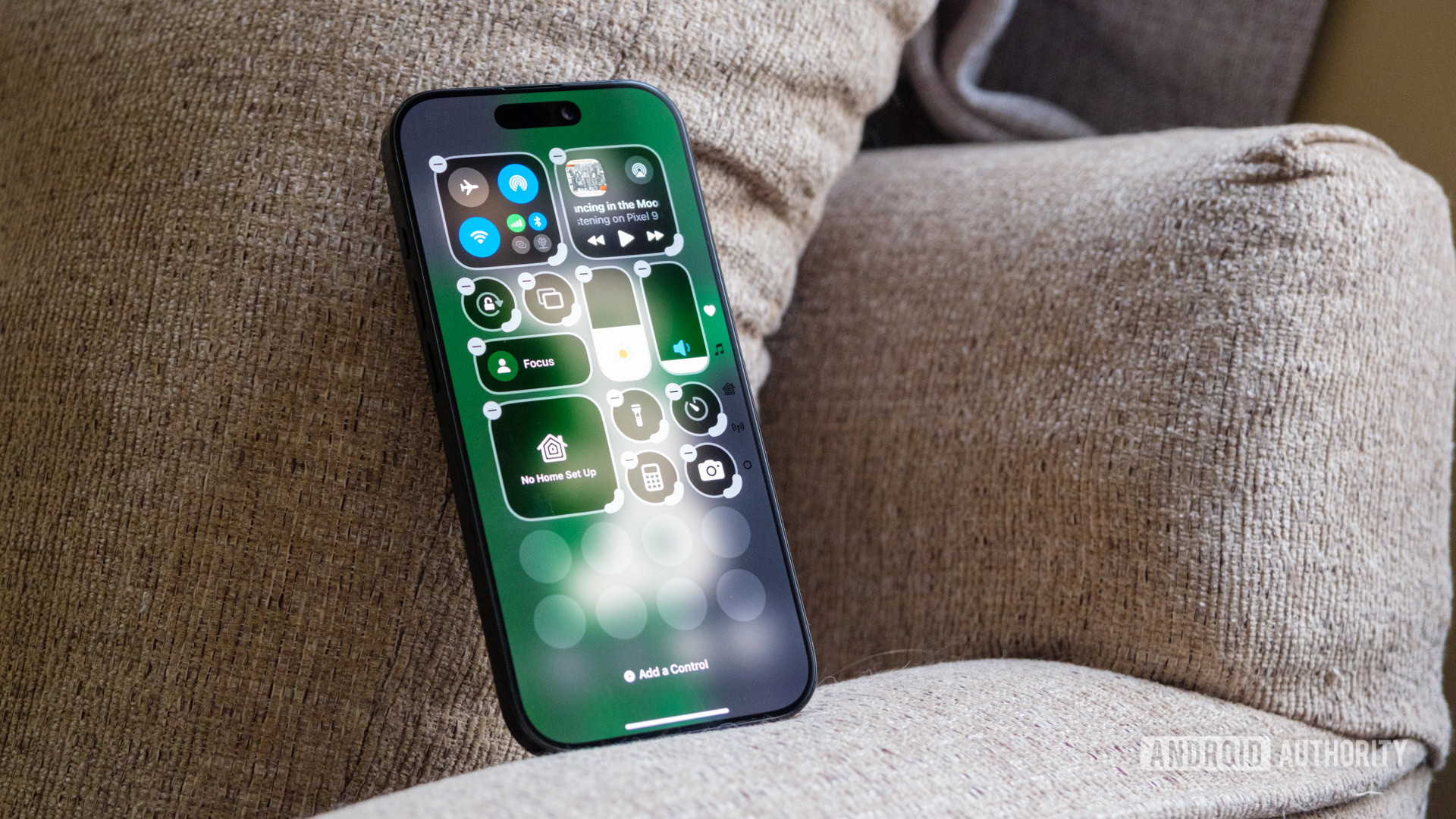
While we’re on the topic of rearranging, Apple has completely redone its Control Center for iOS 18. Like moving around apps and widgets, you can drag and drop different Control Center buttons to make them easier to reach. Even if you don’t want to move your controls around, there are still plenty of new ones to dig into. Instead of the previous Control Center, which offered just a single menu of quick toggles, you now have access to four different screens — one for your iPhone’s media, one for Home controls, one for connectivity, and, of course, the customizable favorites menu.
If you’re ready to mix up your Control Center, here’s what to do:
- Swipe down to open the Control Center.
- Tap the plus-shaped icon in the top left corner.
- Drag and drop your controls.
- Press Add a Control to choose additional buttons from the menu.
And yes, the best news of all is that the Control Center works like the home screen — you no longer have to reach the top of your screen.
Check out the new Photos app
Ryan Haines / Android Authority
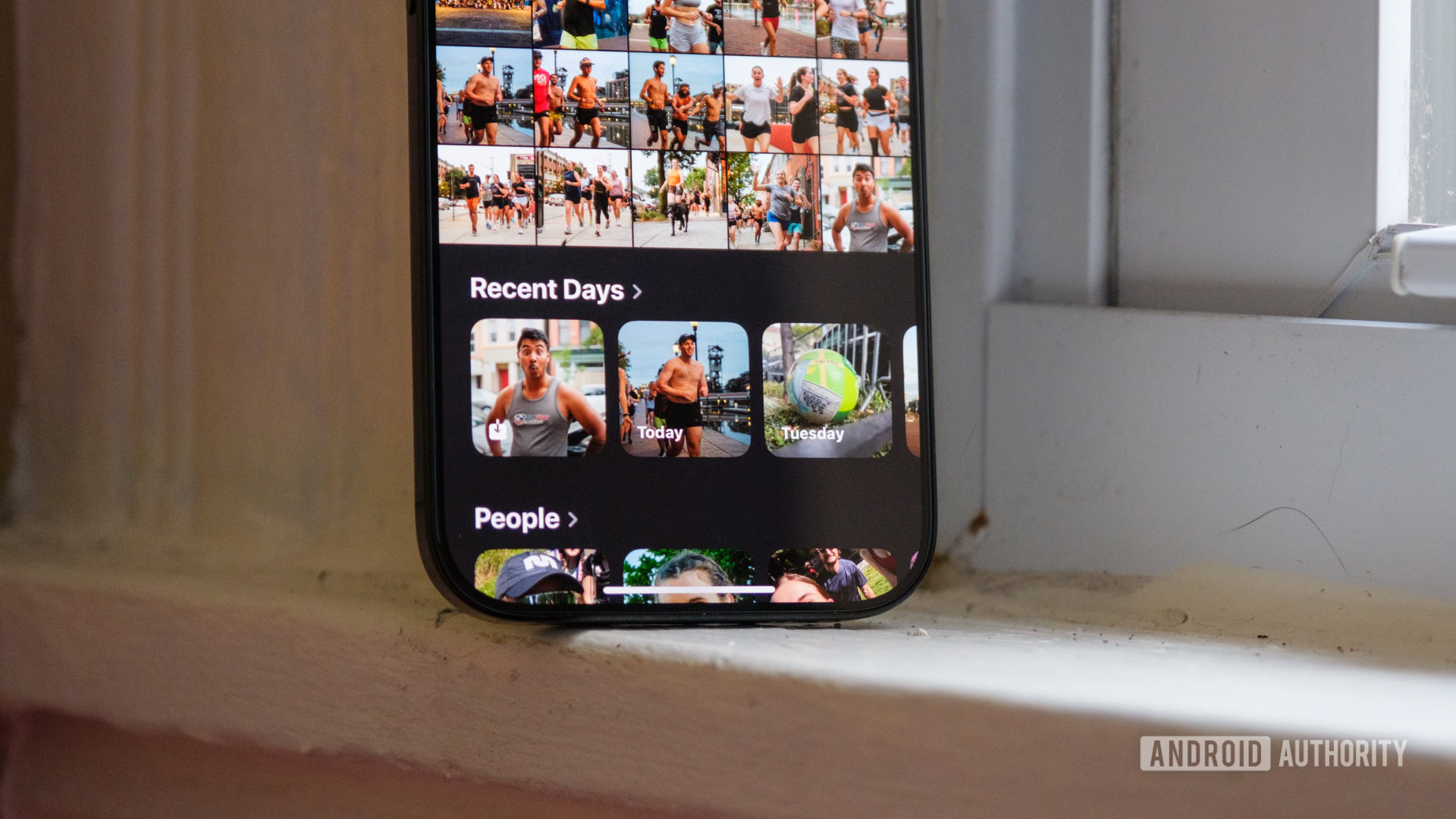
Apple also finally decided to show the Photos app some love to match its camera updates, but the new layout takes a bit of getting used to. It’s both more cramped than before yet easier to navigate. The default layout now shows five photos per row, starting your gallery about two-thirds of the way down the screen. Below that, you’ll get a tab marked Recent Days, which covers days when you took several photos, and a tab marked People for faces that appear often. Unfortunately, Apple doesn’t consider pets people, so you’ll have to work a little harder to find your furry friends.
Outside of the shuffled layout, there’s not much to explore with Photos in iOS 18, at least not yet. Before long, it should be one of the stars of Apple Intelligence, at least once it can remove objects like Google’s Magic Editor does.
Grab a protective iPhone 16 case
Ryan Haines / Android Authority
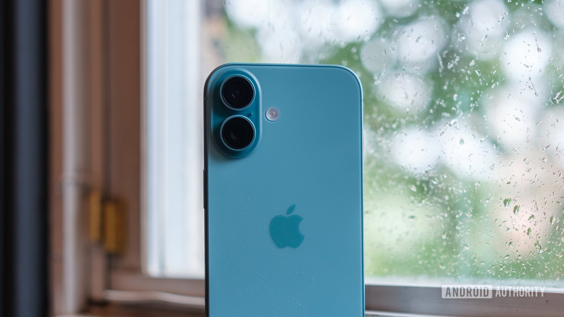
While there’s no denying that Apple’s combination of glass and aluminum or titanium is formidable, it’s certainly not invincible. The one time you take your iPhone 16 for a careless adventure is probably the one time something happens to it. The good news, however, is that you should rarely feel like you have to take your iPhone without a case, as there are by far more options for Apple products than for any other device — at least unless you were one of the four people who bought a FineWoven case for the iPhone 15 series.
Just keep in mind that buying an iPhone 16 case comes with a few new wrinkles. For starters, all four devices are different sizes, with the vanilla iPhone 16 sitting at 6.1 inches. From there, you’ll need a different case for the 6.3-inch iPhone 16 Pro, another for the 6.7-inch iPhone 16 Plus, and the biggest case for the 6.9-inch iPhone 16 Pro Max. Mix in the Camera Control and Action Button on the sides, and you can’t even use a case from the previous generation.
Try new text effects in Messages
Ryan Haines / Android Authority
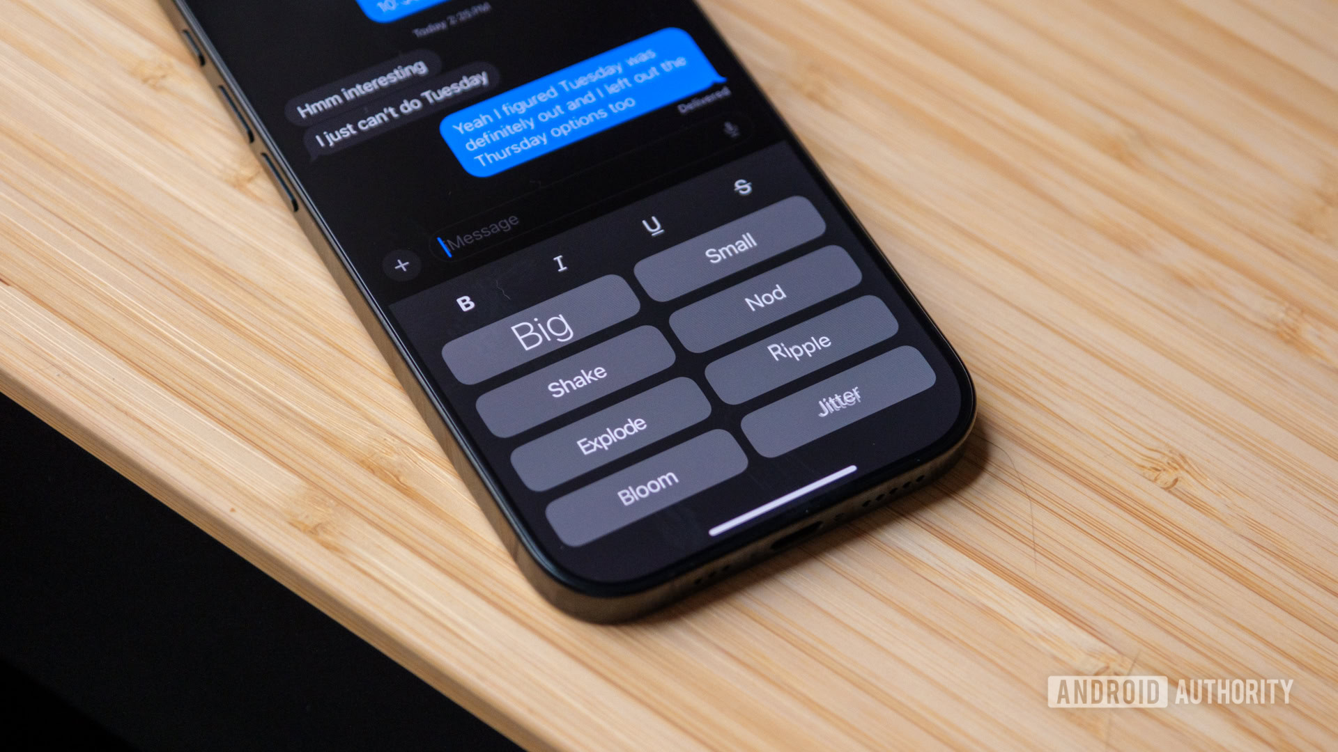
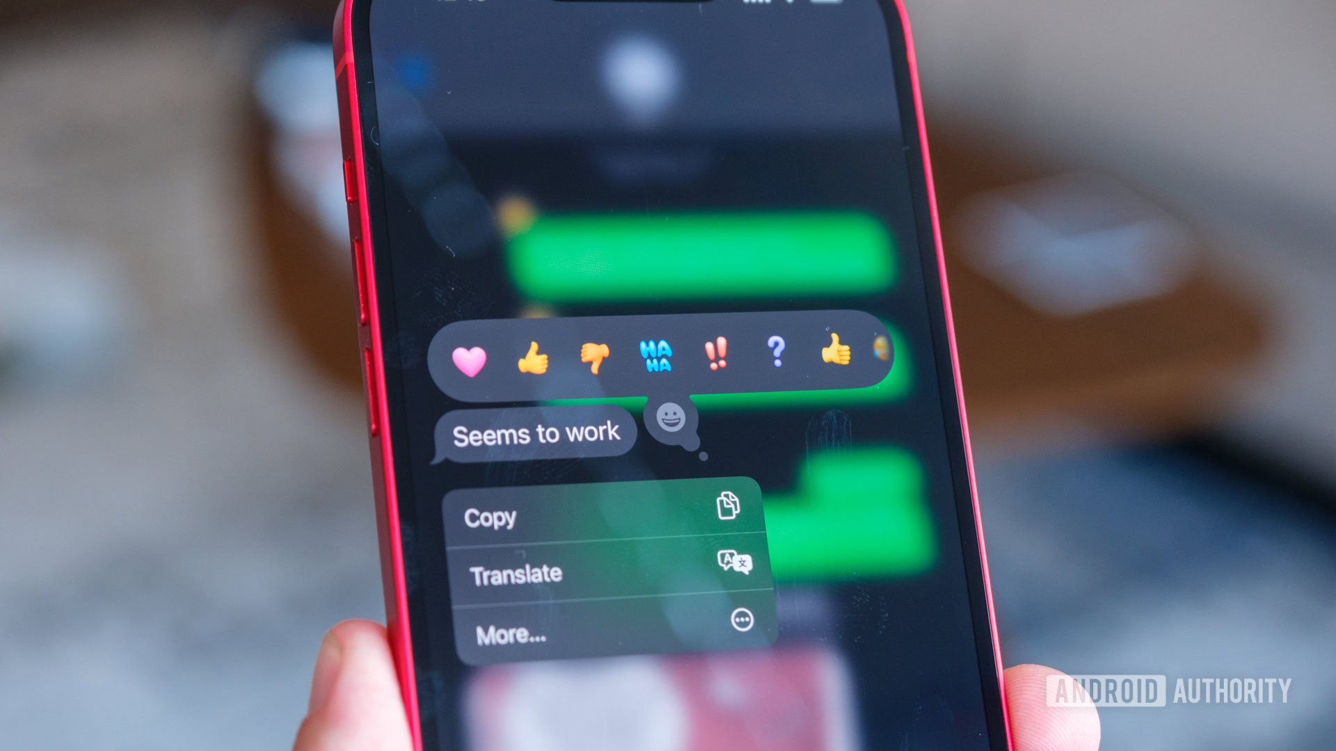
RCS support will probably get — and deserves — most of the attention in Messages, but it’s not the only trick Apple kept up its sleeve. After all, it’s not always easy to sell a die-hard iMessage user on better communication with Android phones because they’ll still only see a green bubble on the other side. What might be more exciting, however, is the ability to react to a message with any emoji in Apple’s library and to apply different text effects to other parts of your message. The effects are somewhere on the level of Microsoft PowerPoint, but they’re still fun.
Once again, most of the new Messages features are active by default, but it’s still worth a quick trip to the Settings menu if you want to change one or two of them. Just remember that Apple has rearranged its settings in iOS 18, so access to Messages now lies alphabetically under the Apps subheading.
Take a hike in Apple Maps
Ryan Haines / Android Authority
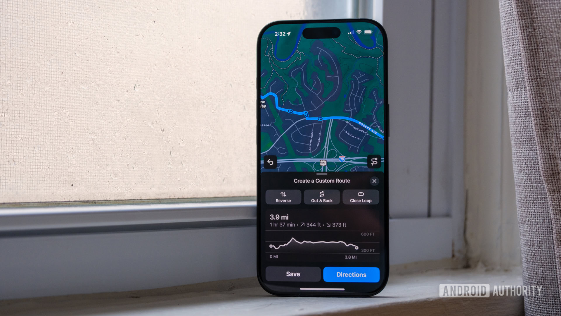
While I usually prefer Apple Maps for driving directions and saving my hiking routes for use on my Garmin watch, I’m open to trying new things. One of those new things is that Apple Maps now supports downloadable trails. Should you decide to let Apple Maps be your guide, you have two options — either choose from a pre-existing trailhead or create one of your own. Right now, the possibilities aren’t quite as fleshed out as they would be in an app like AllTrails, but it’s hard to argue with using one app to drive and hike.
If you want to create your own hike within Apple Maps, here’s how it works:
- Open Apple Maps.
- Search for a nearby (or not nearby) park.
- Tap on a trailhead (usually marked with a green icon).
- Press Create a Custom Route.
- Select other trail markers or campsites to add them to your route.
- Complete your route with the Save button.
You can also choose to reverse your hike, make it an Out & Back, or let Apple Maps close your loop by filling in trails it deems appropriate. It’s much more challenging to fully customize a route, as Apple Maps seems pretty dependent on its trail markers, but the overall process is much more straightforward than relying on a Strava-created map.
Test out Apple’s Photo Styles
Ryan Haines / Android Authority
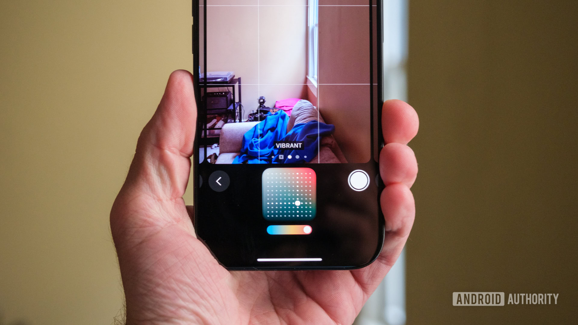
The Camera Control may have grabbed most of the attention regarding Apple’s iPhone 16 cameras, but it’s not the only upgrade. After introducing Photographic Styles — which function like Instagram filters — as far back as the iPhone 13 series, they’ve been upgraded for Apple’s latest devices. Previously, you could swipe between four styles: Rich Contrast, Vibrant, Warm, or Cool, and each one only modified the tone and warmth of your shot.
Now, you still have access to those basic profiles, but you can also tap into a few rose-based options, as well as Dramatic, Cozy, Ethereal, and a few black-and-white Photographic Styles. The updated Photographic Styles still modify the tone of your shot, but they now focus on Color and Palette rather than warmth. I’ve mostly relied on Vibrant and Stark B&W during my testing, as both seem to give the iPhone 16’s often-natural camera a bit more punch.
Here’s how to swap your Photographic Style:
- Open your iPhone 16 camera.
- Tap the small set of dots in the top right corner.
- Swipe left or right to go through the Photographic Styles.
You can also use the Camera Control to access Photographic Styles. Tap it twice while the camera is open and swipe to the same dot-based icon. From there, swipe up and down on the Camera Control or the display itself to choose your style.
Secure your logins with the Passwords app
Ryan Haines / Android Authority
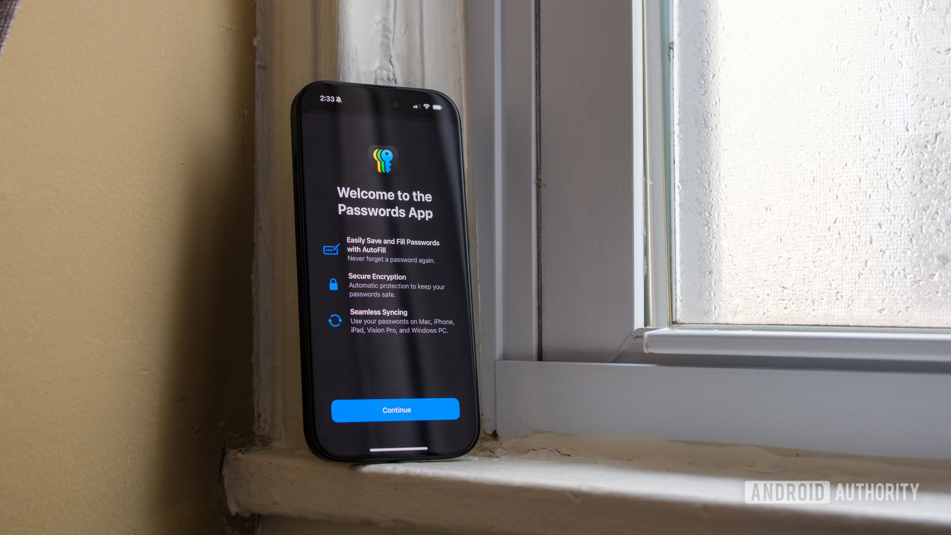
I already enjoy setting up a new iPhone simply because I’m almost always logged into my favorite apps right away, but now Apple has a new way to make password management easier. It introduced a Passwords app as part of iOS 18, and it’s worth a look if you’re not already a LastPass or 1Password user. If you already use another password manager, you might find it redundant, but you might also find that Apple already has most of your passwords if you saved them in Safari.
Honestly, the fact that I already use a MacBook Air every day for work has made Apple’s Passwords an immediate hit. It already has access to my main accounts, meaning I can snag email logins, banking information, and an ever-growing list of Wi-Fi passwords without having to search too hard. Passwords automatically locks itself using your Face ID information, making it as secure as your iPhone.
If you feel like sharing, you can create Groups within the Passwords app to send a Netflix password (or any other login) back and forth. Just keep in mind that Passwords won’t get you around geo-restrictions.
Program your Action Button
Ryan Haines / Android Authority
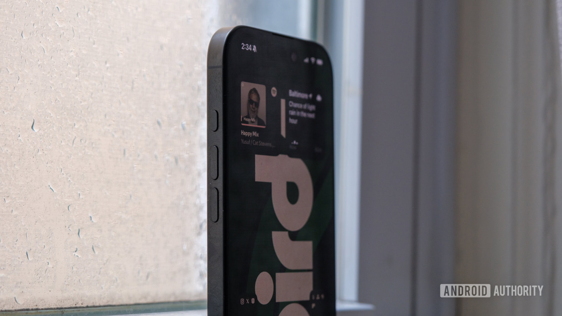
Finally, we should discuss the other button that Apple added to the iPhone 16 series: the Action Button. It’s not as new or exciting as the Camera Control since it was already available on the iPhone 15 Pro series, but now it’s standard issue for all Apple flagships. Essentially, the Action Button replaces the mute switch, sitting above the volume buttons on the left side of the iPhone 16, and it adds a bunch of, well, actions to the mix.
Sure, you can keep it as a mute switch, with a long press to jump between sound and silence, but that’s only the start. The Action Button can also be used to toggle Focus, open the camera, turn on the flashlight, or jump into a favorite app or control. I’ve kept mine locked in on silent mode, but it’s worth trying a few other options to see if one clicks for you (pun intended).
Here’s how to remap your Action Button:
- Open the Settings app.
- Select the Action Button.
- Swipe left or right to go through the available actions
- Press the back arrow or swipe out of Settings to confirm.
Thankfully, it’s incredibly simple to change your actions in just a few seconds, though I wish the Action Button did a bit more. As it stands, you can only program a single press of the Action Button, but I would have liked an option to double-press or even triple-press for additional functions.
Anyway, those are some of the first things I did while setting up and exploring my iPhone 16. If you really want to explore everything that the iPhone 16 series can do, you can check out the current prices below.


 English (US) ·