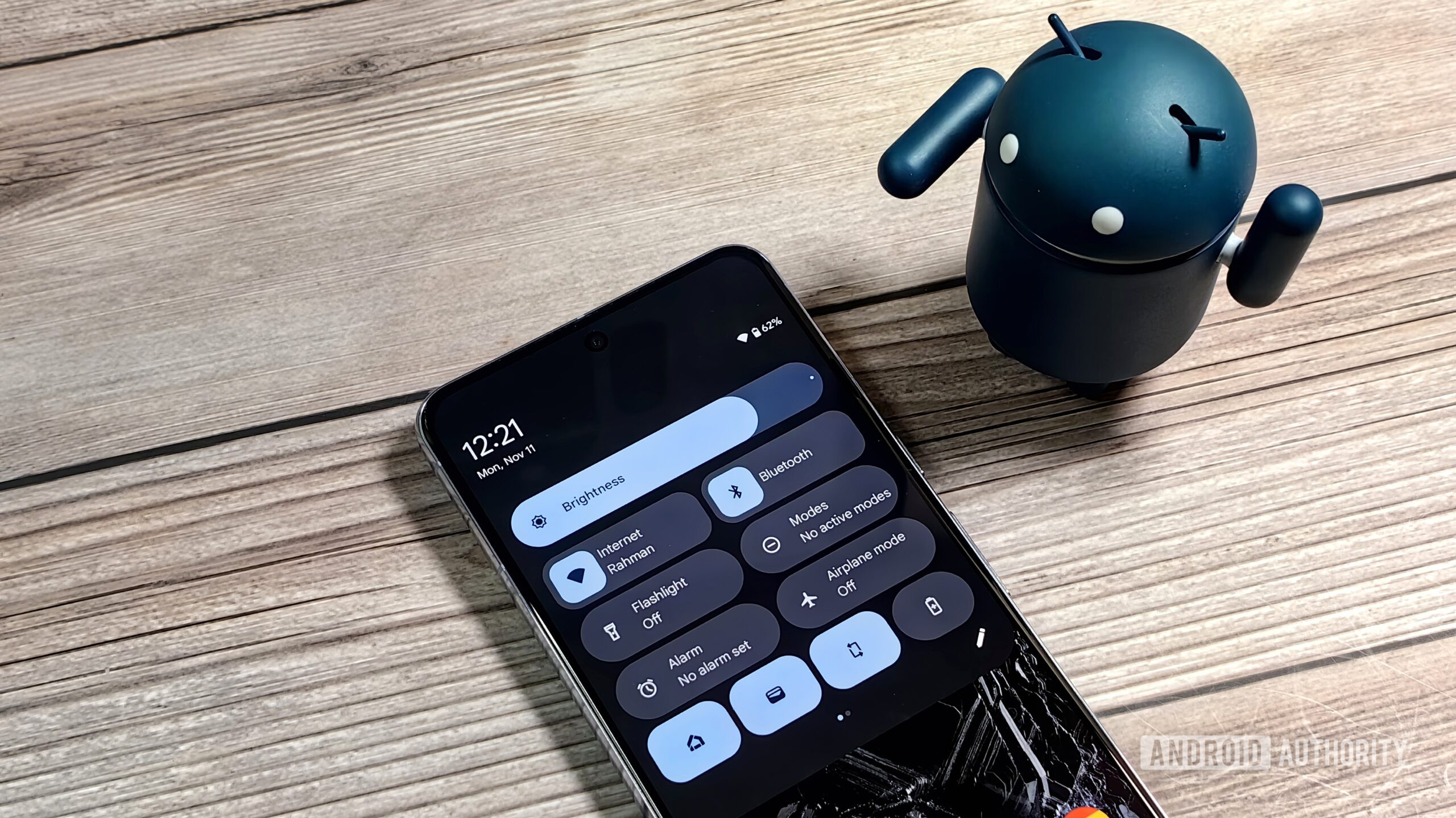
Mishaal Rahman / Android Authority
TL;DR
- Accessing the Quick Settings panel in Android 16 won’t require swiping down with two fingers as feared.
- Instead, you’ll only have to swipe down with one finger on the right half of the status bar.
- However, there’s still no way to swipe between the notifications and Quick Settings panels, but hopefully Google will fix that.
Back in September, I reported that Google is preparing a huge revamp of the notifications and Quick Settings panels in Android 16 that involved splitting the two panels into separate pages. One of the more controversial aspects of the revamped Quick Settings panel is that you now had to swipe down with two fingers to bring down the panel. Thankfully, though, Google is seemingly dropping this aspect of its Quick Settings redesign, meaning that Android 16 won’t require two fingers to pull down the new Quick Settings panel after all.
You’re reading an Authority Insights story. Discover Authority Insights for more exclusive reports, app teardowns, leaks, and in-depth tech coverage you won’t find anywhere else.
That’s not all, though, as I recently discovered that Google changed how the new Quick Settings panel is accessed in Android 15 QPR1 Beta 3. Keep in mind that the new Quick Settings panel is still not enabled by default, so I still had to do a bit of tinkering to enable it. Anyways, I noticed that I’m now able to pull down the new Quick Settings panel by swiping down on the right side of the status bar with a single finger, as opposed to two fingers. Here’s a short video that demonstrates this change:
This is a very simple change that brings Google’s upcoming Quick Settings panel more in line with how other Android OEMs have implemented it. When I first reported on Google’s plan to overhaul the notifications and Quick Settings panels in Android 16, people hated the two-finger swipe down requirement, and for good reason. Having to use two fingers to pull down the Quick Settings panel would have made it really inconvenient to access tiles, but thankfully, it looks like Google has done away with that.
However, Google still hasn’t implemented a way to swipe between the notifications and Quick Settings panels, a feature that other Android-based operating systems like Xiaomi’s HyperOS and OnePlus’ OxygenOS 15 already offer. Hopefully Google works on this feature next, as I think many people will find it annoying that they have to specifically swipe down on one side of the screen to access either the notification or the Quick Settings panel.
While I don’t know exactly when Google will roll out this new design, I’m guessing that it will arrive in the Android 16 release in Q2 of 2025. That’s because many aspects of the new design are still unfinished, such as support for light mode and the various buttons that used to live in the notification/Quick Settings dropdown. If Google does make any further improvements in the upcoming Android 15 QPR2 beta, then I’ll follow up with more articles here on Android Authority.
Got a tip? Talk to us! Email our staff at [email protected]. You can stay anonymous or get credit for the info, it's your choice.


 English (US) ·