Ryan Haines / Android Authority
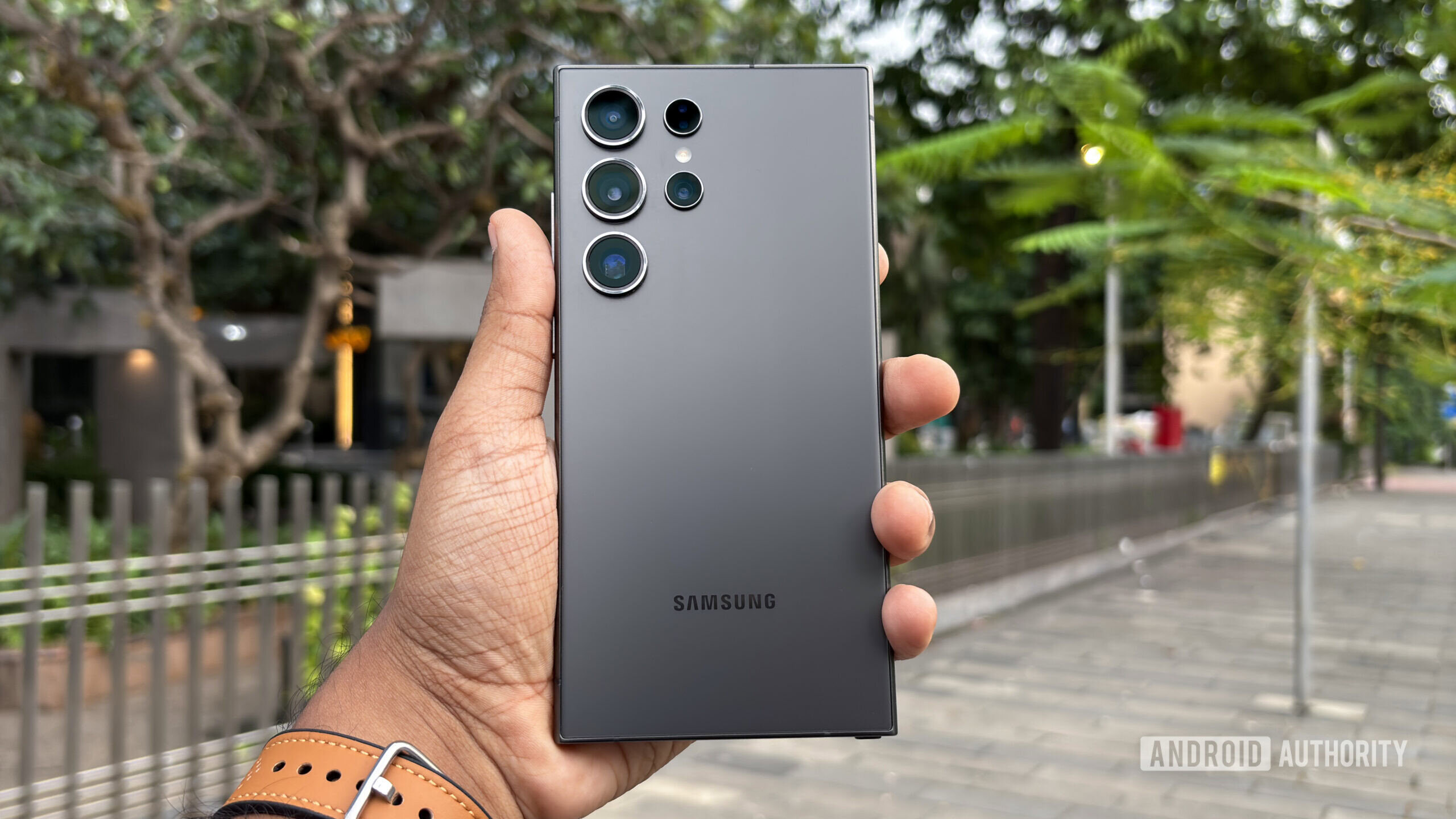
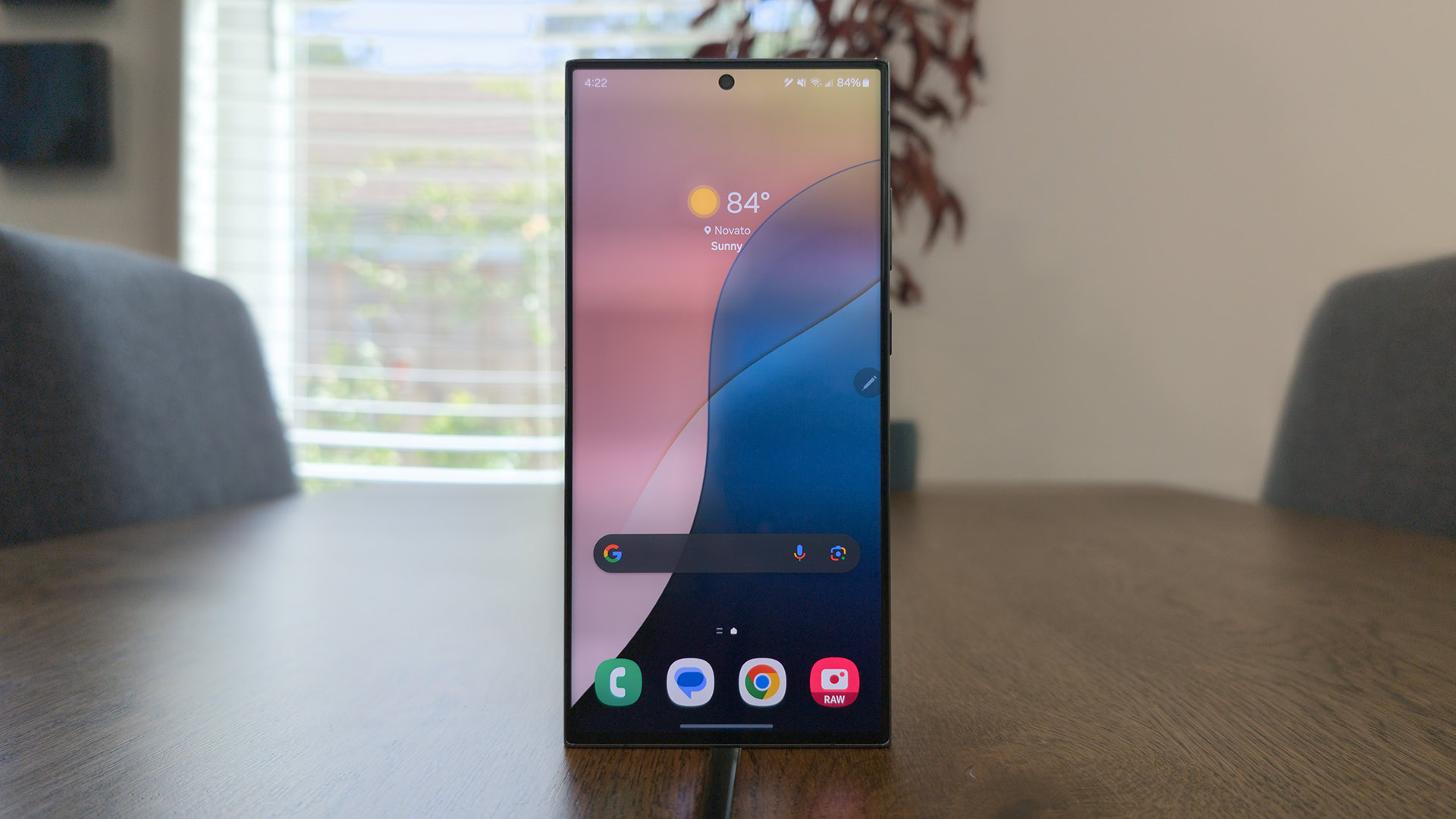
As a Samsung user, I’ve come to appreciate the robust features and customization options that One UI offers. Despite my interest in Google’s minimalist approach and clean user interface, a few key One UI features have kept me from switching to a Pixel. Here are five One UI features I’d love to see make their way to Google’s phones, which could finally convince me to make the jump.
A DeX equivalent
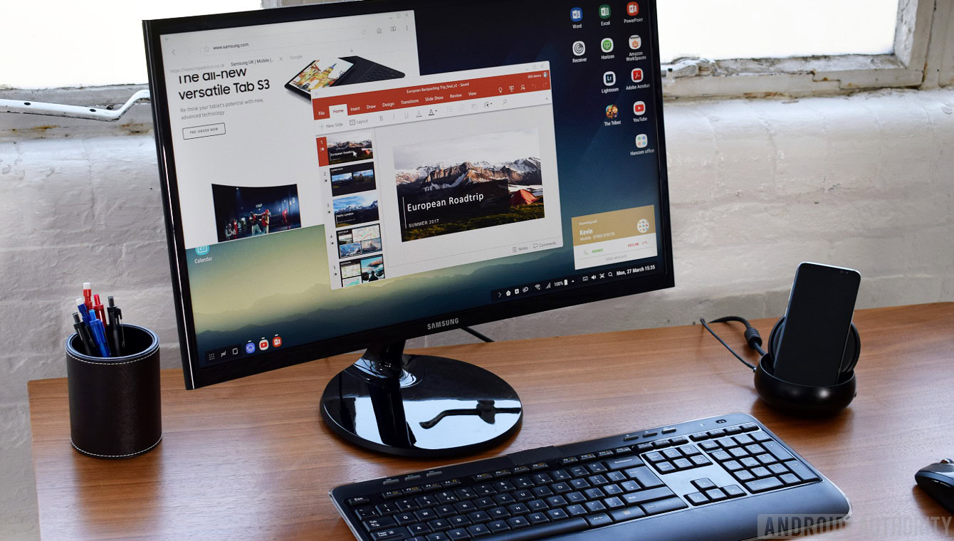
I’m a big fan of Samsung DeX and would love to see an equivalent on the Google Pixel. DeX is a feature that lets me cast my Galaxy phone’s screen to a larger display, like a monitor or TV, using Miracast. It also works on Windows and macOS computers.
You get a Windows-esque interface that allows you to resize and drag-drop open windows however you like. Plus, you can control your apps with a mouse and keyboard and use the same keyboard shortcuts you’re already familiar with on your PC.
Google currently doesn’t have anything like DeX, but there are promising signs. The tech giant tested a project called Ferrochrome, which essentially allowed Chrome OS to run on Android devices. Unfortunately, it was just a proof of concept and won’t be developed further.
However, Google has introduced a new feature on the Pixel 8 and Pixel 8 Pro that could make it easy to implement a DeX-like functionality in the future: display over USB-C. It mirrors your screen to an external display using a USB-C to USB-C or USB-C to HDMI adapter. I’d like to see Google turn this capability into a more integrated desktop experience for Pixel users.
Edge Panel
Edge Panel is one of my most-used One UI features, and for good reason. I love how it can store up to 12 of my most-used apps (and app pairs) or my most dialed contacts. It can also open the music player or compass, and even let me take notes and screenshots.
But by far, my favorite feature is the ability to access the clipboard, with up to 40 copied items, including images. The best part? I’m not limited to any one of these features because I can enable multiple Edge Panels simultaneously and switch between them by swiping on the panel itself. Plus, I can get dozens of additional panels from the Galaxy Store.
This would be a nifty addition to Pixel phones and a productivity, or even utility, game changer for large-screen devices like the Pixel Fold and Pixel Tablet.
Widget Stacks
Widgets have always been one of Android’s most underrated features. But what’s better than one widget? Multiple widgets.
That’s why I was thrilled when Samsung introduced Widget Stacks in One UI 5. This feature lets me stack multiple widgets on top of one another in a swipe-friendly setup. Plus, I can enable automatic rotation between them.
If I group widgets with different sizes, the subsequent additions resize to match the original widget. This feature keeps my home screen tidy and customizable, just the way I like it. And I imagine Google would like it too, since it blends in with the company’s minimalist approach.
Secure Folder
Another feature I’d love to see on the Pixel is Samsung’s Secure Folder. It’s a separate, hidden environment locked behind a passcode where you can save pictures, videos, calendars, and app data without them appearing outside this space. Unfortunately, Google hasn’t offered anything similar to this. However, Android 15 is shaping up to launch with Private Space, and it shares several similarities with Secure Folder.
Like Samsung’s solution, you need to authenticate yourself before starting the setup process. The app is locked behind a password of your choice, and you can launch pretty much any app on the Play Store and store personal files. They both let you hide the app icon from the app drawer. But that’s where the similarities end.
Unlike Secure Folder, which lets you open your existing apps in a private environment, Private Space requires you to download the app again. It comes with a handful of preloaded apps, including Camera, Contacts, Files, and the Play Store. You have to sign into a Google account — your existing one or a new one — to download apps from the Play Store. You can also use your existing screen lock or create a new one.
The Private Space icon sits at the bottom of the app drawer, unlike Secure Folder, which blends in with the normal app arrangement. If you hide the Private Space icon, you need to search for it in the app drawer. Meanwhile, you can only open Secure Folder from the app drawer — Samsung has a Quick Setting toggle to quickly hide and unhide it. Another notable difference is that Secure Folder lets you move files from outside the environment into it. At the moment, Private Space only functions from within the app.
Good Lock
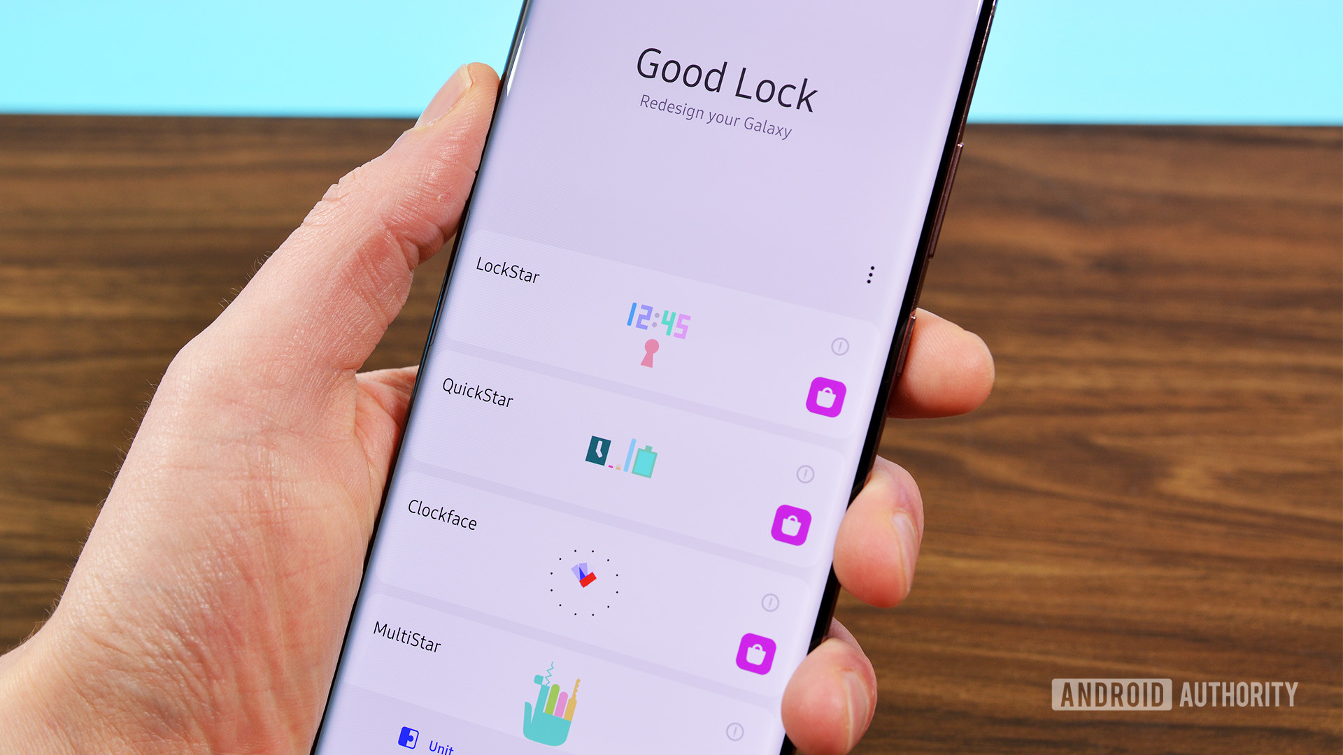
Joe Hindy / Android Authority
The new animated menu makes Good Lock look way more polished than last year.
Good Lock is basically a collection of downloadable modules that bring additional functionality and customization to your device. The sheer number of these modules and the quality they offer are impressive. You have Camera Assistant for camera tweaks, ClockFace for customizing lock screen and always-on display clocks, Dropship for file sharing, Edge Lighting+ for notification effects, and Home Up for launcher customization.
And that’s just the beginning. Good Lock also includes Keys Cafe for keyboard customization, LockStar for lock screen tweaks, and MultiStar for enhanced multitasking, especially on foldables. Other highlights include NavStar for navigation bar customization, NotiStar for notification management, One Hand Operation+ for gesture controls, and SoundAssistant for audio customization.
What I particularly like about Good Lock is its flexibility. You can pick and choose the modules you need instead of having them all pre-installed. Google could take a page from Samsung’s book and create a similar app for Pixels. This would allow power users like me to enjoy these features while keeping the core Pixel UI simple for everyone else.
Which One UI feature would you most like to see on a Pixel?
0 votes
While Google’s Pixel phones offer a great minimalistic experience, there are several powerful features from Samsung’s One UI that I can’t help but miss. Integrating the ones mentioned into the Pixel lineup could really transform the user experience. Until then, I’ll remain on the Samsung side, hoping that one day, my dream of a Pixel with the best of both worlds becomes a reality.


 English (US) ·